
Color theory gets quoted constantly. Know the rules before you break the rules. It is good advice, but it often gets misunderstood. Some people treat color theory like a rigid system you must obey at all times. Others dismiss it entirely and rely on instinct alone. Both approaches miss the point.
Color theory is a foundation. It is there to support decisions, not replace them. The moment it becomes a formula you blindly follow, it stops being useful. The moment you ignore it entirely, your work starts to fall apart. The balance lives in understanding why the rules exist, where they came from, and when they no longer serve the story you are trying to tell.
That balance only comes from experience.
Learning Color Through Paint, Not Presets
My understanding of color did not begin in software. It began with paint. Real pigment. Mixing on a palette. Watching colors change as they combine, dry, and sit next to one another over time. Traditional paint teaches you very quickly that color is not theoretical. It is physical.
When you mix pigments, you are dealing with chemistry. Some colors overpower others. Some combinations dull instantly. Some produce harmony you did not expect. You learn restraint because there is no undo button. Every decision carries weight.
That physical process creates an intuitive understanding of color relationships that is hard to fake digitally. Traditional mixing forces cohesion. Pigments contaminate one another in subtle ways. Shadows carry hints of surrounding colors. Highlights are rarely pure. That natural imperfection creates harmony.
Digital color does not behave that way by default.
Digital Color Is Clean, But Not Always Alive
Digital color is based on light, not pigment. RGB values stack neatly. Saturation stays intact. Everything can be isolated and controlled. This is incredibly powerful, but it also removes friction. When friction disappears, so does consequence.
It becomes very easy to create images that are technically correct but emotionally hollow. Clean palettes. Perfect contrast. No sense of atmosphere. No visual memory.
This is why so much digital work relies on film emulation. Grain. Color roll off. Subtle shifts in contrast. These are attempts to bring back the organic behavior that traditional processes naturally create.
For decades, filmmakers and painters have asked the same question. How do I distinguish myself visually. Early on, the answer was simple. Skill. Could you draw. Could you paint. Could you control light and anatomy. That was enough.
As skill became more widespread, distinction shifted to interpretation. Color became a voice. Not just what you painted, but how you saw.
Color Harmony Is Not a Formula
Color harmony is not something you apply at the end of a process. It is something you build from the beginning. It comes from relationships, not rules.
Warm and cool. Saturation and restraint. Value doing most of the work while color supports it quietly. Painters have known this for centuries. Many of the strongest paintings use limited palettes. Not because the artist lacked options, but because they understood control.
Harmony happens when colors feel like they belong to the same world. Traditional paint naturally pushes you in that direction. Digital tools require you to do it consciously.
This is where experience matters. Anyone can pull a palette from an image. Very few people can build one that supports story, mood, and production realities all at once.
Film, Color, and Visual Language
Film inherited its color language from painting. Early cinematography leaned heavily on painters for reference because film stock behaved more like pigment than modern sensors. Exposure mattered. Lighting mattered. Chemistry mattered.
Even today, digital productions chase the look of film. Not because it is nostalgic, but because it feels human. Film responds imperfectly. It compresses highlights. It softens shadows. It introduces variation.
Those imperfections communicate something audiences feel instinctively. Perfect color often feels artificial. Controlled imperfection feels believable.
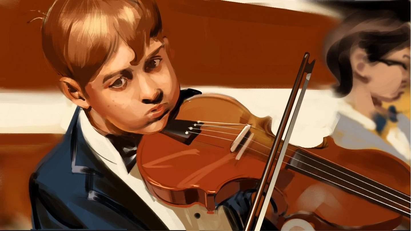
Color in film is never just about beauty. It is about clarity, tone, and emotional direction. Color tells the viewer how to feel before dialogue ever does.
Knowing When to Break the Rules
This is where the phrase know the rules before you break the rules actually applies. Breaking color theory is not rebellion. It is decision making.
When I push a palette too far warm or too far cold, it is not accidental. I know what realism I am giving up. I know what emotional weight I am adding. That tradeoff is intentional.
A less experienced artist might copy a look. A seasoned artist understands why that look works and when it will fail. That understanding comes from years of observation, painting, correction, and study.
Color theory gives you a language. Experience gives you judgment.
Automation Changes the Landscape, Not the Value
We are in a new shift now. Automation can generate color instantly. Algorithms can analyze palettes, apply grades, and replicate styles. Speed has never been higher.
What automation cannot do is care.
It cannot understand why one scene should feel slightly uncomfortable. It cannot know when clarity matters more than beauty. It cannot weigh emotional context against technical correctness.
A real person brings perspective shaped by taste, memory, and lived experience. When I make color decisions, I am thinking about story flow, production constraints, and audience response at the same time.
That kind of thinking does not come from data. It comes from doing the work.
Color in Visual Development and Storyboarding
In visual development and storyboarding, color is not decoration. It is communication. It helps directors, cinematographers, and crews understand tone quickly. It signals emphasis. It establishes mood and rhythm across sequences.
Good color choices prevent confusion later. They reduce misinterpretation. They save time on set and in post. A well designed palette supports lighting decisions, costume choices, and production design.
This is where hiring the right artist matters.
You are not paying for someone who knows color theory. You are paying for someone who knows when to use it and when to step outside it. Someone who understands how color behaves across mediums, pipelines, and real world conditions.
Why the Human Perspective Is the Value
For a long time, artists distinguished themselves through skill alone. Today, skill is assumed. The real value is perspective.
A human artist brings intention. They bring restraint. They bring judgment shaped by years of studying painting, film, and visual storytelling. That perspective cannot be automated.
Color theory is a tool. Traditional pigments teach harmony. Digital tools offer speed. Film emulation reminds us what imperfection feels like. None of it matters without a person making decisions with purpose.
That is why hiring a good artist still matters.
Not because they follow rules, but because they know when the rules stop serving the story.
That is how I approach color. Not as a system to obey, but as a language to speak clearly, honestly, and with intent.
📩 Contact: paul@paultemplestudios.com
🎨 Explore more: www.paultemplestudios.com
Want more blog posts on this topic?
1. Studying Light: Lessons from the Masters of Painting
2. From Traditional Painting to Preproduction: How Fine Art Roots Shape Visual Storytelling
3. How Classical Painting Shaped Modern Filmmaking