
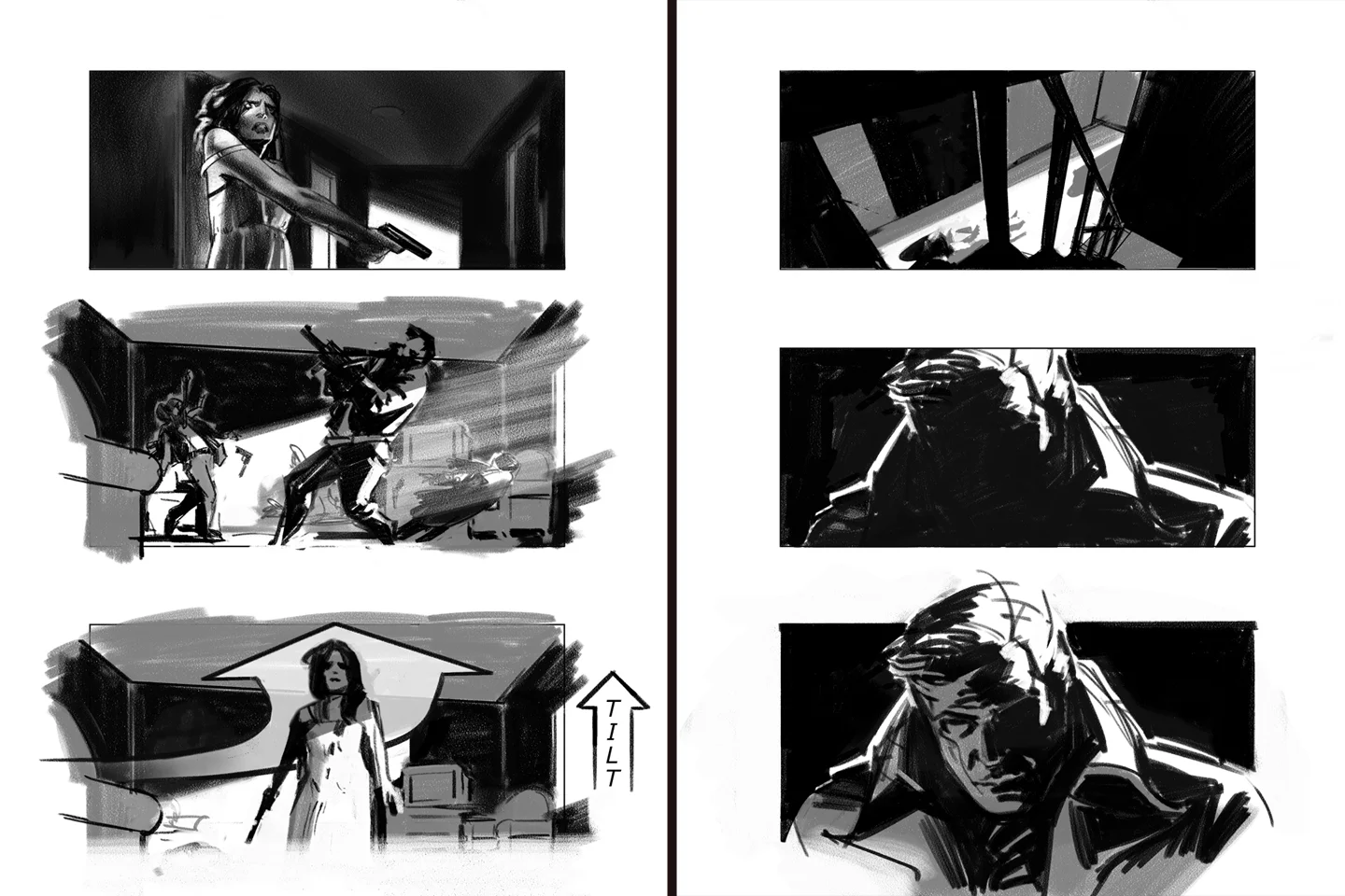
I first picked up Framed Ink by Marcos Mateu-Mestre because I kept hearing other artists talk about it. It is one of those books that gets straight to the point. There is very little wasted space, which is appropriate for a book about visual storytelling. Mateu-Mestre focuses on the fundamentals that make an image communicate: shape, value, lighting, framing, negative space, scale, and the relationship between one shot and the next. These are basic ideas, but they are also the things that can make the difference between an image that is nice to look at and one that actually communicates a story.
That distinction matters a lot in storyboarding. When I am working on a storyboard, I am thinking about what the audience needs to understand from each frame, where the characters are, where the camera is, what deserves attention, and how the sequence should progress from one image to the next. A storyboard needs to communicate quickly because the people looking at it are usually making decisions. A director needs to understand staging and camera placement. A cinematographer needs to understand framing and visual emphasis. An art director or production designer needs to understand how the environment is functioning within the shot. The drawings have to give everyone enough information to start talking about the same film.
That is a big part of why Framed Ink has stayed relevant to me.
Cover of Framed Ink by Marcos Mateu-Mestre
Composition Has a Job to Do
One of the things I appreciate most about Mateu-Mestre's approach is that composition always has a purpose. A frame is a collection of shapes, and those shapes have different levels of visual importance. Some are large, some are small. Some are dark, some are light. Some attract attention immediately, while others sit quietly in the background. The way those pieces are arranged determines how the viewer reads the image and what information reaches them first.
A character standing in the middle of a frame might be perfectly centered and technically well drawn, but moving that character toward the edge can completely change the feeling of the image. Give the character a large amount of empty space and the frame may feel isolated. Put a strong dark shape behind them and the character may become much more prominent. None of those changes require a different character design or a more detailed drawing. The composition is doing the work.
That is one reason I like to work with large shapes when I am developing a board. I want to solve the major decisions while the image is still simple. If the arrangement of the big shapes does not work, rendering every building, costume, prop, and background detail more carefully is not going to solve the underlying problem. The details should support the composition rather than determine it.
Value Is One of the Fastest Ways to Clarify an Image
Another idea that comes up throughout Framed Ink is the importance of value. Before I think about whether something should be blue, orange, green, or red, I want to understand the relationship between light and dark. Where is the strongest contrast? What is going to attract the eye? What can fall back into the background? If I remove the color from an image, can I still understand what is important?
That becomes particularly useful when working on storyboards because the images often need to communicate very quickly. If the character disappears into the background, the viewer has to work harder to understand the shot. If every object has the same visual weight, there is no clear hierarchy. If the important story beat is surrounded by equally strong shapes and contrast, the eye has nowhere obvious to go.
My background in traditional painting has reinforced that idea for me. I have spent years studying painters who understood value and light extremely well, including Sargent, Sorolla, and Munnings. They approached painting in very different ways, but they all understood how much information could be communicated through an organized arrangement of light, dark, and midtone shapes. That kind of study carries directly into visual development and storyboarding. Even when I am working digitally, I am still thinking about many of the same fundamental relationships that a painter has to solve on a canvas.
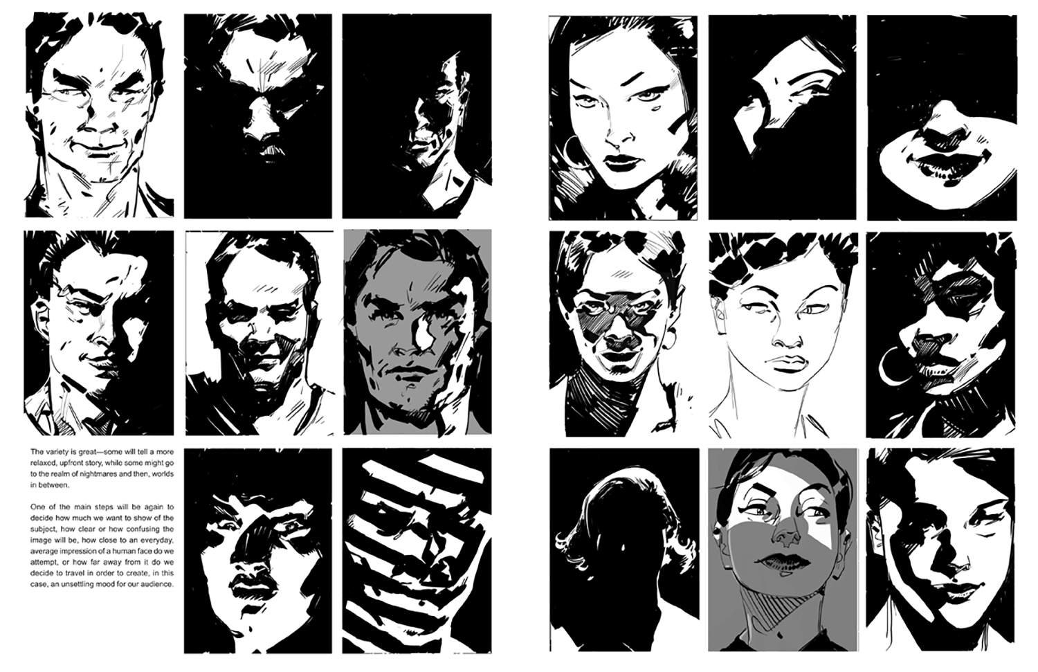
Excerpt from Framed Ink by Marcos Mateu-Mestre
Composition Across a Sequence
This is where I think Framed Ink becomes particularly relevant to storyboarding. A single frame can work beautifully on its own and still fail as part of a sequence. Storyboarding is about the relationship between images, so I am always thinking about what one shot establishes for the next.
If I move from a wide shot into a close-up, the change needs to have a purpose. If a character looks toward something, the following shot needs to give the audience enough information to understand what they are seeing. If the camera moves around a scene, the geography has to remain understandable. If an action sequence changes rapidly between angles, each frame needs to contribute to the audience's understanding rather than simply adding another interesting viewpoint.
Continuity is part of this, but it is more than keeping characters on the correct side of the frame. It is about maintaining visual logic throughout the sequence. The composition of one shot affects how the next shot is understood, and the progression of those compositions can establish rhythm, tension, isolation, scale, or momentum.
That is why I tend to think about sequences rather than individual drawings. I want each frame to work on its own, but I also want to understand what role it is playing in the larger progression.
Why This Matters to Directors and Art Directors
For a director, a storyboard should be a practical thinking tool. It gives you an opportunity to look at the sequence as a whole and start making decisions about staging, camera placement, coverage, pacing, and visual emphasis. You can see whether the action is understandable, whether the camera is helping the scene, whether the important performance beat is visible, and whether the progression from shot to shot is doing what the scene needs.
A director does not necessarily need every board to look like a finished illustration. The drawings need to communicate the intended film clearly enough that the director and production team can make decisions from them. That requires the storyboard artist to understand film language, including camera placement, perspective, staging, screen direction, shot sizes, blocking, acting, lighting, and how those choices affect the viewer.
The same principles apply to visual development and art direction, although the problems can be somewhat different. An art director may be establishing the visual language of an entire project, which means individual images have to work together as part of a larger system. Character designs need to belong within their environments. Sets and locations need to support the characters and story. Lighting needs to reinforce the intended mood. Props, architecture, costumes, and other visual elements need to feel like they belong to the same world.
When I am developing an environment, for example, I am not only thinking about what the location looks like. I am thinking about how it can be photographed, where a character might move through it, what areas will create useful staging opportunities, and how the architecture can contribute to the composition of a shot. Character and creature development has similar considerations. The design needs to work from different angles and at different distances, and it needs to remain readable when the character is placed into a scene.
Simple Drawings Can Require a Lot of Thought
One thing I appreciate about Framed Ink is how simple many of the drawings are. That simplicity can be deceptive because a quick drawing can require a lot of decision making. When there are fewer details to hide behind, the underlying choices become easier to see.
Where is the character standing? How much of the frame are they occupying? What is the dominant shape? Where is the light coming from? What is the background doing? What should the viewer notice first? How does the image connect to the previous shot?
Those are not necessarily drawing problems. They are storytelling and design problems.
That is one reason I like starting with rough sketches when I work. I can test different compositions quickly and make changes before a lot of time has gone into rendering. A rough can tell me that the camera needs to move, that the character needs to be larger, that the background is too busy, or that the staging needs to be reconsidered. Those are useful discoveries to make early. Once the composition and storytelling are working, refinement becomes much more productive.
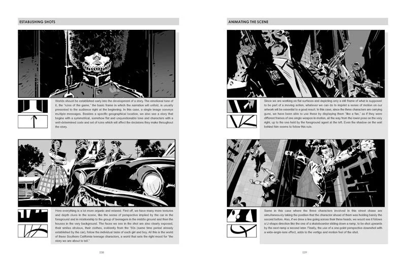
Excerpt from Framed Ink by Marcos Mateu-Mestre
The Fundamentals Still Matter
Software changes constantly. Cameras change, rendering technology changes, and production pipelines continue to evolve. The fundamentals of visual communication are much more consistent. Contrast still attracts attention. Negative space still affects how a character feels within a frame. Scale still communicates importance. Lighting still establishes mood. Silhouettes still need to read. Composition still determines how the viewer moves through an image.
That is why I think a book like Framed Ink continues to be useful. It deals with visual principles rather than a particular software package or production technique. Those principles can be applied to a storyboard drawn with a pencil, a digital shooting board, a fully rendered concept frame, a comic panel, or a finished film.
I also do not think those principles should be treated as rigid rules. Knowing the fundamentals gives you a foundation for making deliberate choices, but sometimes the right decision is to break an expected composition because the story calls for it. A centered composition can be exactly right for one scene and completely wrong for another. A symmetrical frame can communicate control or stability, while an asymmetrical frame can introduce tension. A crowded composition can create energy, while a simple composition can slow the viewer down and isolate a character.
The important part is understanding why you are making the choice.
What I Take From Framed Ink
For me, the biggest takeaway from Framed Ink is the importance of purpose. Every visual decision should be doing something for the story. That does not mean every frame has to be complicated or heavily designed. In many cases, the strongest solution is the simplest one. The challenge is knowing what can be removed, what needs to remain, and how the remaining elements should be arranged.
That is also why experience matters when hiring a storyboard or visual development artist. There are plenty of people who can produce an attractive image. For a film director, art director, or creative team, the more important question is whether the artist understands how that image functions within the larger project.
A strong artist needs to be able to think about composition while also understanding camera language, perspective, anatomy, gesture, lighting, environments, pacing, and production. Those skills allow the drawings to become useful communication tools. They help a director see how a sequence might work, give an art director a clearer sense of the visual direction, and give the production team something concrete to respond to.
That human judgment becomes even more important as image-making technology continues to develop. Tools can make it easier to generate visual possibilities, but someone still has to decide which possibilities actually serve the story. An image can be technically impressive and still be the wrong image for the scene. Knowing why something works, why it does not work, and what needs to change comes from observation, experience, and a strong understanding of visual storytelling.
That is ultimately what I find valuable about Framed Ink. It is a reminder to keep looking at the fundamentals. Shape, value, composition, framing, and visual hierarchy are all part of the same process of deciding how an audience will experience a story through images. I have studied composition from a lot of sources over the years, from traditional painting to film and visual development, and Framed Ink is a particularly practical reference because it puts those ideas into a format that directly relates to sequential storytelling.
When a storyboard sequence feels unclear or a composition is not communicating what I need it to communicate, going back to those fundamentals is often where I find the solution. For me, that is what makes a good art book worth returning to years after you first read it.
📩 Reach out: paul@paultemplestudios.com
🎨 Explore more: paultemplestudios.com
Want more blog posts on this topic?
1. Edgar Payne on Composition: Lessons for Film Work
2. Composition and Control: The Cinematic Science Behind a Great Frame
3. Diving Into the Color Charts of Richard Schmid