

I have a bit of an obsession these days with getting color right. Lately I have been testing new computer monitors because accuracy matters a lot to me when I am working digitally. It has been a surprising headache. Different brands claim excellent color reproduction, but put them side by side and you quickly see they are not on the same page at all. One monitor makes skin tones look too pink, another washes everything out. It reminds me why I still value deep, hands-on color knowledge in my work. That is one reason I keep coming back to the color charts Richard Schmid laid out in his book Alla Prima.
Schmid’s approach to color is one of the most practical and honest systems I have come across. In Alla Prima, he describes a rigorous color chart exercise that forces you to truly understand every pigment on your palette and how it behaves when mixed with every other color. It is not a quick warmup. It is serious work. But the confidence it builds is worth every hour spent mixing.
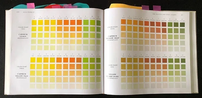
Color charts of Richard Schmid
What the Color Charts Actually Are
In Alla Prima, Schmid recommends creating systematic charts for your chosen palette. You start with full-strength colors and then create value scales by mixing in increasing amounts of white. More importantly, you make “color dominant” charts. For each main color on your palette, you mix it as the dominant hue with every other color in small increments. Then you create value steps for each of those mixtures.
This means painting hundreds of small color swatches in an organized grid. It sounds tedious, and it is. But by the end you have an intimate map of what every combination looks like at different values. You see exactly how a particular red behaves when it meets a blue, or how a yellow changes when mixed with an earth tone. You discover which colors are strong stainers, which ones shift temperature dramatically when lightened, and which mixtures stay clean versus turning muddy.
Why This Exercise Matters to Me
I first dug into Schmid’s Alla Prima years ago in art school. Even though most of my client work is now digital, that foundation carries over every single day. When I am developing concepts or boarding scenes, I need to know how colors will feel under different lighting conditions. The charts trained my eye in a way that no casual mixing ever could.
The beauty of the system is that it removes guesswork. Instead of hoping a color combination will work, you already know what it will do because you have mixed it dozens of times at different values. That kind of knowledge becomes instinctive over time.
Applying Schmid’s Color Thinking to Storyboards and Visual Development
In pre-production for film and TV, color decisions need to be made early. Directors and producers want to see how a sequence will feel emotionally before they commit resources. That is where deep color understanding pays off.
When I create storyboards or concept art, I am not just drawing shapes and values. I am thinking about temperature, saturation, and how colors interact under the key lighting I have planned. Thanks to time spent with Schmid’s methods, I can predict how a warm interior light will affect skin tones against cool window light, or how a desaturated palette will shift the mood of a tense scene.
For advertising work, this knowledge is even more critical. You have very little time to communicate feeling. A well-chosen color harmony can make a thirty-second spot feel premium, comforting, or exciting without extra copy. I often build small color studies during visual development so the agency can see exactly how the palette will support the brand message.
The Practical Payoff on Real Projects
I remember boarding a dramatic scene for an indie feature where the director wanted a sense of unease in a supposedly normal suburban home. Using lessons from color charting, I suggested a palette that stayed mostly cool but included subtle warm accents that felt slightly off. The slight temperature conflict created quiet tension that supported the story. The director responded strongly to the boards because the color choices felt intentional rather than decorative.
In commercial work I use the same thinking. A food client might want their product to look appetizing. Understanding how certain warms behave against neutrals helps me design frames where the food feels inviting instead of flat or artificial. These are not dramatic flashy choices. They are quiet, solid decisions that make the final footage work better.
Color Accuracy in the Digital Age
That brings me back to my monitor situation. I have spent more time than I care to admit calibrating and comparing screens. One monitor might render shadows beautifully but shift reds. Another handles brights well but loses subtlety in mid-tones. It is frustrating because when I am delivering concepts or animated boards, I need the client to see the colors the way I intend them.
This is exactly why foundational color knowledge from something like Schmid’s charts remains so valuable. Technology changes, monitors vary, lighting on set can be unpredictable, but if you understand how pigments and colors fundamentally behave, you can adapt. You make better choices from the beginning instead of hoping post-production will fix problems.
Building Real Color Instinct
The charts teach patience and observation. You cannot rush them if you want accurate results. That same patience helps when I am developing a look for a project. I take time in the early stages to explore color relationships instead of jumping to whatever looks good on the screen at that moment.
For younger artists or directors I work with, I often recommend spending time with systematic color study. It builds confidence that shows up in the work. You stop second-guessing yourself during tight deadlines because you already know what will happen when you mix that particular green with that particular gray.
Wrapping It Up
Richard Schmid’s color charts in Alla Prima are one of the most thorough ways I have found to truly learn your materials. The exercise might feel old-school, but the understanding it delivers is timeless. In visual development and storyboarding, that knowledge helps me deliver work that feels emotionally right and technically solid, whether we are working traditionally, digitally, or somewhere in between.
If you are directing a film, TV project, or commercial and want visual development or storyboards built on thoughtful, confident color choices, I would be glad to talk through your project. We can explore palettes and lighting approaches that serve your story from the very beginning.
📩 Reach out: paul@paultemplestudios.com
🎨 Explore more: www.paultemplestudios.com
Want more blog posts on this topic?
1. Color Theory, Craft, and the Human Eye
2. Color Temperature in Film & Advertising
3. How Classical Painting Shaped Modern Filmmaking