• Home
  • Film
  • Advertising
  • Super Bowl LVII
  • Clients
  • Blog
  • Contact
Menu

Paul Temple Studios

  • Home
  • Film
  • Advertising
  • Super Bowl LVII
  • Clients
  • Blog
  • Contact
×

Behind the Boards: A Blog by Artist, Paul Temple

Welcome to the blog! Here you'll find insights into the art of storyboarding, concept development, shooting boards, and visual storytelling for film, television, and advertising. From camera planning techniques to the emotional impact of character design, this is where I’ll share my expertise honed over a decade of working with directors and top brands. Whether you're a creative director, filmmaker, or agency looking to elevate your pitch, this blog reveals how powerful visuals drive unforgettable stories.

Questions? Email me at paul@paultemplestudios.com

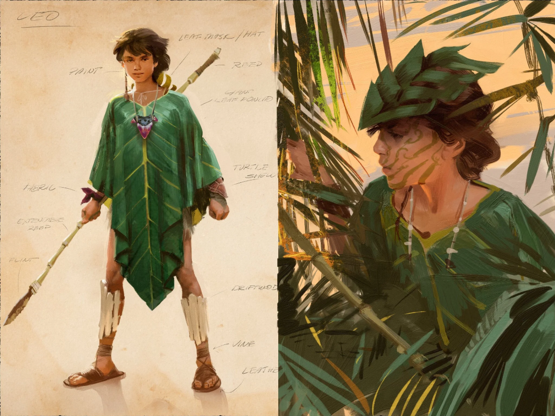
Character design for unannounced fantasy film project. Art by Paul Temple.

Character and clothing design for unannounced fantasy film project. Art by Paul Temple.

The Silhouette Test: Why Character Design Starts with Simple Shapes

Paul Temple December 8, 2025

In my work as a storyboard visdev artist, the first thing I judge in a character design is the silhouette. Before color, before texture, before expression, before costume choices, there is the outline. If a character or an object cannot communicate its identity in a single flat shape, the design is not ready. A strong silhouette is the foundation of visual communication. Everything else is built on top of it.

Filmmakers and artists are often tempted to start decorating too early. Detail feels like craftsmanship. It feels like personality. It feels like labor. But detail does not save a weak design. You can engrave an armor plate with every symbol ever invented and it still will not read as clearly as a shape with a strong, unmistakable outline. A character with a simple but powerful silhouette will stand out every time.

I revisit this principle constantly, not because I enjoy repeating myself, but because it protects productions from confusion later. I was working recently on a fantasy project that required the design of ceremonial masks for an ancient warrior order. The team wanted them to feel powerful, sacred, and visually distinct. I explored various historical influences and sketched detailed versions. When I stepped back and filled them in as solid shapes, many of them looked nearly identical. The attractive details had distracted me from the fact that the core shapes were not pulling their weight.

It did not ruin my week. It was not a dramatic life lesson. It was simply a practical reminder that silhouette always catches the truth. Once I simplified each mask and adjusted the major shapes, everything snapped into place. The masks immediately gained personality and presence. It was a clean example of why I always test silhouette first.

Silhouette works because it is the fastest and clearest way humans read visual information. Our brains identify contrast before texture. We read shapes before faces. We respond to posture before micro expressions. If the silhouette communicates, the viewer understands the scene even before looking at the details.

Here is how I judge a silhouette and why it matters for filmmakers and artists.

Clear Read at a Glance

A silhouette must read instantly. If I blur my eyes, or if I stand back from the frame, the character or action should remain clear. The pose should be readable. The intention should be visible. If the shape is confusing, the pose needs adjustment or the design is overcrowded.

Negative space is one of the best ways to achieve clarity. If a character is holding something, the gap between the arm and the torso must be readable. If a character is walking, you need separation between the limbs so that the stride is obvious. If a character is crouched in fear, their outline should shrink. If a character is confident, their shape should expand.

Even slight adjustments improve the read. Raising an elbow. Angling a shoulder. Leaning the torso forward. Opening the stance. These changes strengthen the silhouette and make the intention obvious.

Unique Identity Through Shape

A strong silhouette helps characters stand apart from one another. If your protagonist, sidekick, mentor, and villain all share roughly the same outline, the visuals lose impact. Good design assigns each character a shape language that belongs to them.

When I develop silhouettes for a lineup, I often render them as pure black cutouts first. If I cannot identify who is who instantly, I refine until I can. The solution may be proportion changes, costume adjustments that change the outline, distinct hair shapes, or stronger posture choices.

The audience should be able to recognize a character even if everything else is removed. That is the standard.

Shape as Storytelling

Silhouette is not just a clarity exercise. It communicates personality on a deeper level.

Round shapes feel friendly. Angular shapes feel dangerous. Tall shapes feel proud. Wide shapes feel grounded. Slanted shapes feel unstable. Small clustered shapes feel anxious. Large open shapes feel confident.

These signals are so intuitive that viewers absorb them without noticing. They feel them instinctively. A good designer takes advantage of that.

The silhouette of the masks from that recent project communicated more about the characters than any embellishment ever could. A tall vertical crest made the warriors feel elevated. A forward tilt made them feel predatory. Carved details helped with worldbuilding but the silhouette carried the meaning.

Silhouette in Motion

A silhouette should hold up not only in still poses but also in action. Motion reveals flaws that static sketches hide. When boarding an action sequence, I test silhouettes throughout the movement. If the outline becomes muddy at any point, the action needs to be rebuilt.

Fight scenes especially rely on clear silhouettes. Good choreography uses readable shapes to guide the viewer through the rhythm of hits, dodges, swings, and impacts. Even in chaotic environments, a clean silhouette lets the audience follow who is doing what and why.

The same applies to quieter motion. A character lifting a cup, slumping into a chair, or turning their head must remain legible. Animation supervisors often say if the silhouette works, the acting works. They are right.

Simplicity First

The fastest way to improve a design is to simplify it. Most artists fall into the trap of decoration. They start adding tiny details long before the big shapes are resolved. That is the equivalent of trying to decide what earrings to wear before choosing a shirt. Details should support design, not compensate for it.

I often start with the simplest version possible. When the silhouette works at a basic level, I add complexity slowly. If a detail breaks the clarity of the outline or distracts from the intention, it does not belong.

This principle is liberating. It frees the designer from clutter. It frees the filmmaker from confusion. It frees the audience from visual noise.

Why Filmmakers Should Care

You do not need to draw professionally to benefit from understanding silhouette. Directors, cinematographers, actors, and production designers all make stronger choices when they think in terms of shape.

Lighting works better with clean silhouettes. Blocking becomes more dynamic. Lens choices become more intentional. A strong silhouette gives the camera something meaningful to work with.

Creature designers, hero designers, and costumers rely on silhouette to define the visual identity of a character long before color swatches or texture samples become relevant. Silhouette is the universal language across the entire pipeline.

Silhouette in Storyboarding

In storyboards, silhouette is often the clearest way to communicate action. I begin many frames with simple shapes. Circles, triangles, rectangles. These give me the gesture before I think about detail. When a frame feels unclear, I reduce it to black and check what is happening.

In quiet scenes, silhouette guides emotional clarity. A lonely character leans into emptiness. A confident character stands tall with broad shape language. A frightened character collapses inward. These choices let the audience understand emotion without dialogue.

In high energy scenes, silhouette is my anchor. Even if the environment explodes, the reader must follow the characters. A strong outline is the fastest solution.

Using Silhouette to Fix Problems

One of the easiest diagnostic tools in visual development is to black out your work. If the silhouette fails, the design needs revision. If the silhouette reads but the details feel off, the design is probably strong but needs refinement. If both read well, the design is complete.

When I used silhouette to refine the fantasy masks, it was a practical correction, not a dramatic revelation. The team liked the final versions because they carried personality even without textures or complexity. That is the power of silhouette. It strips away everything but the truth.

Final Thoughts

Silhouette is the first and most honest test of a design. It reveals clarity, personality, purpose, and identity faster than any other method. It helps directors communicate intent. It helps storyboard artists clarify action. It helps production designers refine characters. It helps the entire pipeline function smoothly.

A character with a strong silhouette will survive any change in lighting, framing, costume, coloring, or detail. They will always read clearly and immediately. They will hold the viewer’s attention.

I always say that detail is the seasoning and silhouette is the meal. You can create a gorgeous design, but if the outline does not say anything, the viewer will forget it the moment the shot changes. If the silhouette is strong, the design will live in the audience’s memory.

Silhouette first. Everything else second. That rule has never failed me, and it keeps my work focused, honest, and clear.

In Film, Concept Art
Comment

Environment concept art by Paul Temple.

World-Building: The Art of Making Environments Feel Alive

Paul Temple October 27, 2025

When most people hear world-building, they picture sprawling fantasy maps or sci-fi planets rendered in dazzling 3D. But world-building is not just about scale or spectacle. It is about truth. The worlds that stick with us feel like they existed long before the story began and will keep existing long after it ends.

As a storyboard artist, I think about that every time I draw an environment. Whether it is a dystopian street, a farmhouse kitchen, or a mythical jungle, the goal is the same: to make the space feel lived in, believable, and emotionally in sync with the story.

The Environment as a Character

A well-designed environment should not just contain the story. It should participate in it. Great filmmakers understand this instinctively. Think about the desert in Mad Max: Fury Road. It is more than a setting. It is an antagonist. It shapes every choice, every chase, and every moment of desperation.

When I storyboard, I try to treat every environment like a silent actor. It has mood, personality, and history. A crumbling wall might say more about a character’s past than a page of dialogue. A shaft of light across the floor might reveal a sense of hope or isolation. These details give the frame its subtext.

Cinematography does the same thing with light, lens, and movement. But in storyboards, the process begins earlier with design and composition. How the environment is drawn defines how the story breathes.

Designing for Story Tone

Every production design choice communicates emotion. A city drawn with rigid lines and cold color temperature can make a story feel oppressive or corporate. A warm, uneven landscape full of texture and asymmetry can make the same story feel human and hopeful.

When designing environments for storyboards or concept art, I always start by asking:

  • What emotion is this location supposed to evoke?

  • How does this space reflect the character’s state of mind?

  • What is the rhythm of this environment, chaotic or calm?

A good example is a sequence I worked on where a character was facing a personal failure. The director wanted the environment to echo that. Instead of drawing a pristine office, I tilted the perspective slightly, let the shadows feel heavy, and scattered small hints of disarray—papers, a broken pen, a faint light leak through blinds. Nothing overt, but enough to make the frame feel unstable.

That is world-building in miniature. You do not need a fantasy kingdom to build a world. You need awareness of tone and how the environment mirrors emotion.

The Invisible Architecture of Believability

In design terms, environments only feel alive when the logic behind them is invisible but sound. If I design a marketplace, I have to know where the food comes from, how people move through it, what the noise level feels like, and what kind of lighting it would realistically have at that time of day.

Even if none of that is explicitly shown, the viewer senses it. You can always tell when an environment was designed without that underlying structure. It feels hollow, like a set waiting for actors.

The audience may not notice that the pipes in a sci-fi corridor make sense or that the shadows line up with a practical light source, but those small truths make the difference between a believable frame and one that feels fake.

That is why I spend time researching architecture, natural light, and even materials. A lived-in world comes from lived-in details.

Composition and World Language

Composition is where design meets storytelling. When an environment is composed well, it tells the audience where to look, what to feel, and how the world behaves.

In painting, this has always been a central idea. Vermeer guided our eyes with windows and reflections. Caravaggio used darkness to make light feel divine. Those same principles apply in filmmaking.

When designing storyboards, I think about the grammar of the world. How does the space want to move? What kind of compositions feel right for it? A rigid, symmetrical composition might make sense for a totalitarian world. A handheld, off-balance layout might fit a collapsing one.

If a world is built with care, the compositions naturally flow from its design. The camera placements, blocking, and even editing rhythm all emerge from how the environment was drawn.

Texture and Imperfection

One of the biggest mistakes I see in modern visual design, especially with digital tools, is the obsession with perfection. Clean edges, evenly lit rooms, surfaces that look straight out of rendering software. Real worlds are not like that.

When I paint environments, I intentionally introduce irregularities. Cracks, stains, weathering, slight warping. These imperfections give the world personality. They remind us that time exists in this space, that life has worn it in.

Directors who work visually understand this. Spielberg and Deakins both use texture to ground their worlds. Even in fantasy or sci-fi, the illusion of reality depends on friction, dust, and decay. The more tactile the frame, the deeper the immersion.

The Role of Light

Light is the heartbeat of world-building. It defines temperature, mood, and even moral tone.

When designing storyboards, I think in terms of light first, objects second. Light reveals what matters and conceals what does not. It can make a world feel safe or hostile, familiar or alien.

A soft, diffuse light through fog tells us one kind of story. A sharp beam slicing through darkness tells another. Even before the actors step in, the environment has already told us how to feel.

Painters have always known this. Rembrandt’s chiaroscuro and Turner’s atmospheric light are the same ideas cinematographers use today. The difference is that in storyboards, we build the mood before the camera even exists.

Designing for Cinematic Flow

World-building for storyboards is not just about single images. It is about flow. The environment should feel consistent from shot to shot, guiding the viewer’s eye like a visual rhythm.

That means paying attention to spatial continuity, perspective, and geography. A doorway drawn at the wrong height or a window placed inconsistently from shot to shot can instantly break immersion.

When I design sequences, I map the geography first. Where the exits are, how the light moves, what the scale relationships are. Once the world’s logic is solid, the sequence feels grounded. Directors and DPs can trust it, and the edit will cut together smoothly.

A believable world is not just pretty. It is useful.

The Artist’s Responsibility

A storyboard artist’s job is not just to visualize what is written. It is to build a world that can hold the story. That means understanding architecture, geography, and the emotional life of spaces.

Every environment has a story to tell, even before a single line of dialogue is spoken. Whether it is the sterile glow of a hospital hallway or the warmth of a childhood home, the environment should support the film’s emotional truth.

As artists, we have to honor that responsibility. The goal is not to make something that looks impressive. It is to make something that feels real enough for the audience to believe in.

Conclusion

World-building is the invisible art that supports everything else in film. Without it, stories float. With it, they root into the viewer’s mind.

In a great film, you remember the characters and the story, but you also remember how it felt to be there. That is the mark of a world that lives.

📩 Reach out: paul@paultemplestudios.com
🎨 Explore more: www.paultemplestudios.com

Want more blog posts on this topic?
1. Concept Art and Storyboards for Indie Film Crowdfunding
2.
Breathing Life Into Your Characters: The Importance of Good Character Design
3.
Setting the Emotional Tempo: How Storyboards Shape the Audience’s Experience

In Film, Concept Art
Comment
Concept art for unnamed indie film project. Art by Paul Temple.

Concept art for unnamed indie film project. Art by Paul Temple.

Concept Art and Storyboards for Indie Film Crowdfunding

Paul Temple September 18, 2025

Independent filmmaking has always required equal parts creativity and resourcefulness. Unlike major studios with vast budgets, indie filmmakers often work with lean teams and even leaner bank accounts. Crowdfunding platforms such as Kickstarter, Indiegogo, and Seed&Spark have become a lifeline for bringing bold new stories to the screen.

But crowdfunding is about more than just asking for money. It is about inspiring trust, sparking imagination, and showing potential backers that your vision is worth supporting. This is where concept art and storyboards become powerful tools. A pitch deck filled with words alone can fall flat. A video without visuals often leaves too much to the imagination. Strong illustrations help fill the gap, making your film’s world tangible before the cameras ever roll.

As an illustrator and storyboard artist, I have worked with indie directors who are preparing crowdfunding campaigns, as well as those moving toward production after a successful raise. I have seen firsthand how professional visuals can turn an idea into something people want to invest in.

Why Visuals Matter in Crowdfunding

The crowdfunding space is competitive. Hundreds of new projects launch every month, all competing for the attention and wallets of potential backers. To stand out, filmmakers need to communicate their story quickly and memorably.

That is nearly impossible to do with text alone. Even a well-crafted pitch video can feel vague if it only features a director talking to the camera. Backers want to know what kind of film they are supporting. They want a sense of the tone, scale, and emotional weight of the project.

Concept art and storyboards provide that clarity. They show backers:

  • What the characters will look like

  • How the story will unfold visually

  • The mood and atmosphere of the world

  • That the director has a clear vision

In short, visuals move the project from “idea” to “film in the making.”

Concept Art: Setting the Tone

Concept art is often the first layer of visual communication in a crowdfunding campaign. These illustrations establish the mood and design of the film’s world.

For example, if your story takes place in a futuristic city, concept art can help show the skyline, costume design, and overall tone. If it is a historical drama, concept art might capture the lighting, color palette, and period-specific details that ground the story in its era.

Backers respond emotionally to concept art. A single striking illustration can say more about your project than a two-minute video ever could. It conveys not just what your film is, but why it matters.

I am currently working with a filmmaker who graduated from LMU (Loyola Marymount University) on character designs and key illustrations. These visuals will serve as the centerpiece of his crowdfunding campaign, giving potential backers a vivid first look at his characters and the story’s emotional arc. Instead of guessing what his film might feel like, backers will immediately see it.

Storyboards: Showing the Story

While concept art sets the tone, storyboards show the story itself. They break down the film into sequences and demonstrate how the camera will move through the action.

For crowdfunding, storyboards can be incredibly powerful in two ways:

  1. Pitch Videos – Many campaigns include a short teaser or proof-of-concept trailer. Storyboards help directors plan these efficiently, maximizing production value even on a small budget.

  2. Campaign Materials – Sharing storyboard frames on your campaign page gives backers insight into how the film will flow. It reassures them that you have thought through not just the idea, but the execution.

Recently, I worked with an indie director on storyboards for his short film. He plans to release some of those frames as part of his crowdfunding push, but also use the boards on set during filming. That’s a win-win!

Why Professional Illustrations Matter

Some filmmakers might ask, “Why not just use AI or quick sketches?” While technology can generate images, it cannot capture intention.

A professional illustrator tailors visuals to the story, the tone, and the audience. For indie crowdfunding, this is critical. Backers are not just buying into a story; they are buying into a filmmaker’s vision. The illustrations need to reflect care, purpose, and clarity.

A machine can produce an image, but it cannot collaborate with a director on how best to present a scene. It cannot understand the thematic weight of a moment or adjust visuals to highlight a character’s inner conflict. Professional illustrators bring discernment that builds trust—something algorithms cannot offer.

For filmmakers asking people to invest in their story, that trust can make the difference between a campaign that reaches its goal and one that falls short.

Building a Crowdfunding Campaign with Visuals

So how can indie filmmakers integrate concept art and storyboards into their crowdfunding campaigns? Here are some key strategies:

1. Create a Visual Pitch Deck

A pitch deck with illustrations makes your campaign instantly more professional. Include concept art of key characters, environments, or pivotal moments in the story. Backers should be able to flip through and immediately understand the scope of your project.

2. Use Storyboards to Plan a Teaser

A short teaser trailer can boost your campaign’s credibility. Even if you cannot shoot final footage yet, storyboard sequences can guide a proof-of-concept video that excites backers.

3. Share Artwork on Social Media

Crowdfunding campaigns rely heavily on social promotion. Having a bank of professional illustrations allows you to drip-feed visuals leading up to launch. Each post becomes a chance to capture interest.

4. Show the Process

Backers love to feel part of the creative journey. Sharing early sketches, character design drafts, or snippets of storyboard panels helps them feel invested in the project’s progress.

5. Keep the Story First

While visuals are powerful, they should always serve the story. Avoid overwhelming your campaign with polished frames that distract from the narrative. The goal is to communicate vision, not create a finished film before you have even raised the budget.

The Backer’s Perspective

It is worth remembering what backers want when they browse a campaign. Most are not film professionals. They might not understand technical jargon or detailed production schedules. What they do respond to are clear visuals that connect emotionally.

An illustration of a heroic moment, a storyboard of a suspenseful sequence, or a character design that feels authentic—all of these help potential backers see what they are funding. That emotional connection is what inspires people to click “Back this Project.”

Indie Films That Prove the Power of Visuals

Many successful indie campaigns have used visuals as a cornerstone of their fundraising. While I cannot share private case studies, I have observed projects where professional concept art and storyboards made the difference between obscurity and recognition.

One example is The Chosen, the crowdfunded series created by Dallas Jenkins. While not every filmmaker has access to the same resources, The Chosen proved how important it is to give potential backers a clear visual window into the story. From promotional art to behind-the-scenes illustrations, visuals helped the project connect deeply with its audience.

Other smaller projects have similarly relied on concept art to demonstrate vision long before a single frame of footage was shot. These campaigns remind us that in crowdfunding, imagination and clarity often matter more than production value.

Practical Tips for Filmmakers

If you are preparing to launch a crowdfunding campaign, here are some practical steps you can take with visuals:

  • Budget for Illustration – Set aside part of your pre-launch budget to commission concept art or storyboards. Think of it as an investment in the campaign’s success.

  • Focus on Key Moments – You do not need dozens of illustrations. A handful of strong pieces that capture your film’s tone and story beats can go a long way.

  • Collaborate Closely – Work with your illustrator as part of the creative team. Share your script, mood boards, and inspirations. The stronger the collaboration, the stronger the visuals.

  • Use Illustrations Beyond Crowdfunding – The artwork you commission can also be used later in press kits, festival submissions, and even production design discussions. Think of it as a long-term asset.

Why Storyboards and Concept Art Are Worth It

At the heart of indie filmmaking is a leap of faith. You are asking people to believe in your story before it exists on screen. That requires courage, clarity, and vision.

Concept art and storyboards are not just marketing tools—they are bridges of trust. They reassure backers that the filmmaker has a plan. They help collaborators understand what the final film should look like. And most importantly, they ignite imagination.

For filmmakers navigating the world of crowdfunding, visuals are not optional. They are essential. Whether you are raising $5,000 for a short or $500,000 for a feature, illustrations give your campaign the spark it needs to stand out.

Final Thoughts

Independent filmmakers are storytellers at heart. Crowdfunding is simply another stage of storytelling—inviting others to believe in your vision and take part in making it real.

Concept art and storyboards give that invitation form. They turn ideas into images. They help strangers on the internet feel like partners in your creative journey.

So before you launch your next campaign, ask yourself: how clearly can people see your film? If the answer is not clear enough, concept art and storyboards may be the missing piece that moves your project from dream to funded reality.

📩 Reach out: paul@paultemplestudios.com
🎨 Explore more: www.paultemplestudios.com

Want more blog posts on this topic?
1. Drawing Faith to the Screen: Storyboards and Concept Art for Christian Filmmaking
2.
Breathing Life Into Your Characters: The Importance of Good Character Design
3.
The Human Element: Why Observation Still Beats AI in Visual Development

In Film, Concept Art, Storyboards Tags Indie film, Independent filmmaker, crowdfunding, film, film pitch, concept art, storyboards, shooting boards
Comment

Carrying the Legacy of Film Illustrators Forward

Paul Temple August 25, 2025

When I sit down to create a frame for a film project, I never feel like I am working in isolation. I am always aware that I am stepping into a long tradition of artists who shaped cinema. Storyboard and concept artists have always been the bridge between an idea and its realization on screen. That is true today, and it was just as true when the early visionaries of visual storytelling set the standards that still guide us.

Film illustration has always thrived in the space between vision and execution. Long before cameras rolled, illustrators helped directors see what their films might become. They tested compositions, designed characters, and created worlds where none yet existed. Their drawings were not decoration. They were blueprints for production, emotional roadmaps for actors, and a director’s first opportunity to “see” a film before it was made.

Some names stand out in this tradition. Iain McCaig, James Gurney, and Syd Mead each brought something distinctive to the craft. They represent different branches of the same tree, but the roots are shared. When I study their work, I find lessons that I carry directly into my own practice as a storyboard and concept artist.

Iain McCaig: Storytelling Through Character

Star Wars character designs by Iain McCaig.

McCaig is best known to a broad audience for designing characters like Darth Maul and Padmé Amidala in the Star Wars prequels, but his influence extends far beyond those iconic designs. What has always struck me is how his drawings capture the human core of a story. His characters never feel like static designs. They live. They think. They hold secrets. His ability to suggest narrative in a single pose or gesture is something I aspire to in my own frames.

When I am drawing a storyboard sequence or piece of concept art, I try to carry forward that emphasis on character-driven storytelling. It is not enough for a shot to be technically clear. It has to breathe with the inner life of the characters. A figure leaning against a doorframe can tell us volumes about hesitation, defiance, or sorrow. McCaig’s example reminds me that every storyboard is not just about framing a camera move, but about revealing humanity in action.

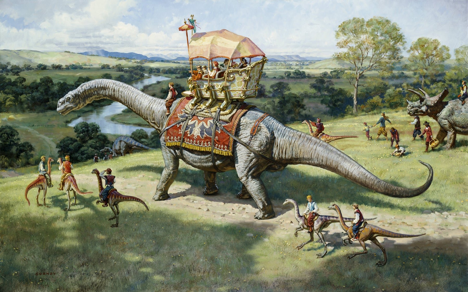
James Gurney: Worldbuilding With Believability

Dinotopia concept art by James Gurney.

James Gurney might be most famous for Dinotopia, but to me he represents a masterclass in worldbuilding. He took the impossible idea of humans coexisting with dinosaurs and made it believable through a painter’s eye for light, atmosphere, and detail. His technique grounded fantasy in reality. Viewers could imagine walking into his painted worlds because they were rendered with the discipline of an observational artist.

That commitment to believability resonates with the work I do in film. Whether I am sketching a cramped apartment interior or a sweeping alien landscape, the goal is the same: to make the world feel lived-in. I focus on small details that anchor a scene, like the clutter of objects on a desk or the way a horizon softens in haze. These are not just aesthetic flourishes. They are cues that allow a viewer to suspend disbelief. Gurney’s legacy is a reminder that even the most fantastic storyboards need a scaffolding of reality.

Syd Mead: Designing the Future

Blade Runner concept art by Syd Mead.

Syd Mead’s work redefined how we imagine technology and the future. His designs for Blade Runner, Tron, and countless other projects gave us a vision of worlds shaped by machines, neon, and concrete. What made his work so powerful was not just technical precision, but a sense of plausibility. He imagined futures that felt both alien and inevitable.

I often think about Mead’s approach when I am tasked with visualizing environments that have not yet been built. Whether it is an experimental set design or a digital world that will only exist in post-production, I approach it with the same question Mead asked: what would it feel like to live here? That question shifts a drawing from abstraction into experience. His legacy pushes me to think not only about form, but about atmosphere, weight, and the rhythm of daily life in these imagined spaces.

Technique as Inheritance

Each of these artists worked in different corners of the industry, but their techniques are part of the inheritance of anyone working in film illustration today. McCaig taught us the importance of character and gesture. Gurney demonstrated how to make the extraordinary believable. Mead showed us how design could shape culture’s vision of the future.

I carry those lessons into every storyboard and concept painting. I pay attention to line weight because a heavier contour can ground a figure, while a lighter one can suggest fragility. I use compositional diagonals to pull a viewer’s eye into a frame. I think carefully about where to leave a drawing unfinished, because suggestion can be more powerful than explicit detail. These are not just technical decisions. They are echoes of a long conversation that illustrators have been having for decades about how best to translate thought into image.

Why the Legacy Matters

Some might ask why this lineage is important in an age when digital tools can create entire worlds at the push of a button. My answer is simple: tools are only as good as the hands that guide them. The illustrators I admire did not rely on shortcuts. They relied on observation, discipline, and an ability to communicate. Those qualities remain the foundation of the work today.

When I draw, I am not competing with history. I am in dialogue with it. The sketch that goes down on my paper is informed by Mead’s futuristic discipline, Gurney’s painterly realism, and McCaig’s gift for character. But it is also shaped by my own sensibilities, my own way of seeing. That is how traditions evolve. We do not preserve them by imitation, but by extending them into the present.

Looking Ahead

The role of the illustrator in film is changing, but it is not disappearing. In fact, the demand for clarity of vision has only grown. Directors and production designers still need someone to translate a script into a visual roadmap. They still need someone who can suggest emotion, atmosphere, and pacing in a way that a line of text never could.

When I look at the frames on my desk, I see them as part of this larger continuum. Each drawing is a conversation across time. McCaig, Gurney, and Mead left us examples of how to capture character, build worlds, and envision the future. I try to honor those lessons by applying them to the stories of today.

In the end, illustration for film is about trust. A director trusts me to show them what their film might look like before it exists. An audience trusts the images to carry them into a story. And I trust the tradition of artists who came before me, knowing that their techniques, honed across decades, still guide the pencil in my hand.

📩 Reach out: paul@paultemplestudios.com
🎨 Explore more: www.paultemplestudios.com

Want more blog posts on this topic?
1. Breathing Life Into Your Characters: The Importance of Good Character Design
2.
World-Building: The Art of Making Environments Feel Alive
3.
From Traditional Painting to Preproduction: How Fine Art Roots Shape Visual Storytelling

In Film, Traditional Painting, Storyboards, Concept Art Tags concept art, film, character design, storyboards, storyboard artist, cinematographer, art design
Comment
Character design for “Vinita” for the “Ben Sharp” film project. Art by Paul Temple.

“Vinita” character design for the “Ben Sharp” western film project. Art by Paul Temple.

Breathing Life Into Your Characters: The Importance of Good Character Design

Paul Temple August 21, 2025

Character design isn’t just for fantasy projects. Whether you’re storyboarding a commercial, developing concept art for a film, or sketching out a short, every character, whether human, animal, or even an inanimate object with personality, needs to communicate who they are, how they move, and how they fit into the story. It’s not about making a nice piece of art. It’s about crafting a blueprint that informs performance, costume, stance, gesture, facial expression, and even props or weapons. Done well, character design guides directors, actors, and production teams long before the first frame is shot, ensuring that everyone is aligned on the character’s story and presence.

The Purpose Behind Character Design

A well-developed character shows the audience, in an instant, what type of person they are, how they might react in various situations, and what their role in the narrative is. This helps the director, the actors, and the production team understand the character’s motivations and limitations. When the design is right, it reduces confusion on set and gives everyone a shared reference for the story.

For instance, think about posture. A character who stands tall with squared shoulders might convey confidence or authority, while a character who slouches or fidgets communicates insecurity or tension. Costume choices, hair, and even subtle props provide additional cues. These choices allow a director to see exactly how a character occupies space in the story before a single frame is filmed. Every decision in character design impacts story flow, audience perception, and even actor performance.

Building Personality Through Visual Cues

Gesture and stance are crucial to character design. Subtle movements, how a character holds their hands, or the way they walk, can speak volumes. Facial expressions are another layer. The slight tilt of a brow, a set jaw, or a smirk can communicate a character’s emotional state without a single line of dialogue. These visual cues are essential in storyboards because they allow the director and production team to plan shots that emphasize emotion and intent.

Costume and props are more than decorative. A weapon, a tool, or a unique item can define a character’s role, skills, or personality traits. In concept art, these elements are carefully considered to support storytelling. If a character is a detective, a signature hat or notebook might become a visual shorthand. For a sci-fi project, a futuristic gadget may define both personality and function. The choices made in character design become a language for the audience and the production team to understand the character instantly.

Collaboration With Directors and Writers

Character design is not a solo exercise. It’s a collaborative process that involves the director, writers, production designers, and sometimes even actors. The storyboard artist or concept artist serves as a bridge between script and screen. By visualizing a character’s appearance, movement, and behavior, the artist provides a tool for the director to make informed choices about blocking, camera angles, and pacing. The design also helps writers see how a character might behave in specific scenes, which can lead to refining dialogue or story beats. This collaboration ensures the character’s design aligns with the overall vision of the project.

Consistency Across Storyboards

One of the biggest challenges in production is maintaining character consistency across scenes. Storyboard artists play a vital role in this. By establishing a clear design from the start, they provide a reference for the director and other artists. Every sketch or frame reinforces the character’s visual traits, gestures, and expressions. This prevents inconsistencies that could confuse the audience or disrupt narrative flow. A well-designed character becomes instantly recognizable no matter the context, which is particularly important in complex sequences or long-form content.

Why Emotional and Narrative Clarity Matters

Character design contributes directly to storytelling. Each design decision shapes how the audience interprets the character and the story. In storyboards, this is even more critical. The sequence of frames, the composition of shots, and the movement of characters all hinge on the design. If the character’s personality and intentions are clear in the visuals, the emotional impact of the scene is stronger. Misunderstandings or ambiguous designs can lead to scenes that feel flat or confusing. Thoughtful character design ensures every frame communicates the right emotional cues.

Designing for Action and Interaction

Characters rarely exist in isolation. How a character interacts with other characters, props, or the environment is part of the design. Storyboard artists consider these interactions carefully to plan blocking, camera angles, and shot composition. For example, a character picking up an object or reacting to another character’s gesture needs to feel natural and consistent. The design provides the roadmap for these movements, helping the director anticipate how the scene will play out and which shots will best convey story and emotion.

Influence From Classical and Contemporary Artists

Historical influences inform modern character design. Artists like John Singer Sargent, Joaquín Sorolla, and Frank Munnings mastered gesture, posture, and expression to communicate personality and narrative in their paintings. These principles translate directly into my personal storyboard and concept art work. The way light falls on a face, the direction of a glance, or the curve of a hand can imply thought, emotion, or intention. Studying these traditional techniques allows a storyboard artist to bring depth and subtlety to character design, ensuring every visual choice supports the story.

From Sketch to Screen

The process begins with rough sketches, exploring forms, proportions, and attitudes. These sketches evolve into refined character sheets that detail costumes, gestures, and expressions. Color may be added to highlight personality or differentiate characters in a sequence. These finished designs are then used in storyboards, guiding shot composition, camera movement, and narrative pacing. Directors and production teams rely on these visuals to plan scenes, rehearse blocking, and communicate story intent. A well-prepared design sheet saves time, reduces confusion, and streamlines production, while giving everyone a clear understanding of the character’s purpose and presence.

Why Choosing the Right Artist Matters

Selecting the right artist for character design can make or break a production. The artist must understand narrative context, character motivation, and the visual language of film. It’s not enough to be a good illustrator. The artist has to anticipate how the character will move, interact, and communicate nonverbally. A well-informed character designer helps directors and writers see story possibilities, prevent visual conflicts, and maintain consistency across all media. The right artist translates narrative intent into visuals that serve the story, budget, and production schedule.

Conclusion

Character design in storyboards and concept art is a critical component of storytelling and it’s not just for fantasy projects. It goes beyond creating appealing visuals and delves into performance, expression, costume, and interaction. Every detail, from stance to props, informs directors, actors, and production teams, guiding the story before cameras roll. By understanding narrative context, emotional intention, and visual language, a skilled artist ensures that characters communicate clearly, feel consistent, and resonate with the audience. Character design is where story meets performance, and investing in it early creates efficiency, clarity, and emotional impact throughout production.

📩 Reach out: paul@paultemplestudios.com
🎨 Explore more: www.paultemplestudios.com

Want more blog posts on this topic?
1. Carrying the Legacy of Film Illustrators Forward
2.
World-Building: The Art of Making Environments Feel Alive
3.
From Traditional Painting to Preproduction: How Fine Art Roots Shape Visual Storytelling

In Concept Art, Film
Comment
Older →

Search Posts


Featured Blog Posts

Featured
Composition and Control: The Cinematic Science Behind a Great Frame
Nov 3, 2025
Composition and Control: The Cinematic Science Behind a Great Frame
Nov 3, 2025
Nov 3, 2025
Storyboards and Cinematography: Speaking the Same Language
Sep 25, 2025
Storyboards and Cinematography: Speaking the Same Language
Sep 25, 2025
Sep 25, 2025
Concept Art and Storyboards for Indie Film Crowdfunding
Sep 18, 2025
Concept Art and Storyboards for Indie Film Crowdfunding
Sep 18, 2025
Sep 18, 2025
Breathing Life Into Your Characters: The Importance of Good Character Design
Aug 21, 2025
Breathing Life Into Your Characters: The Importance of Good Character Design
Aug 21, 2025
Aug 21, 2025
 

Latest Blog Posts

Featured
The Silhouette Test: Why Character Design Starts with Simple Shapes
Dec 8, 2025
The Silhouette Test: Why Character Design Starts with Simple Shapes
Dec 8, 2025
Dec 8, 2025
The Fake Perfect Trap and Why Lived In Art Wins Every Time
Dec 4, 2025
The Fake Perfect Trap and Why Lived In Art Wins Every Time
Dec 4, 2025
Dec 4, 2025
How Shooting Boards Help Indie Filmmakers Compete with Studio Productions
Dec 2, 2025
How Shooting Boards Help Indie Filmmakers Compete with Studio Productions
Dec 2, 2025
Dec 2, 2025
The Human Element: Why Observation Still Beats AI in Visual Development
Nov 10, 2025
The Human Element: Why Observation Still Beats AI in Visual Development
Nov 10, 2025
Nov 10, 2025
Nov 6, 2025
Studying Light: Lessons from the Masters of Painting
Nov 6, 2025
Nov 6, 2025
Composition and Control: The Cinematic Science Behind a Great Frame
Nov 3, 2025
Composition and Control: The Cinematic Science Behind a Great Frame
Nov 3, 2025
Nov 3, 2025
Shooting Boards for Action Scenes: Why Every Great Action Scene Starts on Paper
Oct 30, 2025
Shooting Boards for Action Scenes: Why Every Great Action Scene Starts on Paper
Oct 30, 2025
Oct 30, 2025
World-Building: The Art of Making Environments Feel Alive
Oct 27, 2025
World-Building: The Art of Making Environments Feel Alive
Oct 27, 2025
Oct 27, 2025
How Classical Painting Shaped Modern Filmmaking
Oct 22, 2025
How Classical Painting Shaped Modern Filmmaking
Oct 22, 2025
Oct 22, 2025
Common Mistakes Directors Avoid with Shooting Boards
Oct 8, 2025
Common Mistakes Directors Avoid with Shooting Boards
Oct 8, 2025
Oct 8, 2025

© Paul Temple Studios 2012-2025 All Rights Reserved. Unauthorized use of content from this website is prohibited.