• Home
  • Film
  • Advertising
  • Contact
Menu

Paul Temple Studios

  • Home
  • Film
  • Advertising
  • Contact
×

Behind the Boards: A Blog by Artist, Paul Temple

Welcome to the blog! Here you'll find insights into the art of storyboarding, concept development, shooting boards, and visual storytelling for film, television, and advertising. From camera planning techniques to the emotional impact of character design, this is where I’ll share my expertise honed over a decade of working with directors and top brands. Whether you're a creative director, filmmaker, or agency looking to elevate your pitch, this blog reveals how powerful visuals drive unforgettable stories.

Questions? Email me at paul@paultemplestudios.com

Hiring a Storyboard and VisDev Artist: A Step by Step Guide for Filmmakers and Directors

Paul Temple January 7, 2026

If you have never hired a storyboard artist or visual development artist before, you are not alone. Most directors, producers, and creatives I talk to feel a little unsure the first time. They know they need boards, but they are not always sure what to bring to the table, how detailed things need to be, or what the process actually looks like once the project starts.

This post is meant to take the mystery out of it.

Whether you are developing a feature, a short film, a series, or an independent project, the process of working with me follows a clear structure. My job is to help you translate ideas into visuals that your team and your crew can understand and execute.

Here is what the process typically looks like, from the first conversation to final delivery.

Step One: The Initial Call

Every project starts with a conversation.

This is usually a video call or phone call where we talk through the project at a high level. You do not need everything figured out yet. That is part of what I help with.

During this call, we usually cover:

  • What the project is and where it is in development.

  • The scope of the story or sequence.

  • The type of visual work you think you need.

  • Your timeline and any deadlines that matter.

This conversation sets the foundation. It helps me understand how much guidance you need and where I can add the most value.

Step Two: The Brief

After the initial call, I ask for a brief. This does not need to be overly formal, but it does need to be clear.

A solid brief usually includes:

  • The script or scene breakdown.

  • The number of frames or designs you think you need.

  • Reference images, mood boards, or visual inspiration.

  • Any constraints related to budget, scale, or production realities.

If you do not have all of this yet, that is completely fine. Part of my role is helping you shape the brief into something workable. Many projects begin with loose ideas that need structure before they can move forward visually.

Step Three: Quote and Schedule

Once I understand the scope, I provide a quote and a schedule. This may take a few days depending on the size of the script or material provided.

The quote is based on:

  • Number of frames or designs.

  • Level of finish.

  • Complexity of environments, characters, or action.

  • Timeline expectations.

The schedule outlines:

  • When rough sketches will be delivered.

  • When feedback is due.

  • How many revision rounds are included.

  • When final delivery happens.

This step removes uncertainty. Everyone knows what is being made and when.

Step Four: Rough Sketches

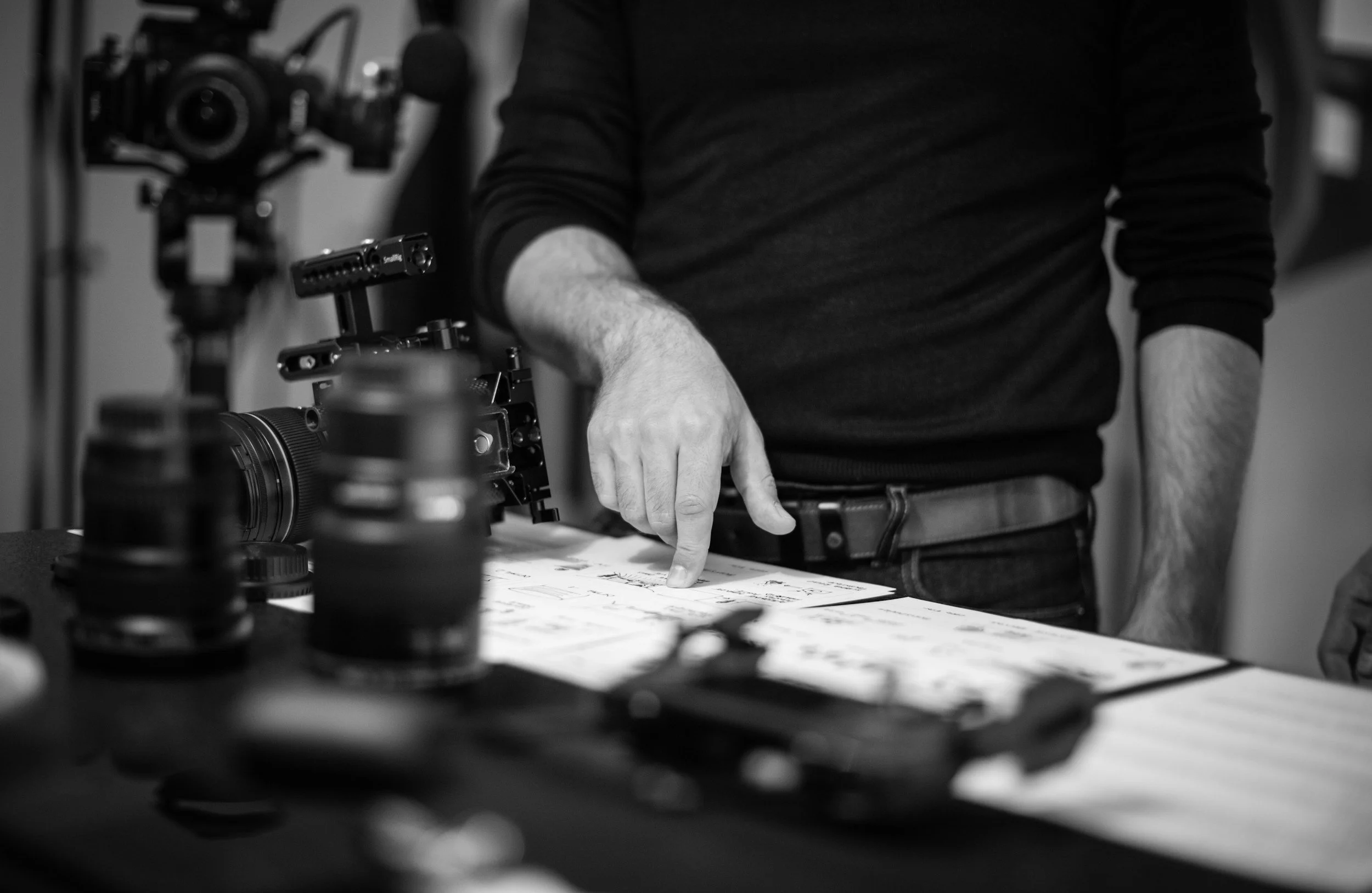
This is where drawing begins.

Rough sketches are not meant to be polished. They exist to solve problems. Composition, staging, camera placement, and story clarity all get worked out here.

At this stage, I am focused on:

  • Readability.

  • Clear visual storytelling.

  • Logical camera flow

  • Making sure the idea works on screen.

This phase moves quickly and is designed to invite discussion. It is far easier to adjust a rough drawing than a finished one.

Step Five: Feedback and Revisions

Feedback is a core part of the process.

Once roughs are delivered, you review them and send notes. These notes may come from a director, producer, or an entire creative team.

I revise based on that feedback, and the process repeats 2 or 3 times until the direction is locked.

This back and forth is where you and I align our visions. The goal isn’t perfection at this point.

Step Six: Refinement and Finish

Once structure and intent are approved, the work moves into refinement.

This phase takes significantly longer than the rough sketch phase. Whether the boards are black and white or color, refinement is where tone, clarity, and craft come together.

Refinement includes:

  • Cleaning up line work.

  • Clarifying lighting and spatial relationships.

  • Strengthening gesture and silhouette.

  • Ensuring consistency from frame to frame.

For color work, this also includes color harmony, light direction, and mood control.

This is the stage where the drawings become reliable tools for production.

Step Seven: Delivery and Payment

Once refinement is complete, you will receive the final files along with an invoice due within 30 days.

At this stage, ownership of the files is fully transferred to you. You are free to use, adapt, or repurpose the artwork as needed across your production, pitch materials, or internal workflows, with no restrictions on usage.

Ready to Move Forward?

You do not need to have everything solved before reaching out. I promise.

What helps most at the start is a clear sense of what you are trying to make, openness to collaboration, and a willingness to give honest feedback as the work evolves.

If something feels confusing during the process, that is often a good sign. Initial sketches have a way of revealing storytelling problems early, when they are still easy to fix. Visual development and storyboards exist to surface those questions long before production pressure sets in.

I help with:

  • Translating scripts into clear visual plans

  • Clarifying tone and visual intent

  • Identifying storytelling problems before production

  • Creating visuals that serve the final film, not just the development stage

You do not need to speak in artistic or technical terms to begin. That is my responsibility. The work starts with understanding your story and shaping visuals that support it.

Art Services Available at Paul Temple Studios

Visual development services may include:

  • Character and creature design

  • Costume and prop exploration

  • Environment studies

  • World building and tonal exploration

These designs help define the visual language of a project early. They give directors and producers something concrete to respond to, refine, and build from as the project takes shape.

Storyboards and shooting boards are used to:

  • Plan sequences

  • Break down action scenes

  • Define blocking and camera movement

  • Give production teams clear visual direction

Shooting boards focus less on polish and more on function. They are designed to communicate how a scene is meant to be captured, helping directors, cinematographers, and crew stay aligned during production.

In both cases, the goal is the same: clarity. When everyone understands the visual intent, production runs more smoothly and creative decisions hold together on screen.

Why This Process Matters

Hiring a storyboard or visual development artist is about removing guesswork. Clear visuals reduce confusion, prevent costly mistakes, and allow teams to communicate efficiently. They shift problem-solving to the page instead of the set, where time and resources are limited.

If you have never hired an artist before, the process should feel collaborative. My role is not to impose a style, but to help strengthen the story and make the path forward clearer for everyone involved. That is the value of thoughtful visual development and storyboards.

If you are developing a film, television project, or pitch and want to talk through how visuals can support your story, let’s set up an initial call! I am always happy to discuss your project and see if working together makes sense.

📩 Reach out: paul@paultemplestudios.com
🎨 Explore more: www.paultemplestudios.com

Other blog posts you might be interested in:
1. Concept Art and Storyboards for Indie Film Crowdfunding
2.
How Shooting Boards Help Indie Filmmakers Compete with Studio Productions
3.
Composition and Control: The Cinematic Science Behind a Great Frame

In Film, Storyboards, Advertising, Shooting Boards
Comment
Character design for unannounced fantasy film project. Art by Paul Temple.

Character and clothing design for unannounced fantasy film project. Art by Paul Temple.

The Silhouette Test: Why Character Design Starts with Simple Shapes

Paul Temple December 8, 2025

In my work as a storyboard visdev artist, the first thing I judge in a character design is the silhouette. Before color, before texture, before expression, before costume choices, there is the outline. If a character or an object cannot communicate its identity in a single flat shape, the design is not ready. A strong silhouette is the foundation of visual communication. Everything else is built on top of it.

Filmmakers and artists are often tempted to start decorating too early. Detail feels like craftsmanship. It feels like personality. It feels like labor. But detail does not save a weak design. You can engrave an armor plate with every symbol ever invented and it still will not read as clearly as a shape with a strong, unmistakable outline. A character with a simple but powerful silhouette will stand out every time.

I revisit this principle constantly, not because I enjoy repeating myself, but because it protects productions from confusion later. I was working recently on a fantasy project that required the design of ceremonial masks for an ancient warrior order. The team wanted them to feel powerful, sacred, and visually distinct. I explored various historical influences and sketched detailed versions. When I stepped back and filled them in as solid shapes, many of them looked nearly identical. The attractive details had distracted me from the fact that the core shapes were not pulling their weight.

It did not ruin my week. It was not a dramatic life lesson. It was simply a practical reminder that silhouette always catches the truth. Once I simplified each mask and adjusted the major shapes, everything snapped into place. The masks immediately gained personality and presence. It was a clean example of why I always test silhouette first.

Silhouette works because it is the fastest and clearest way humans read visual information. Our brains identify contrast before texture. We read shapes before faces. We respond to posture before micro expressions. If the silhouette communicates, the viewer understands the scene even before looking at the details.

Here is how I judge a silhouette and why it matters for filmmakers and artists.

Clear Read at a Glance

A silhouette must read instantly. If I blur my eyes, or if I stand back from the frame, the character or action should remain clear. The pose should be readable. The intention should be visible. If the shape is confusing, the pose needs adjustment or the design is overcrowded.

Negative space is one of the best ways to achieve clarity. If a character is holding something, the gap between the arm and the torso must be readable. If a character is walking, you need separation between the limbs so that the stride is obvious. If a character is crouched in fear, their outline should shrink. If a character is confident, their shape should expand.

Even slight adjustments improve the read. Raising an elbow. Angling a shoulder. Leaning the torso forward. Opening the stance. These changes strengthen the silhouette and make the intention obvious.

Unique Identity Through Shape

A strong silhouette helps characters stand apart from one another. If your protagonist, sidekick, mentor, and villain all share roughly the same outline, the visuals lose impact. Good design assigns each character a shape language that belongs to them.

When I develop silhouettes for a lineup, I often render them as pure black cutouts first. If I cannot identify who is who instantly, I refine until I can. The solution may be proportion changes, costume adjustments that change the outline, distinct hair shapes, or stronger posture choices.

The audience should be able to recognize a character even if everything else is removed. That is the standard.

Shape as Storytelling

Silhouette is not just a clarity exercise. It communicates personality on a deeper level.

Round shapes feel friendly. Angular shapes feel dangerous. Tall shapes feel proud. Wide shapes feel grounded. Slanted shapes feel unstable. Small clustered shapes feel anxious. Large open shapes feel confident.

These signals are so intuitive that viewers absorb them without noticing. They feel them instinctively. A good designer takes advantage of that.

The silhouette of the masks from that recent project communicated more about the characters than any embellishment ever could. A tall vertical crest made the warriors feel elevated. A forward tilt made them feel predatory. Carved details helped with worldbuilding but the silhouette carried the meaning.

Silhouette in Motion

A silhouette should hold up not only in still poses but also in action. Motion reveals flaws that static sketches hide. When boarding an action sequence, I test silhouettes throughout the movement. If the outline becomes muddy at any point, the action needs to be rebuilt.

Fight scenes especially rely on clear silhouettes. Good choreography uses readable shapes to guide the viewer through the rhythm of hits, dodges, swings, and impacts. Even in chaotic environments, a clean silhouette lets the audience follow who is doing what and why.

The same applies to quieter motion. A character lifting a cup, slumping into a chair, or turning their head must remain legible. Animation supervisors often say if the silhouette works, the acting works. They are right.

Simplicity First

The fastest way to improve a design is to simplify it. Most artists fall into the trap of decoration. They start adding tiny details long before the big shapes are resolved. That is the equivalent of trying to decide what earrings to wear before choosing a shirt. Details should support design, not compensate for it.

I often start with the simplest version possible. When the silhouette works at a basic level, I add complexity slowly. If a detail breaks the clarity of the outline or distracts from the intention, it does not belong.

This principle is liberating. It frees the designer from clutter. It frees the filmmaker from confusion. It frees the audience from visual noise.

Why Filmmakers Should Care

You do not need to draw professionally to benefit from understanding silhouette. Directors, cinematographers, actors, and production designers all make stronger choices when they think in terms of shape.

Lighting works better with clean silhouettes. Blocking becomes more dynamic. Lens choices become more intentional. A strong silhouette gives the camera something meaningful to work with.

Creature designers, hero designers, and costumers rely on silhouette to define the visual identity of a character long before color swatches or texture samples become relevant. Silhouette is the universal language across the entire pipeline.

Silhouette in Storyboarding

In storyboards, silhouette is often the clearest way to communicate action. I begin many frames with simple shapes. Circles, triangles, rectangles. These give me the gesture before I think about detail. When a frame feels unclear, I reduce it to black and check what is happening.

In quiet scenes, silhouette guides emotional clarity. A lonely character leans into emptiness. A confident character stands tall with broad shape language. A frightened character collapses inward. These choices let the audience understand emotion without dialogue.

In high energy scenes, silhouette is my anchor. Even if the environment explodes, the reader must follow the characters. A strong outline is the fastest solution.

Using Silhouette to Fix Problems

One of the easiest diagnostic tools in visual development is to black out your work. If the silhouette fails, the design needs revision. If the silhouette reads but the details feel off, the design is probably strong but needs refinement. If both read well, the design is complete.

When I used silhouette to refine the fantasy masks, it was a practical correction, not a dramatic revelation. The team liked the final versions because they carried personality even without textures or complexity. That is the power of silhouette. It strips away everything but the truth.

Final Thoughts

Silhouette is the first and most honest test of a design. It reveals clarity, personality, purpose, and identity faster than any other method. It helps directors communicate intent. It helps storyboard artists clarify action. It helps production designers refine characters. It helps the entire pipeline function smoothly.

A character with a strong silhouette will survive any change in lighting, framing, costume, coloring, or detail. They will always read clearly and immediately. They will hold the viewer’s attention.

I always say that detail is the seasoning and silhouette is the meal. You can create a gorgeous design, but if the outline does not say anything, the viewer will forget it the moment the shot changes. If the silhouette is strong, the design will live in the audience’s memory.

Silhouette first. Everything else second. That rule has never failed me, and it keeps my work focused, honest, and clear.

📩 Contact: paul@paultemplestudios.com
🎨 Explore more: www.paultemplestudios.com

Want more blog posts on this topic?
1. Breathing Life Into Your Characters: The Importance of Good Character Design
2.
Carrying the Legacy of Film Illustrators Forward
3.
Concept Art and Storyboards for Indie Film Crowdfunding

In Film, Concept Art
Comment

Concept art for an unannounced horror film project. Art by Paul Temple.

Composition and Control: The Cinematic Science Behind a Great Frame

Paul Temple November 3, 2025

There’s a moment when a frame just clicks. You feel the rhythm of it before you even know why. The balance of light, movement, and negative space suddenly tells the story in a single glance. That’s composition. It is control in its purest form.

In film, every frame has a job. It directs the viewer’s eye, builds emotion, and shapes the story long before the dialogue starts. As a storyboard artist, my job is to help directors take control of that visual language before the camera ever rolls. The best compositions aren’t just beautiful. They are deliberate. Every shape, line, and gesture contributes to what the audience feels.

The Geometry of Storytelling

Classical painters understood that geometry could guide emotion. You can trace the same principles of balance and rhythm from Da Vinci’s “The Last Supper” straight into the opening sequence of “Raiders of the Lost Ark.” Triangular compositions pull attention to a central idea. Diagonal lines create movement. Symmetry conveys control, while imbalance creates tension. These visual rules are the scaffolding beneath any cinematic story.

When I block out a frame, I’m thinking about energy flow. Where does the eye travel first? What lingers in the periphery? How do shadow and light compete or cooperate within the same space? The viewer may not consciously notice these things, but they feel them. And in film, feeling is everything.

This is where composition meets control. The artist’s control of the audience’s attention is what gives storyboards their power. You’re not just drawing. You’re designing where the story happens, and how it unfolds.

Visual Development and Intent

Studios like ILM and Framestore describe visual development as “world-building through design.” That phrase captures it perfectly. It’s not just about the frame itself, but the emotional ecosystem that supports it. In pre-production, everything from color palettes to camera angles is designed to support the director’s vision.

The goal isn’t realism. It’s believability. Environments, lighting, and composition all exist to reinforce tone and story intent. For example, if a scene is about isolation, you can communicate that with negative space, low contrast, and distant framing. If it’s about chaos, you fill the frame with converging diagonals and broken symmetry. These are visual equivalents of punctuation in writing. They shape how the viewer reads the image.

Great composition doesn’t happen by accident. It’s an act of storytelling discipline.

Classical Control, Cinematic Application

One of the biggest influences on modern visual storytelling comes from classical painting. Artists like Caravaggio and Vermeer didn’t just paint figures. They directed them. Every shadow and gesture led the viewer toward the heart of the story. That same principle applies in film design.

When I work on a storyboard, I’m often thinking like a cinematographer. Where should the emotional weight sit? What is the lens doing to the story? I might use a strong chiaroscuro effect to create drama, or a shallow depth of field to isolate emotion. These are painter’s tools, applied through the lens of cinema.

This connection between painting and film is what gives storyboards their cinematic realism. It’s not enough to make a drawing look good. It has to feel like a shot that belongs in motion.

The Language of the Frame

Composition is not only about what’s inside the frame. It’s about what’s implied beyond it. The audience’s imagination fills in what they don’t see. A strong storyboard artist controls that implication.

One of the best ways to do that is through visual hierarchy. Think of it as volume control for storytelling. The foreground can whisper or shout. Mid-ground shapes can build tension. The background can reveal or conceal key context. Managing those layers creates emotional rhythm.

I often think of the frame as a stage. Every element has to justify its position. If a prop or character doesn’t serve the story, it distracts. The best compositions are not just full of information. They are full of intention.

That’s one of the reasons visual development teams at studios like Framestore talk so much about “shape language.” The silhouette of an environment, or even the curve of a prop, carries emotional tone. Sharp, angular shapes often signal danger or conflict. Rounded, organic shapes suggest safety or warmth. Composition is where all of those design choices come together to form cinematic meaning.

Controlling the Emotional Flow

Filmmaking is emotional architecture. Composition is what builds the hallways the audience travels through. A good frame guides the viewer without them realizing it. The camera’s placement, the lighting, and the density of detail all shape the emotional flow of a scene.

I think of this process like conducting. You can use rhythm in composition the way a musician uses tempo. Wide shots slow the pace. Tight shots quicken it. Diagonal framing speeds up the energy. Center framing brings calm. It’s a subtle dance between control and chaos.

A lot of storyboard work is about finding that emotional tempo. If a director wants tension, I might stack the frame vertically, using oppressive shapes and low light. If they want relief, I’ll open it horizontally, allowing air and movement. These decisions translate directly into how the audience experiences time and feeling.

The Cinematic Mindset

Composition isn’t something you add later. It’s baked into the DNA of every story choice. A well-composed storyboard can define how a sequence is shot, how it’s edited, and even how it’s scored.

This is why visual development artists often collaborate closely with directors and production designers. The frame is the first conversation between story and image. Once that language is established, everything else flows from it.

When I study a film like “Blade Runner 2049” or “The Revenant,” I’m looking at how every element inside the frame earns its place. Nothing is random. Even in chaos, there is control. That’s the hallmark of cinematic thinking.

The Subtle Art of Restraint

Sometimes, control is about knowing when to stop. Too much information weakens a frame. Too much contrast confuses it. Composition thrives on restraint.

One of my favorite exercises when teaching storyboarding is to remove one element at a time from a frame. If the story still reads clearly, then the composition is strong. If it falls apart, you know which piece carried the weight. This helps train the eye to think like a filmmaker instead of a draftsman.

The goal is not to show everything. It’s to show what matters most.

Designing for Movement

The best compositions are not static. They anticipate motion. Storyboards are snapshots of a moving idea. The direction of a character’s gaze, the tilt of a camera, or the placement of a horizon can all suggest momentum.

Visual development teams often use “flow lines” to track how a viewer’s eye moves through a shot. These invisible pathways guide attention, connect story beats, and maintain visual clarity. When done right, the audience feels carried through the frame without realizing they’re being directed.

This is where drawing and filmmaking meet in perfect balance. The still image becomes kinetic.

Control as a Form of Trust

Ultimately, composition and control come down to trust. The director has to trust the storyboard artist to translate emotion into image. The audience has to trust that what they’re seeing is intentional.

Good composition builds that trust. It feels inevitable, like the story could not exist any other way. That’s the power of visual discipline.

When I sit down to draw a frame, I’m not just thinking about angles or balance. I’m thinking about how to make the viewer feel something specific. Every frame is a decision. Every line carries responsibility. That’s what makes cinematic storytelling such an addictive craft.

The Takeaway

Composition is not decoration. It is story structure in visual form. Whether you’re painting, designing, or boarding a film, control is the thread that ties every creative choice together.

When you see a great frame, you feel it immediately. The geometry is invisible, but the emotion is undeniable. That’s when you know composition is doing its job.

The science behind a great frame isn’t about rules. It’s about awareness. It’s about shaping emotion through light, form, and rhythm. Once you understand that, you stop drawing pictures and start directing feelings.

📩 Reach out: paul@paultemplestudios.com
🎨 Explore more: www.paultemplestudios.com

Want more blog posts on this topic?
1.Storyboards and Cinematography: Speaking the Same Language
2.
Building the Perfect Reveal in Storyboards
3.
Setting the Emotional Tempo: How Storyboards Shape the Audience’s Experience

In Film, Storyboards
Comment

Environment concept art by Paul Temple.

World-Building: The Art of Making Environments Feel Alive

Paul Temple October 27, 2025

When most people hear world-building, they picture sprawling fantasy maps or sci-fi planets rendered in dazzling 3D. But world-building is not just about scale or spectacle. It is about truth. The worlds that stick with us feel like they existed long before the story began and will keep existing long after it ends.

As a storyboard artist, I think about that every time I draw an environment. Whether it is a dystopian street, a farmhouse kitchen, or a mythical jungle, the goal is the same: to make the space feel lived in, believable, and emotionally in sync with the story.

The Environment as a Character

A well-designed environment should not just contain the story. It should participate in it. Great filmmakers understand this instinctively. Think about the desert in Mad Max: Fury Road. It is more than a setting. It is an antagonist. It shapes every choice, every chase, and every moment of desperation.

When I storyboard, I try to treat every environment like a silent actor. It has mood, personality, and history. A crumbling wall might say more about a character’s past than a page of dialogue. A shaft of light across the floor might reveal a sense of hope or isolation. These details give the frame its subtext.

Cinematography does the same thing with light, lens, and movement. But in storyboards, the process begins earlier with design and composition. How the environment is drawn defines how the story breathes.

Designing for Story Tone

Every production design choice communicates emotion. A city drawn with rigid lines and cold color temperature can make a story feel oppressive or corporate. A warm, uneven landscape full of texture and asymmetry can make the same story feel human and hopeful.

When designing environments for storyboards or concept art, I always start by asking:

  • What emotion is this location supposed to evoke?

  • How does this space reflect the character’s state of mind?

  • What is the rhythm of this environment, chaotic or calm?

A good example is a sequence I worked on where a character was facing a personal failure. The director wanted the environment to echo that. Instead of drawing a pristine office, I tilted the perspective slightly, let the shadows feel heavy, and scattered small hints of disarray—papers, a broken pen, a faint light leak through blinds. Nothing overt, but enough to make the frame feel unstable.

That is world-building in miniature. You do not need a fantasy kingdom to build a world. You need awareness of tone and how the environment mirrors emotion.

The Invisible Architecture of Believability

In design terms, environments only feel alive when the logic behind them is invisible but sound. If I design a marketplace, I have to know where the food comes from, how people move through it, what the noise level feels like, and what kind of lighting it would realistically have at that time of day.

Even if none of that is explicitly shown, the viewer senses it. You can always tell when an environment was designed without that underlying structure. It feels hollow, like a set waiting for actors.

The audience may not notice that the pipes in a sci-fi corridor make sense or that the shadows line up with a practical light source, but those small truths make the difference between a believable frame and one that feels fake.

That is why I spend time researching architecture, natural light, and even materials. A lived-in world comes from lived-in details.

Composition and World Language

Composition is where design meets storytelling. When an environment is composed well, it tells the audience where to look, what to feel, and how the world behaves.

In painting, this has always been a central idea. Vermeer guided our eyes with windows and reflections. Caravaggio used darkness to make light feel divine. Those same principles apply in filmmaking.

When designing storyboards, I think about the grammar of the world. How does the space want to move? What kind of compositions feel right for it? A rigid, symmetrical composition might make sense for a totalitarian world. A handheld, off-balance layout might fit a collapsing one.

If a world is built with care, the compositions naturally flow from its design. The camera placements, blocking, and even editing rhythm all emerge from how the environment was drawn.

Texture and Imperfection

One of the biggest mistakes I see in modern visual design, especially with digital tools, is the obsession with perfection. Clean edges, evenly lit rooms, surfaces that look straight out of rendering software. Real worlds are not like that.

When I paint environments, I intentionally introduce irregularities. Cracks, stains, weathering, slight warping. These imperfections give the world personality. They remind us that time exists in this space, that life has worn it in.

Directors who work visually understand this. Spielberg and Deakins both use texture to ground their worlds. Even in fantasy or sci-fi, the illusion of reality depends on friction, dust, and decay. The more tactile the frame, the deeper the immersion.

The Role of Light

Light is the heartbeat of world-building. It defines temperature, mood, and even moral tone.

When designing storyboards, I think in terms of light first, objects second. Light reveals what matters and conceals what does not. It can make a world feel safe or hostile, familiar or alien.

A soft, diffuse light through fog tells us one kind of story. A sharp beam slicing through darkness tells another. Even before the actors step in, the environment has already told us how to feel.

Painters have always known this. Rembrandt’s chiaroscuro and Turner’s atmospheric light are the same ideas cinematographers use today. The difference is that in storyboards, we build the mood before the camera even exists.

Designing for Cinematic Flow

World-building for storyboards is not just about single images. It is about flow. The environment should feel consistent from shot to shot, guiding the viewer’s eye like a visual rhythm.

That means paying attention to spatial continuity, perspective, and geography. A doorway drawn at the wrong height or a window placed inconsistently from shot to shot can instantly break immersion.

When I design sequences, I map the geography first. Where the exits are, how the light moves, what the scale relationships are. Once the world’s logic is solid, the sequence feels grounded. Directors and DPs can trust it, and the edit will cut together smoothly.

A believable world is not just pretty. It is useful.

The Artist’s Responsibility

A storyboard artist’s job is not just to visualize what is written. It is to build a world that can hold the story. That means understanding architecture, geography, and the emotional life of spaces.

Every environment has a story to tell, even before a single line of dialogue is spoken. Whether it is the sterile glow of a hospital hallway or the warmth of a childhood home, the environment should support the film’s emotional truth.

As artists, we have to honor that responsibility. The goal is not to make something that looks impressive. It is to make something that feels real enough for the audience to believe in.

Conclusion

World-building is the invisible art that supports everything else in film. Without it, stories float. With it, they root into the viewer’s mind.

In a great film, you remember the characters and the story, but you also remember how it felt to be there. That is the mark of a world that lives.

📩 Reach out: paul@paultemplestudios.com
🎨 Explore more: www.paultemplestudios.com

Want more blog posts on this topic?
1. Concept Art and Storyboards for Indie Film Crowdfunding
2.
Breathing Life Into Your Characters: The Importance of Good Character Design
3.
Setting the Emotional Tempo: How Storyboards Shape the Audience’s Experience

In Film, Concept Art
Comment

Concept art for an unreleased film project. Art by Paul Temple.

How Classical Painting Shaped Modern Filmmaking

Paul Temple October 22, 2025

Modern filmmaking moves fast. Too fast, sometimes. Everyone wants to shoot, render, composite, and post before the coffee cools. But the truth is, emotional storytelling has not evolved nearly as much as the tools have. Human emotion is still built from the same visual cues it was five hundred years ago. Light, shadow, gesture, and composition. The difference is, painters took the time to study them.

Filmmakers, especially directors and storyboard artists, can still learn a lot from classical art. Painters like Caravaggio, Vermeer, and Sargent understood how to make a single frozen moment pulse with life. That is the same goal of every storyboard frame and film shot. If you can design emotion in stillness, you can control it in motion.

The Frame as a Painting

Every shot in a film is a frame. And every frame can be read like a painting. Classical artists worked with a deep awareness of how the viewer’s eye moves through an image. Nothing in their compositions was accidental. A strong diagonal might lead your eye toward a tragic figure. A vertical composition could make the subject feel noble or distant. A circular arrangement might make the scene feel enclosed and intimate.

In filmmaking, this same control applies. A storyboard artist who understands compositional language can influence the emotional tone before a single camera rolls. Is the viewer supposed to feel empathy, tension, or fear? Those answers are built into the visual hierarchy.

When I design boards, I think about light and shape before detail. If the shapes read clearly, the mood will follow. A character placed in shadow against a glowing environment is about isolation. A character lit from below might suggest danger. These visual relationships are timeless.

Caravaggio and the Power of Contrast

Caravaggio painted light like it was an actor. His chiaroscuro technique created drama out of the simplest gestures. The light always had purpose, cutting through darkness with surgical precision. Filmmakers use the same language. Hard light creates danger. Soft light creates intimacy.

The next time you’re blocking a scene, look at how Caravaggio handles direction and source. His figures emerge from blackness like revelations. The viewer’s eye has no choice but to follow. That same sense of control is what cinematographers and storyboard artists chase when they design key frames.

If every element of your image competes equally for attention, emotion gets lost. Caravaggio understood restraint. The black areas of his paintings are just as important as the lit ones. The same goes for filmmaking. A good storyboard knows when to let a moment breathe and when to hold back.

Sargent and the Gesture of Truth

John Singer Sargent painted people the way great actors perform. His brushwork was confident, but what he really captured was gesture. Every tilt of the head, every relaxed hand or tense shoulder told a story.

Modern filmmakers can take a lesson from that. Acting is not just dialogue. It is shape and motion. When I draw characters for a board, I think of Sargent’s quick economy. One confident line can describe more emotion than a dozen overworked ones. The same applies in live action. A director who understands gesture will get stronger performances because they see what emotion looks like, not just what it sounds like.

Storyboard artists sit at that intersection between drawing and performance. We translate scripts into human movement. The better we understand anatomy and gesture, the more believable those emotions become. A single frame can convey pride, fear, love, or exhaustion through posture alone.

Vermeer and the Quiet Moment

Not every emotional beat in a film needs to be loud. Vermeer mastered the quiet moments. His subjects were often caught between actions: a woman reading a letter, a musician pausing mid-note, sunlight creeping across a wall. There was tension in the stillness because everything in the frame supported that pause.

Filmmakers tend to chase momentum. Every shot pushes to the next, every cut promises action. But silence is powerful when it is composed intentionally. Vermeer knew how to hold attention through restraint. His light was directional but patient. His compositions were structured yet soft.

As a storyboard artist, I often remind myself that not every frame needs to shout. Some need to listen. A quiet scene, properly composed, gives the audience a moment to feel. In an age of rapid editing and digital spectacle, those moments are rare and valuable.

Classical Discipline Meets Digital Speed

Digital tools have changed everything about how we produce visual art, but not what makes it effective. It is easier than ever to create an image. It is harder than ever to make one that feels true. The discipline of classical art gives modern filmmakers an advantage in that chaos.

When you study traditional composition, you learn to think in layers. Foreground, midground, background. You learn rhythm and balance. You learn how color temperature affects emotion. These are not old-fashioned ideas. They are the foundation of every effective visual story.

Technology should serve those principles, not replace them. Whether I am storyboarding for a film or designing concept art in Photoshop or Unreal, I rely on the same classical structure. I block in the big shapes first, define the light source, then refine. A computer can speed that process up, but it cannot replace the eye that sees meaning in those shapes.

Why Emotion is a Design Problem

A lot of people think emotion just happens on set. That it emerges naturally from the actor’s performance or the music or the writing. But emotion is a design problem. It comes from control. You design the viewer’s experience through every decision that leads up to that moment.

Classical painters were emotional architects. They understood how to build a picture that would make a viewer feel awe, sadness, or compassion. That is what a director or storyboard artist must do for the screen.

The difference is motion. Film gives you time as an extra tool. But the emotional mechanics remain the same. The right gesture, the right light, the right angle. They all work together to tell the audience what to feel before a single line of dialogue is spoken.

When you look at a great film sequence, you can often freeze any frame and find a strong composition underneath. That is not an accident. It is the same craftsmanship that painters practiced for centuries.

Learning from the Masters

Filmmakers and storyboard artists can benefit from studying classical art, not just looking at it. Go beyond the surface. Analyze how the artist constructed the image. Ask what they left out. Learn to read the picture like a director reads a scene.

Here are a few ways to study classical art through a filmmaker’s lens:

  1. Composition analysis. Break down how your eye moves through the painting. Track the shapes, not the details.

  2. Lighting studies. Recreate classical lighting in a digital environment or on a storyboard. Observe how light defines mood.

  3. Gesture drawing. Study anatomy and movement through quick sketches. These train your hand and brain to communicate emotion efficiently.

  4. Value structure. Strip an image down to black, white, and gray. The best compositions read clearly even without color.

  5. Emotional intent. Ask yourself what the artist wanted you to feel. Then identify which visual elements made that happen.

The point is not to copy classical art, but to understand its systems. Once you internalize those visual laws, you can break them with purpose.

The Human Factor

In an industry increasingly shaped by digital automation, it is tempting to believe that emotional storytelling can be generated. But software cannot feel. It can only approximate patterns it has seen before. Classical art teaches you to see like a human. It trains empathy, not just technique.

A painter spends hours observing real light and real people. They notice the slight tension in a hand, the way color bounces between skin tones, or how a shadow deepens the mood of a scene. That kind of attention to life is what great filmmakers bring to their work.

AI can replicate a look. It cannot replicate intent. A film succeeds when every visual choice has purpose. That purpose comes from a human who understands why an image works, not just how to make one.

Closing the Loop

Modern directors and storyboard artists are the inheritors of classical craftsmanship. The medium has changed, but the language is the same. We are still painting with light, shape, and gesture. The best filmmakers are not just technicians. They are painters with cameras, sculptors of time.

Every great cinematic moment starts as a visual idea, a design of emotion. Whether that design happens on a sketchpad or a tablet, it carries the DNA of centuries of visual thought. Classical art is not just history. It is the foundation of everything we do when we try to make an audience feel something real.

If you want to design emotion, study the masters who did it before film even existed. The tools have changed, but the eye has not.

📩 Reach out: paul@paultemplestudios.com
🎨 Explore more: www.paultemplestudios.com

Want more blog posts on this topic?
1. From Traditional Painting to Preproduction: How Fine Art Roots Shape Visual Storytelling
2.
Carrying the Legacy of Film Illustrators Forward

In Film, Traditional Painting
Comment
← NewerOlder →

Search Posts

No results found
 

Featured Blog Posts

Featured
Breaking Creative Ruts: Metaphor and Non-Linear Thinking in Visual Development
March 9, 2026
Breaking Creative Ruts: Metaphor and Non-Linear Thinking in Visual Development
March 9, 2026
March 9, 2026
Hiring a Storyboard and VisDev Artist:  A Step by Step Guide for Filmmakers and Directors
January 7, 2026
Hiring a Storyboard and VisDev Artist: A Step by Step Guide for Filmmakers and Directors
January 7, 2026
January 7, 2026
Composition and Control: The Cinematic Science Behind a Great Frame
November 3, 2025
Composition and Control: The Cinematic Science Behind a Great Frame
November 3, 2025
November 3, 2025
Concept Art and Storyboards for Indie Film Crowdfunding
September 18, 2025
Concept Art and Storyboards for Indie Film Crowdfunding
September 18, 2025
September 18, 2025
 

Latest Blog Posts

Featured
Using Screenwriting Structure in Storyboards for Better Films
June 8, 2026
Using Screenwriting Structure in Storyboards for Better Films
June 8, 2026
June 8, 2026
Learning to Pivot in Pre-Production: Lessons for Directors
May 18, 2026
Learning to Pivot in Pre-Production: Lessons for Directors
May 18, 2026
May 18, 2026
Diving Into the Color Charts of Richard Schmid
May 12, 2026
Diving Into the Color Charts of Richard Schmid
May 12, 2026
May 12, 2026
Negative Space: The Power of What You Leave Out
April 14, 2026
Negative Space: The Power of What You Leave Out
April 14, 2026
April 14, 2026
Color Temperature in Film & Advertising
April 6, 2026
Color Temperature in Film & Advertising
April 6, 2026
April 6, 2026
Imitation and Originality: Why Your Personal Twist Matters
March 30, 2026
Imitation and Originality: Why Your Personal Twist Matters
March 30, 2026
March 30, 2026
Avoiding Flat Diagrammatic Staging in Film & Advertising
March 23, 2026
Avoiding Flat Diagrammatic Staging in Film & Advertising
March 23, 2026
March 23, 2026
Patterns in Nature: Lessons for Cinematic Composition
March 16, 2026
Patterns in Nature: Lessons for Cinematic Composition
March 16, 2026
March 16, 2026
Breaking Creative Ruts: Metaphor and Non-Linear Thinking in Visual Development
March 9, 2026
Breaking Creative Ruts: Metaphor and Non-Linear Thinking in Visual Development
March 9, 2026
March 9, 2026
Camera Movement in Static Boards: Conveying Motion and Energy Without Animation
March 2, 2026
Camera Movement in Static Boards: Conveying Motion and Energy Without Animation
March 2, 2026
March 2, 2026
Behind the Boards: A Blog by Paul Temple

© Paul Temple Studios 2012-2026 All Rights Reserved. Unauthorized use of content from this website is prohibited.