• Home
  • Film
  • Stage
  • Advertising
  • Contact
Menu

Paul Temple Studios

  • Home
  • Film
  • Stage
  • Advertising
  • Contact
×
 

Behind the Boards: A Blog by Artist, Paul Temple

Welcome to the blog! Here you'll find insights into the art of storyboarding, concept development, shooting boards, and visual storytelling for film, television, and advertising. From camera planning techniques to the emotional impact of character design, this is where I’ll share my expertise honed over a decade of working with directors and top brands. Whether you're a creative director, filmmaker, or agency looking to elevate your pitch, this blog reveals how powerful visuals drive unforgettable stories.

Questions? Email me at paul@paultemplestudios.com

Storyboard frame from a Canada Dry ad pitch. Art by Paul Temple.

Storyboard frame from a Canada Dry ad pitch. Art by Paul Temple.

The Human Element: Why Observation Still Beats AI in Visual Development

Paul Temple November 10, 2025

There’s a strange idea floating around in the creative world right now. People think that the faster an image can be produced, the better the artist must be. AI has fed that illusion. With the right prompts, anyone can generate something that looks cinematic, lit beautifully, and painted with apparent skill. But the surface of an image is not the same as its soul. The human element, the ability to truly observe and interpret what we see, is still what separates an artist from an algorithm.

AI can process millions of references, but it cannot see. It can stitch together color, texture, and lighting from existing data, but it does not know why a hand reaches the way it does, or why light bends through air before touching a subject. It cannot feel the weight of a gesture or the intent of a glance. It cannot decide that a moment means something. And that is why visual development, at its highest level, still belongs to people who study life itself.

Seeing Versus Observing

Observation is a discipline, not a reflex. It takes years to train your eye to notice what others overlook. Most people look at a scene and register only what their brain thinks is important. I study everything, even the things that seem insignificant. The curve of a shoulder, the shift of temperature between two light sources, the way dust softens a beam of sunlight.

AI sees data. It can render something that mimics the physics of light, but it does not understand the relationship between light and story. It can reproduce the visual pattern of Rembrandt’s chiaroscuro, but it cannot grasp why he placed his figures in that light. I make choices with meaning. Light, color, and form all serve narrative. That is what gives a painting or a frame its power.

In filmmaking, the same principle applies. Shooting boards and concept designs are not just about what something looks like. They are about what it feels like. The emotion behind a moment. The pressure between characters. The anticipation of what comes next. Those are things only a human observer can translate.

The Role of Experience

My background in classical drawing and painting gives me a foundation that software cannot replicate. Years of studying anatomy, light, and composition train my eye to solve visual problems instinctively. When a filmmaker describes a scene with three characters in low light, I am not just thinking about how to frame them attractively. I am calculating the visual flow, the tonal hierarchy, and the emotional rhythm that makes the shot believable.

Experience also creates flexibility. When the director changes a scene or a line of dialogue, I have to adapt while keeping continuity intact. That ability comes from practice and intuition, not algorithms. Years of studying gesture drawing help me simplify a complex motion into a few strong lines. A program can only recycle poses it has already seen.

Experience teaches understanding, not imitation. That is the difference between rendering and storytelling.

The Subtext Problem

AI can describe an image, but it cannot understand context. It cannot follow a story arc or remember why a character feels the way they do from one frame to the next. That is why AI-generated visual development often breaks down when it has to maintain emotional or narrative continuity.

I know when to exaggerate a gesture or shift lighting to reinforce the mood of a scene. I understand that the meaning of a look depends on what came before and what will come after. Machines cannot infer that subtext.

That missing awareness shows up in small but important ways. Characters might subtly change proportions from frame to frame. Lighting direction might drift. Backgrounds might lose consistency. These small breaks in continuity destroy immersion. My training prevents those mistakes by thinking like a director. Every frame connects to the next. Every choice serves the story.

Human Light and Machine Light

The study of light is one of the oldest and most complex parts of art. From Monet to Vermeer to Sargent, artists have used light not only to describe form but to express emotion. That same sensitivity is essential in filmmaking.

AI can simulate light, but only statistically. It does not know how warmth or coolness affects mood. It cannot decide that a beam of light should isolate a character at the exact moment they face moral conflict. I make those decisions intuitively, shaped by experience and empathy.

I have spent years studying the way masters used light to guide the viewer’s attention. When I design a frame, I apply those same lessons. The placement of shadows, the contrast between subject and background, the subtle diffusion of color… all of it carries emotional intent. That kind of storytelling through light is not something a program can reproduce with authenticity.

Observation as a Superpower

Observation is more than seeing; it is analysis in real time. It means breaking down what you see into principles of design and emotion. Artists who train their eyes through life drawing or plein air painting develop this skill until it becomes instinctive.

When I work in concept design or storyboards, I approach each task like a painter building a composition. Every frame has a sense of weight, scale, and clarity. That clarity fuels creativity. The more I notice in real life, the more visual vocabulary I have to draw from. AI recycles what already exists. I reinterpret. That difference is what keeps visual storytelling fresh.

The Reality of AI Tools

AI tools have value as part of a pipeline. They can help generate references, thumbnails, or color ideas quickly. But the danger lies in mistaking convenience for creativity. The final image still needs human direction. Someone has to decide which details matter and why.

Filmmakers know this instinctively. They may use AI to generate references, but they still rely on human artists to translate ideas into coherent sequences. Shooting boards, concept designs, and character sketches all depend on choices that reflect narrative understanding. Those choices come from people, not software.

The Bridge Between Art and Film

Visual development sits at the intersection of art and storytelling. It is where ideas become visible for the first time. The process requires more than technical skill. It demands empathy, logic, and emotion… all things that define human intelligence.

When I approach a project, I am thinking about what serves the story and how each element supports the director’s intent. That collaborative awareness is what makes a visual development artist valuable. It is not about decoration. It is about communication.

In film production, communication is everything. I have to understand what the cinematographer, production designer, and director all need from a single image. I anticipate camera movement, lighting setups, and spatial logic. A machine cannot juggle that kind of human collaboration.

The Future Is Human

Technology will continue to change the industry, but the foundation of great visual storytelling will stay the same. Observation, study, and empathy will always matter. They are what make art feel real.

The truth is, anyone can generate an image now. What separates professionals from the crowd is the ability to think, interpret, and choose. Those skills come from being human, from years of training the eye and understanding the world through light and form.

My work reflects that belief. My shooting boards and designs are not just drawings. They are translations of story, intent, and feeling into visual form.

The tools will evolve, but art is still about seeing. Real seeing. And that begins with observation.

📩 Reach out: paul@paultemplestudios.com
🎨 Explore more: www.paultemplestudios.com

Want more blog posts on this topic?
1. Setting the Emotional Tempo: How Storyboards Shape the Audience’s Experience
2.
Understanding Context and Subtext: Why Choosing the Right Storyboard Artist Matters
3.
Breathing Life Into Your Characters: The Importance of Good Character Design

In Cinematography, AI
Comment

Watercolor by Paul Temple.

Studying Light: Lessons from the Masters of Painting

Paul Temple November 6, 2025

Light is the foundation of every good image. Painters knew that long before film existed. They studied how light wraps around form, how it affects mood, and how it can make something ordinary feel alive. Before cinematographers had cameras or color grading, painters were already experimenting with value, tone, and atmosphere.

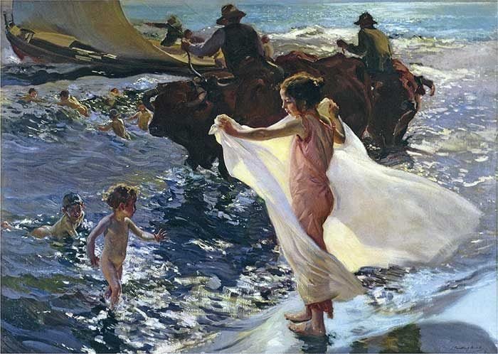
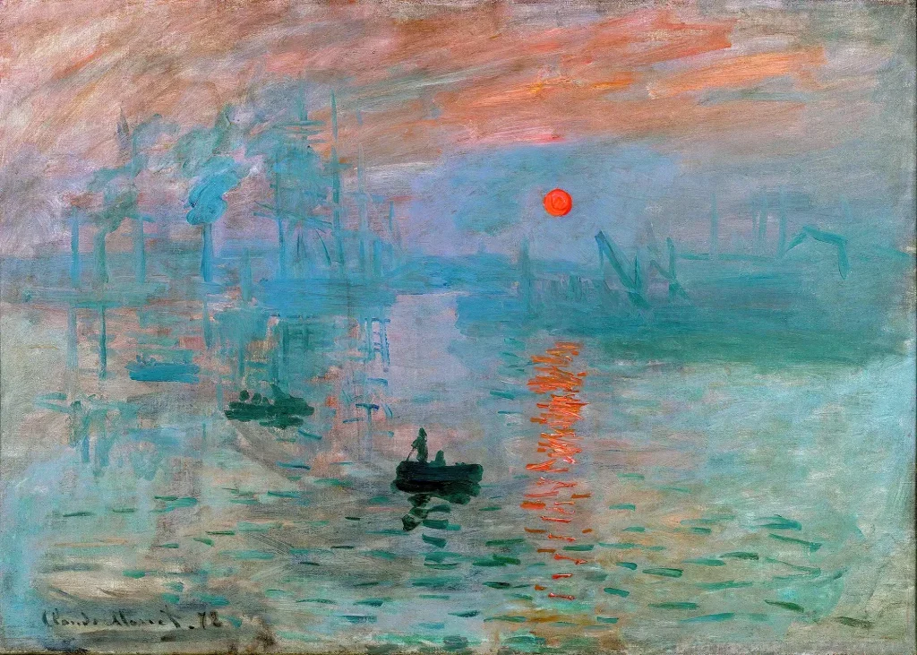
When I study painters who mastered light, I always come back to the same names: John Singer Sargent, Joaquín Sorolla, Claude Monet, and Alfred Munnings. They each had their own approach, but what connected them was their ability to translate light into emotion. They didn’t just record what they saw; they designed it. That is what makes their work feel timeless.

John Singer Sargent

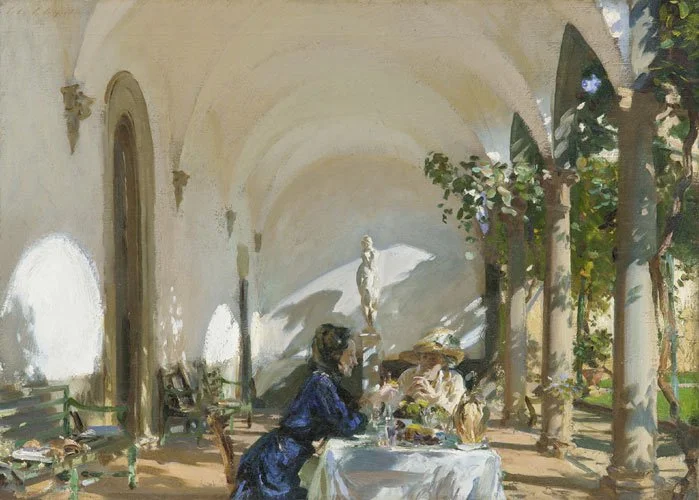
Sargent painted as if light was a sculptural tool. You can see it in the way he built a portrait, blocking in the biggest shapes first and then carving form through subtle value changes. He had an incredible sense of restraint. Nothing was overworked. The softness of an edge or a single flick of highlight across a cheekbone could describe an entire structure. Standing in front of one of his paintings at the Nelson-Atkins Museum in Kansas City, it is easy to forget that you are looking at paint. He created a sense of immediacy that feels alive, almost cinematic.

Joaquín Sorolla

Sorolla worked differently but with the same goal: to capture the experience of light. His paintings of figures on the beach in Valencia are flooded with sunlight. The whites are rarely pure white. They vibrate with warm yellows and cool blues. Shadows are not dead zones; they are filled with reflected color. You can feel the weight of the air and the shimmer of water. That sensitivity to atmosphere is what makes his work so powerful. He was painting not just what light looked like but what it felt like to stand in it.

Claude Monet

Monet took that idea further by studying how light changes over time. He would paint the same cathedral or haystack at sunrise, noon, and dusk, each time chasing a different version of truth. He wasn’t interested in precision but in perception. He painted color relationships, the way a warm sky influences the ground or how mist softens form. That understanding of relative color and temperature has shaped everything from impressionism to modern cinematography.

Alfred Munnings

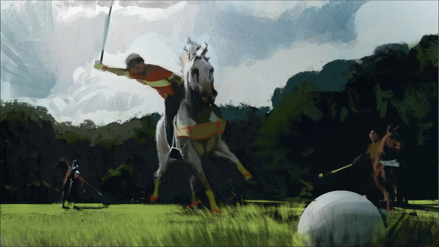
Munnings, often remembered for his equestrian scenes, brought the same respect for light to movement. His outdoor paintings capture fleeting gestures and moments, yet they always feel structurally sound. Horses gleam with the bounce of sunlight, trees filter light across figures, and the color of dust hangs in the air. Munnings had a deep understanding of form and anatomy, but it was his handling of light that gave his subjects energy and truth.

I have spent years studying these painters, not to imitate them but to understand their thinking. Each one treated light as architecture. It defined everything else. When you paint, you learn that form is only visible because of light. The structure of a face, the curve of an arm, or the mass of a building all depend on how light falls across them. You start to think in values instead of outlines. That mindset transfers directly to film.

In visual storytelling, light still serves the same purpose. It directs the eye, sets the tone, and defines space. A filmmaker uses light the same way a painter does: to build emotion and guide attention. When you look at great cinematographers, you can trace their approach back to painters. Think of Roger Deakins and the way he composes with soft contrast, or Emmanuel Lubezki’s use of natural light in long takes. Both rely on value control, edge variation, and composition that comes straight out of the painter’s toolkit.

Painting trains the eye to simplify. You learn to reduce complex scenes into patterns of light and shadow, to find what really matters. That kind of clarity is essential when designing a sequence for film. Shooting boards, for example, rely on that discipline. A good board artist doesn’t draw everything. They draw only what the audience needs to see. The shapes of light and dark are what make the shot readable, especially in fast-moving action.

When I work on a shooting board, the same lessons apply. Each frame must communicate instantly. It has to make sense to the director, the cinematographer, and the crew, all while serving the story. I often think about how Sargent simplified complexity through light, or how Sorolla used edges to keep energy in a scene. Those ideas carry over directly. The same visual logic that makes a painting feel believable makes a film sequence feel coherent.

Light is also a storytelling device. It defines emotion and rhythm. Painters have always known that. The way light touches a subject changes the entire tone. A face half in shadow suggests mystery. A scene filled with low, warm light feels nostalgic or safe. Harsh overhead light creates tension. These are not just aesthetic choices. They are narrative tools. Painters mastered them first, and filmmakers continue to build on those foundations.

At the Nelson-Atkins Museum, I like to get right up close to a painting and study the brushwork. Up close, it’s often shockingly simple… just one confident swipe of paint for a nose. Then you step back, and suddenly it all makes sense. That mix of looseness and control is exactly what I aim for in visual development.

Painters like Sargent and Monet were essentially doing what filmmakers do now. They observed life, analyzed how light behaved, and then used that knowledge to tell a story through visual choices. They were designers of reality, shaping it to make it feel more true. The better you understand their methods, the better you can control mood and meaning in film.

In both painting and film, the real craft lies in subtlety. Most people watching a movie won’t consciously think about the light, but they will feel it. Just as someone standing in front of a Sargent portrait feels the presence of the sitter without knowing why, a movie audience senses tension, warmth, or isolation through lighting choices that were carefully planned.

Years of traditional study taught me that good lighting is about restraint. You do not need to show everything. You need to reveal just enough. Painters knew this instinctively. They let the viewer’s eye do some of the work. The same is true in film. A frame that shows too much loses focus. A frame that controls value relationships pulls the viewer exactly where you want them to look.

That control of attention is what makes a sequence readable and emotionally strong. Whether it is a single painted portrait or a fast-cut action scene, the principle is the same: light shapes meaning.

I often encourage younger entertainment artists to study classical painting, not just film frames. The old masters figured out every visual problem we still face today. How to show form. How to use color temperature to create depth. How to balance composition so the eye flows naturally through the scene. Once you learn those lessons from paint, you start to see them everywhere… in photography, in animation, in cinema.

The longer I work in this field, the more I realize that painting is the purest form of visual problem-solving. It strips away dialogue, editing, and movement and leaves you with only value, color, and shape. If you can tell a story with those, you can tell it anywhere.

Studying painters like Sargent, Sorolla, Monet, and Munnings isn’t about nostalgia. It is about keeping craftsmanship alive. They built the foundation that all visual storytellers still rely on. Every time I paint or draw a sequence, I am applying what they discovered centuries ago… how light reveals truth, form, and emotion.

Light is both science and poetry. It obeys physics but expresses feeling. The more you study it, the more you realize how much it controls everything we see and feel in an image. That is what connects fine art and film at the deepest level. They both depend on the same language of light.

📩 Reach out: paul@paultemplestudios.com
🎨 Explore more: www.paultemplestudios.com

Want more blog posts on this topic?
1. From Traditional Painting to Preproduction: How Fine Art Roots Shape Visual Storytelling
2.
How Classical Painting Shaped Modern Filmmaking
3.
Carrying the Legacy of Film Illustrators Forward

In Traditional Painting
Comment

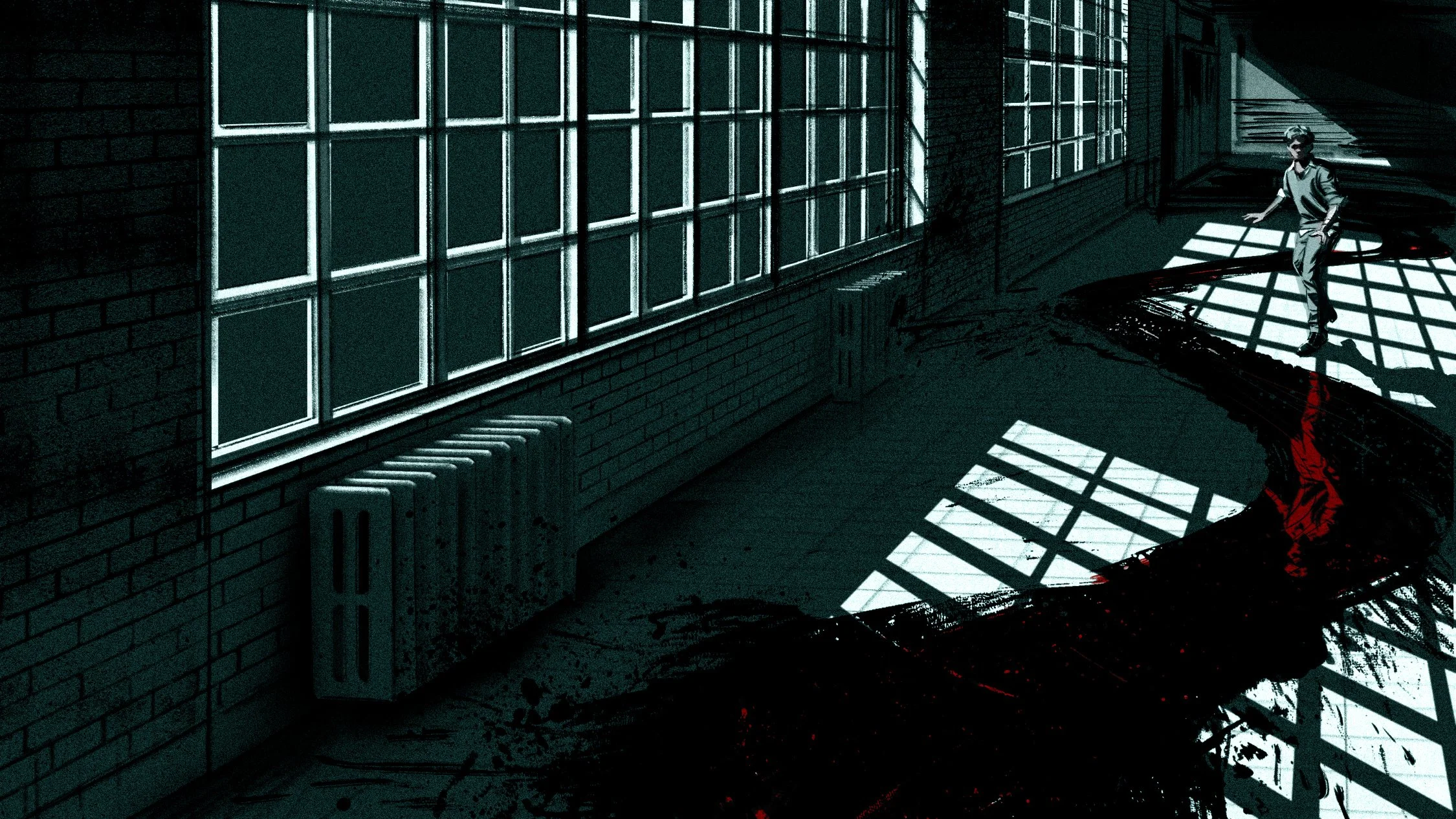
Concept art for an unannounced horror film project. Art by Paul Temple.

Composition and Control: The Cinematic Science Behind a Great Frame

Paul Temple November 3, 2025

There’s a moment when a frame just clicks. You feel the rhythm of it before you even know why. The balance of light, movement, and negative space suddenly tells the story in a single glance. That’s composition. It is control in its purest form.

In film, every frame has a job. It directs the viewer’s eye, builds emotion, and shapes the story long before the dialogue starts. As a storyboard artist, my job is to help directors take control of that visual language before the camera ever rolls. The best compositions aren’t just beautiful. They are deliberate. Every shape, line, and gesture contributes to what the audience feels.

The Geometry of Storytelling

Classical painters understood that geometry could guide emotion. You can trace the same principles of balance and rhythm from Da Vinci’s “The Last Supper” straight into the opening sequence of “Raiders of the Lost Ark.” Triangular compositions pull attention to a central idea. Diagonal lines create movement. Symmetry conveys control, while imbalance creates tension. These visual rules are the scaffolding beneath any cinematic story.

When I block out a frame, I’m thinking about energy flow. Where does the eye travel first? What lingers in the periphery? How do shadow and light compete or cooperate within the same space? The viewer may not consciously notice these things, but they feel them. And in film, feeling is everything.

This is where composition meets control. The artist’s control of the audience’s attention is what gives storyboards their power. You’re not just drawing. You’re designing where the story happens, and how it unfolds.

Visual Development and Intent

Studios like ILM and Framestore describe visual development as “world-building through design.” That phrase captures it perfectly. It’s not just about the frame itself, but the emotional ecosystem that supports it. In pre-production, everything from color palettes to camera angles is designed to support the director’s vision.

The goal isn’t realism. It’s believability. Environments, lighting, and composition all exist to reinforce tone and story intent. For example, if a scene is about isolation, you can communicate that with negative space, low contrast, and distant framing. If it’s about chaos, you fill the frame with converging diagonals and broken symmetry. These are visual equivalents of punctuation in writing. They shape how the viewer reads the image.

Great composition doesn’t happen by accident. It’s an act of storytelling discipline.

Classical Control, Cinematic Application

One of the biggest influences on modern visual storytelling comes from classical painting. Artists like Caravaggio and Vermeer didn’t just paint figures. They directed them. Every shadow and gesture led the viewer toward the heart of the story. That same principle applies in film design.

When I work on a storyboard, I’m often thinking like a cinematographer. Where should the emotional weight sit? What is the lens doing to the story? I might use a strong chiaroscuro effect to create drama, or a shallow depth of field to isolate emotion. These are painter’s tools, applied through the lens of cinema.

This connection between painting and film is what gives storyboards their cinematic realism. It’s not enough to make a drawing look good. It has to feel like a shot that belongs in motion.

The Language of the Frame

Composition is not only about what’s inside the frame. It’s about what’s implied beyond it. The audience’s imagination fills in what they don’t see. A strong storyboard artist controls that implication.

One of the best ways to do that is through visual hierarchy. Think of it as volume control for storytelling. The foreground can whisper or shout. Mid-ground shapes can build tension. The background can reveal or conceal key context. Managing those layers creates emotional rhythm.

I often think of the frame as a stage. Every element has to justify its position. If a prop or character doesn’t serve the story, it distracts. The best compositions are not just full of information. They are full of intention.

That’s one of the reasons visual development teams at studios like Framestore talk so much about “shape language.” The silhouette of an environment, or even the curve of a prop, carries emotional tone. Sharp, angular shapes often signal danger or conflict. Rounded, organic shapes suggest safety or warmth. Composition is where all of those design choices come together to form cinematic meaning.

Controlling the Emotional Flow

Filmmaking is emotional architecture. Composition is what builds the hallways the audience travels through. A good frame guides the viewer without them realizing it. The camera’s placement, the lighting, and the density of detail all shape the emotional flow of a scene.

I think of this process like conducting. You can use rhythm in composition the way a musician uses tempo. Wide shots slow the pace. Tight shots quicken it. Diagonal framing speeds up the energy. Center framing brings calm. It’s a subtle dance between control and chaos.

A lot of storyboard work is about finding that emotional tempo. If a director wants tension, I might stack the frame vertically, using oppressive shapes and low light. If they want relief, I’ll open it horizontally, allowing air and movement. These decisions translate directly into how the audience experiences time and feeling.

The Cinematic Mindset

Composition isn’t something you add later. It’s baked into the DNA of every story choice. A well-composed storyboard can define how a sequence is shot, how it’s edited, and even how it’s scored.

This is why visual development artists often collaborate closely with directors and production designers. The frame is the first conversation between story and image. Once that language is established, everything else flows from it.

When I study a film like “Blade Runner 2049” or “The Revenant,” I’m looking at how every element inside the frame earns its place. Nothing is random. Even in chaos, there is control. That’s the hallmark of cinematic thinking.

The Subtle Art of Restraint

Sometimes, control is about knowing when to stop. Too much information weakens a frame. Too much contrast confuses it. Composition thrives on restraint.

One of my favorite exercises when teaching storyboarding is to remove one element at a time from a frame. If the story still reads clearly, then the composition is strong. If it falls apart, you know which piece carried the weight. This helps train the eye to think like a filmmaker instead of a draftsman.

The goal is not to show everything. It’s to show what matters most.

Designing for Movement

The best compositions are not static. They anticipate motion. Storyboards are snapshots of a moving idea. The direction of a character’s gaze, the tilt of a camera, or the placement of a horizon can all suggest momentum.

Visual development teams often use “flow lines” to track how a viewer’s eye moves through a shot. These invisible pathways guide attention, connect story beats, and maintain visual clarity. When done right, the audience feels carried through the frame without realizing they’re being directed.

This is where drawing and filmmaking meet in perfect balance. The still image becomes kinetic.

Control as a Form of Trust

Ultimately, composition and control come down to trust. The director has to trust the storyboard artist to translate emotion into image. The audience has to trust that what they’re seeing is intentional.

Good composition builds that trust. It feels inevitable, like the story could not exist any other way. That’s the power of visual discipline.

When I sit down to draw a frame, I’m not just thinking about angles or balance. I’m thinking about how to make the viewer feel something specific. Every frame is a decision. Every line carries responsibility. That’s what makes cinematic storytelling such an addictive craft.

The Takeaway

Composition is not decoration. It is story structure in visual form. Whether you’re painting, designing, or boarding a film, control is the thread that ties every creative choice together.

When you see a great frame, you feel it immediately. The geometry is invisible, but the emotion is undeniable. That’s when you know composition is doing its job.

The science behind a great frame isn’t about rules. It’s about awareness. It’s about shaping emotion through light, form, and rhythm. Once you understand that, you stop drawing pictures and start directing feelings.

📩 Reach out: paul@paultemplestudios.com
🎨 Explore more: www.paultemplestudios.com

Want more blog posts on this topic?
1.Storyboards and Cinematography: Speaking the Same Language
2.
Building the Perfect Reveal in Storyboards
3.
Setting the Emotional Tempo: How Storyboards Shape the Audience’s Experience

In Film, Storyboards
Comment

Shooting boards for an action scene in the “Traders” film project. Art by Paul Temple.

Shooting Boards for Action Scenes: Why Every Great Action Scene Starts on Paper

Paul Temple October 30, 2025

Action scenes in movies are incredibly controlled. When an explosion feels believable or a chase scene keeps your eyes locked to the screen, it’s not luck. Someone planned it that way. Shooting boards are where that clarity starts.

Shooting boards serve two critical purposes. First, they give the filming crew a clear roadmap. The director, cinematographer, and crew need to know exactly how a scene should unfold, what moves when, where the camera goes, and how the actors and props interact. That’s the practical side. But there’s a second, equally important purpose: guiding the audience’s eye and attention. A well-planned sequence ensures that, even in the midst of chaos or rapid action, viewers instinctively know where to look and what matters. Every frame, every gesture, every cut starts on paper, balancing the technical needs of production with the storytelling needs of the audience.

Motion Has Rules

Before cameras, stunt rigs, or digital effects, motion exists as an idea. On paper, that idea has to work. The path of movement, the timing between cuts, the camera position, the energy of each gesture… these are the real ingredients of an action scene. If it doesn’t work in sketches, it won’t work when you film it.

A good shooting board treats motion like music. You need rhythm, pauses, and contrast. Fast cuts lose their power without slower beats in between. A chase scene is just noise if there’s no visual structure behind it. The drawings don’t just describe what happens; they show how it feels.

I’ve worked with directors who think of shooting boards as a safety net, but they’re more like a conductor’s score. They keep every department (camera, stunt, lighting, and visual effects) on the same beat. When the boards are clear, everyone moves with confidence.

The Language of Action

There’s a reason some directors’ action scenes feel easy to follow, even when they’re chaotic. They understand visual grammar. Every cut and camera move has to guide the audience through space. Without that logic, you lose them.

Shooting boards use that same grammar. You build a sense of direction through composition and continuity. A wide shot establishes geography. A close-up builds tension. A quick insert gives impact. Each frame leads naturally to the next so the viewer never has to guess what’s happening.

I spend a lot of time thinking about where the eye will land in each panel. If the hero runs left to right in one shot, I keep that direction consistent until there’s a deliberate reason to change it. That kind of visual discipline makes action feel clean, not confusing.

Drawing Movement

Drawing movement is not about sketching blur. It’s about showing weight, intention, and flow. The angle of a shoulder or the bend of a leg can tell you how fast something moves or how hard it hits. A drawing that captures that force gives the director something to build on.

The best action shooting boards almost vibrate on the page. The drawings might be loose, but the momentum is clear. You can feel the camera tilting, the character twisting, or the explosion pushing the frame outward. Good draftsmanship matters here. If the anatomy or perspective is off, the energy dies.

When I draw a complex stunt, I think about the laws of motion as much as the story. Gravity, follow-through, anticipation—they all show up in the drawing. You can cheat a lot with effects later, but if the foundation isn’t there in the boards, something will always feel off.

Working with Stunts and Camera

Action scenes are a team sport. Shooting boards let you communicate with the departments that bring the danger to life. Stunt coordinators use boards to time their choreography. Camera operators plan their rigs around what the boards show. Even visual effects artists rely on them to know when to step in and when to stay invisible.

When I hand off a sequence, it’s not just about the cool shot. It’s about giving every person on set a map they can actually use. The boards have to be readable, not decorative. If the stunt team can’t tell where someone lands after a jump, the drawing failed.

Directors who understand this process tend to get better performances. They know when to push realism and when to stylize. They know what to shoot practically and what to enhance later. That confidence starts with strong visual planning.

Keeping the Viewer Oriented

The hardest part of action shooting boards is orientation. It’s easy to get lost in the excitement and forget what the viewer will actually understand. A great action scene always has an internal compass. The audience should know where they are, what’s at stake, and how each shot connects.

I like to think about it like chess. Every move has to make sense in relation to the last one. The camera is your opponent’s perspective. The drawings are your plan. You’re not just showing movement—you’re controlling how it’s perceived.

That’s why you can have two car chases with the same budget and one will feel thrilling while the other feels like a blur. One director understands spatial storytelling. The other just filmed cars moving fast.

Shooting Boards vs. Chaos

Without boards, action scenes become expensive guesswork. Every new camera angle means resetting, every unclear sequence means wasted time. A shooting board isn’t just a visual aid; it’s a cost saver. It prevents mistakes before they happen.

Studios know this. That’s why even large-scale productions rely heavily on boards. When the director of photography and the visual effects supervisor can agree on how the scene flows, the entire shoot moves smoother. It’s not glamorous work, but it’s the backbone of efficiency.

The Problem with “Fix It in Post”

There’s a dangerous phrase that floats around film sets: “We’ll fix it in post.” It’s another way of saying, “We didn’t plan this properly.” Shooting boards exist to kill that phrase. When the flow of action is already mapped out, editors aren’t scrambling to find a rhythm later. They’re cutting to a plan that already works.

You can always adjust timing, add effects, or tweak performances, but you can’t fix a story that was never clear to begin with. A drawing that communicates motion accurately saves everyone from confusion down the line.

The Human Advantage

There’s a lot of talk about AI image tools replacing sketch work. They can generate flashy visuals, sure. But clarity, intent, and continuity are not algorithmic. Machines don’t understand how to sustain action through camera logic or character performance.

A human shooting board artist can read a script, sense what the director wants, and build energy with restraint. You know when to cut, when to hold, and when to break rhythm. That judgment comes from understanding how stories move, not just how they look.

Great action scenes rely on that instinct. You have to feel the story beat by beat. You can’t automate that.

Why It Still Starts on Paper

Even with 3D previs and digital tools, the first step of designing motion often starts with a pencil or stylus. It’s faster to think in drawings than in code. It’s where ideas breathe. You can explore, adjust, and discard freely until the rhythm feels right.

Paper is where mistakes are cheap and discoveries are quick. Once that motion is locked in the drawings, everything else becomes easier—camera setups, edit timing, even sound design. The entire pipeline benefits from visual clarity at the start.

That’s why I still believe every great action scene starts on paper. Not because it’s traditional, but because it’s effective.

Closing

Action looks effortless when it’s done right. But behind that smoothness is planning, understanding, and drawing that moves. Shooting boards are not decoration. They’re direction. They keep the story clear when the chaos hits.

📩 Reach out: paul@paultemplestudios.com
🎨 Explore more: paultemplestudios.com

Want more blog posts on this topic?
1. See It Before You Shoot It: The Power of Shooting Boards
2.
What Filmmakers Want from Shooting Boards: Save Time, Money and Communicate Clearly
3.
Common Mistakes Directors Avoid with Shooting Boards

In Shooting Boards
Comment

Environment concept art by Paul Temple.

World-Building: The Art of Making Environments Feel Alive

Paul Temple October 27, 2025

When most people hear world-building, they picture sprawling fantasy maps or sci-fi planets rendered in dazzling 3D. But world-building is not just about scale or spectacle. It is about truth. The worlds that stick with us feel like they existed long before the story began and will keep existing long after it ends.

As a storyboard artist, I think about that every time I draw an environment. Whether it is a dystopian street, a farmhouse kitchen, or a mythical jungle, the goal is the same: to make the space feel lived in, believable, and emotionally in sync with the story.

The Environment as a Character

A well-designed environment should not just contain the story. It should participate in it. Great filmmakers understand this instinctively. Think about the desert in Mad Max: Fury Road. It is more than a setting. It is an antagonist. It shapes every choice, every chase, and every moment of desperation.

When I storyboard, I try to treat every environment like a silent actor. It has mood, personality, and history. A crumbling wall might say more about a character’s past than a page of dialogue. A shaft of light across the floor might reveal a sense of hope or isolation. These details give the frame its subtext.

Cinematography does the same thing with light, lens, and movement. But in storyboards, the process begins earlier with design and composition. How the environment is drawn defines how the story breathes.

Designing for Story Tone

Every production design choice communicates emotion. A city drawn with rigid lines and cold color temperature can make a story feel oppressive or corporate. A warm, uneven landscape full of texture and asymmetry can make the same story feel human and hopeful.

When designing environments for storyboards or concept art, I always start by asking:

  • What emotion is this location supposed to evoke?

  • How does this space reflect the character’s state of mind?

  • What is the rhythm of this environment, chaotic or calm?

A good example is a sequence I worked on where a character was facing a personal failure. The director wanted the environment to echo that. Instead of drawing a pristine office, I tilted the perspective slightly, let the shadows feel heavy, and scattered small hints of disarray—papers, a broken pen, a faint light leak through blinds. Nothing overt, but enough to make the frame feel unstable.

That is world-building in miniature. You do not need a fantasy kingdom to build a world. You need awareness of tone and how the environment mirrors emotion.

The Invisible Architecture of Believability

In design terms, environments only feel alive when the logic behind them is invisible but sound. If I design a marketplace, I have to know where the food comes from, how people move through it, what the noise level feels like, and what kind of lighting it would realistically have at that time of day.

Even if none of that is explicitly shown, the viewer senses it. You can always tell when an environment was designed without that underlying structure. It feels hollow, like a set waiting for actors.

The audience may not notice that the pipes in a sci-fi corridor make sense or that the shadows line up with a practical light source, but those small truths make the difference between a believable frame and one that feels fake.

That is why I spend time researching architecture, natural light, and even materials. A lived-in world comes from lived-in details.

Composition and World Language

Composition is where design meets storytelling. When an environment is composed well, it tells the audience where to look, what to feel, and how the world behaves.

In painting, this has always been a central idea. Vermeer guided our eyes with windows and reflections. Caravaggio used darkness to make light feel divine. Those same principles apply in filmmaking.

When designing storyboards, I think about the grammar of the world. How does the space want to move? What kind of compositions feel right for it? A rigid, symmetrical composition might make sense for a totalitarian world. A handheld, off-balance layout might fit a collapsing one.

If a world is built with care, the compositions naturally flow from its design. The camera placements, blocking, and even editing rhythm all emerge from how the environment was drawn.

Texture and Imperfection

One of the biggest mistakes I see in modern visual design, especially with digital tools, is the obsession with perfection. Clean edges, evenly lit rooms, surfaces that look straight out of rendering software. Real worlds are not like that.

When I paint environments, I intentionally introduce irregularities. Cracks, stains, weathering, slight warping. These imperfections give the world personality. They remind us that time exists in this space, that life has worn it in.

Directors who work visually understand this. Spielberg and Deakins both use texture to ground their worlds. Even in fantasy or sci-fi, the illusion of reality depends on friction, dust, and decay. The more tactile the frame, the deeper the immersion.

The Role of Light

Light is the heartbeat of world-building. It defines temperature, mood, and even moral tone.

When designing storyboards, I think in terms of light first, objects second. Light reveals what matters and conceals what does not. It can make a world feel safe or hostile, familiar or alien.

A soft, diffuse light through fog tells us one kind of story. A sharp beam slicing through darkness tells another. Even before the actors step in, the environment has already told us how to feel.

Painters have always known this. Rembrandt’s chiaroscuro and Turner’s atmospheric light are the same ideas cinematographers use today. The difference is that in storyboards, we build the mood before the camera even exists.

Designing for Cinematic Flow

World-building for storyboards is not just about single images. It is about flow. The environment should feel consistent from shot to shot, guiding the viewer’s eye like a visual rhythm.

That means paying attention to spatial continuity, perspective, and geography. A doorway drawn at the wrong height or a window placed inconsistently from shot to shot can instantly break immersion.

When I design sequences, I map the geography first. Where the exits are, how the light moves, what the scale relationships are. Once the world’s logic is solid, the sequence feels grounded. Directors and DPs can trust it, and the edit will cut together smoothly.

A believable world is not just pretty. It is useful.

The Artist’s Responsibility

A storyboard artist’s job is not just to visualize what is written. It is to build a world that can hold the story. That means understanding architecture, geography, and the emotional life of spaces.

Every environment has a story to tell, even before a single line of dialogue is spoken. Whether it is the sterile glow of a hospital hallway or the warmth of a childhood home, the environment should support the film’s emotional truth.

As artists, we have to honor that responsibility. The goal is not to make something that looks impressive. It is to make something that feels real enough for the audience to believe in.

Conclusion

World-building is the invisible art that supports everything else in film. Without it, stories float. With it, they root into the viewer’s mind.

In a great film, you remember the characters and the story, but you also remember how it felt to be there. That is the mark of a world that lives.

📩 Reach out: paul@paultemplestudios.com
🎨 Explore more: www.paultemplestudios.com

Want more blog posts on this topic?
1. Concept Art and Storyboards for Indie Film Crowdfunding
2.
Breathing Life Into Your Characters: The Importance of Good Character Design
3.
Setting the Emotional Tempo: How Storyboards Shape the Audience’s Experience

In Film, Concept Art
Comment
← NewerOlder →
 

Search Posts

No results found
 

Featured Blog Posts

Featured
Breaking Creative Ruts: Metaphor and Non-Linear Thinking in Visual Development
March 9, 2026
Breaking Creative Ruts: Metaphor and Non-Linear Thinking in Visual Development
March 9, 2026
Read more →
March 9, 2026
Hiring a Storyboard and VisDev Artist:  A Step by Step Guide for Filmmakers and Directors
January 7, 2026
Hiring a Storyboard and VisDev Artist: A Step by Step Guide for Filmmakers and Directors
January 7, 2026
Read more →
January 7, 2026
Composition and Control: The Cinematic Science Behind a Great Frame
November 3, 2025
Composition and Control: The Cinematic Science Behind a Great Frame
November 3, 2025
Read more →
November 3, 2025
Concept Art and Storyboards for Indie Film Crowdfunding
September 18, 2025
Concept Art and Storyboards for Indie Film Crowdfunding
September 18, 2025
Read more →
September 18, 2025
 

Latest Blog Posts

Featured
Don’t Let Your Film Ideas Stay Babies: Grow Them with Real Artists
August 3, 2026
Don’t Let Your Film Ideas Stay Babies: Grow Them with Real Artists
August 3, 2026
Read more →
August 3, 2026
J.C. Leyendecker: Mastery, Craft, and Timeless Visual Storytelling
July 27, 2026
J.C. Leyendecker: Mastery, Craft, and Timeless Visual Storytelling
July 27, 2026
Read more →
July 27, 2026
A Life Well Lived: Why AI Will Never Replace Art in Storytelling
July 21, 2026
A Life Well Lived: Why AI Will Never Replace Art in Storytelling
July 21, 2026
Read more →
July 21, 2026
HerosFarewell_02s.jpg
July 14, 2026
Edgar Payne on Composition: Lessons for Film Work
July 14, 2026
Read more →
July 14, 2026
Why Great Artists Need Interests Outside Their Main Medium
July 6, 2026
Why Great Artists Need Interests Outside Their Main Medium
July 6, 2026
Read more →
July 6, 2026
George Bridgman: The Anatomy Teacher Behind Generations of Artists
June 29, 2026
George Bridgman: The Anatomy Teacher Behind Generations of Artists
June 29, 2026
Read more →
June 29, 2026
Using Screenwriting Structure in Storyboards for Better Films
June 8, 2026
Using Screenwriting Structure in Storyboards for Better Films
June 8, 2026
Read more →
June 8, 2026
Learning to Pivot in Pre-Production: Lessons for Directors
May 18, 2026
Learning to Pivot in Pre-Production: Lessons for Directors
May 18, 2026
Read more →
May 18, 2026
Diving Into the Color Charts of Richard Schmid
May 12, 2026
Diving Into the Color Charts of Richard Schmid
May 12, 2026
Read more →
May 12, 2026
Negative Space: The Power of What You Leave Out
April 14, 2026
Negative Space: The Power of What You Leave Out
April 14, 2026
Read more →
April 14, 2026
 
Behind the Boards: A Blog by Paul Temple

© Paul Temple Studios 2012-2026. All images on this site may not be reproduced in any form, stored, manipulated or used to train generative AI models of any kind without prior written consent from Paul Temple.