• Home
  • Film
  • Advertising
  • Stage
  • Contact
Menu

Paul Temple Studios

  • Home
  • Film
  • Advertising
  • Stage
  • Contact
×
 

Behind the Boards: A Blog by Artist, Paul Temple

Welcome to the blog! Here you'll find insights into the art of storyboarding, concept development, shooting boards, and visual storytelling for film, television, and advertising. From camera planning techniques to the emotional impact of character design, this is where I’ll share my expertise honed over a decade of working with directors and top brands. Whether you're a creative director, filmmaker, or agency looking to elevate your pitch, this blog reveals how powerful visuals drive unforgettable stories.

Questions? Email me at paul@paultemplestudios.com

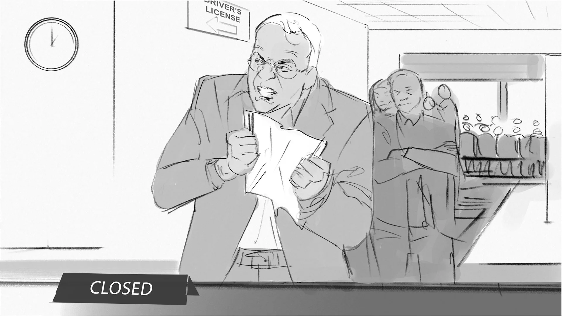
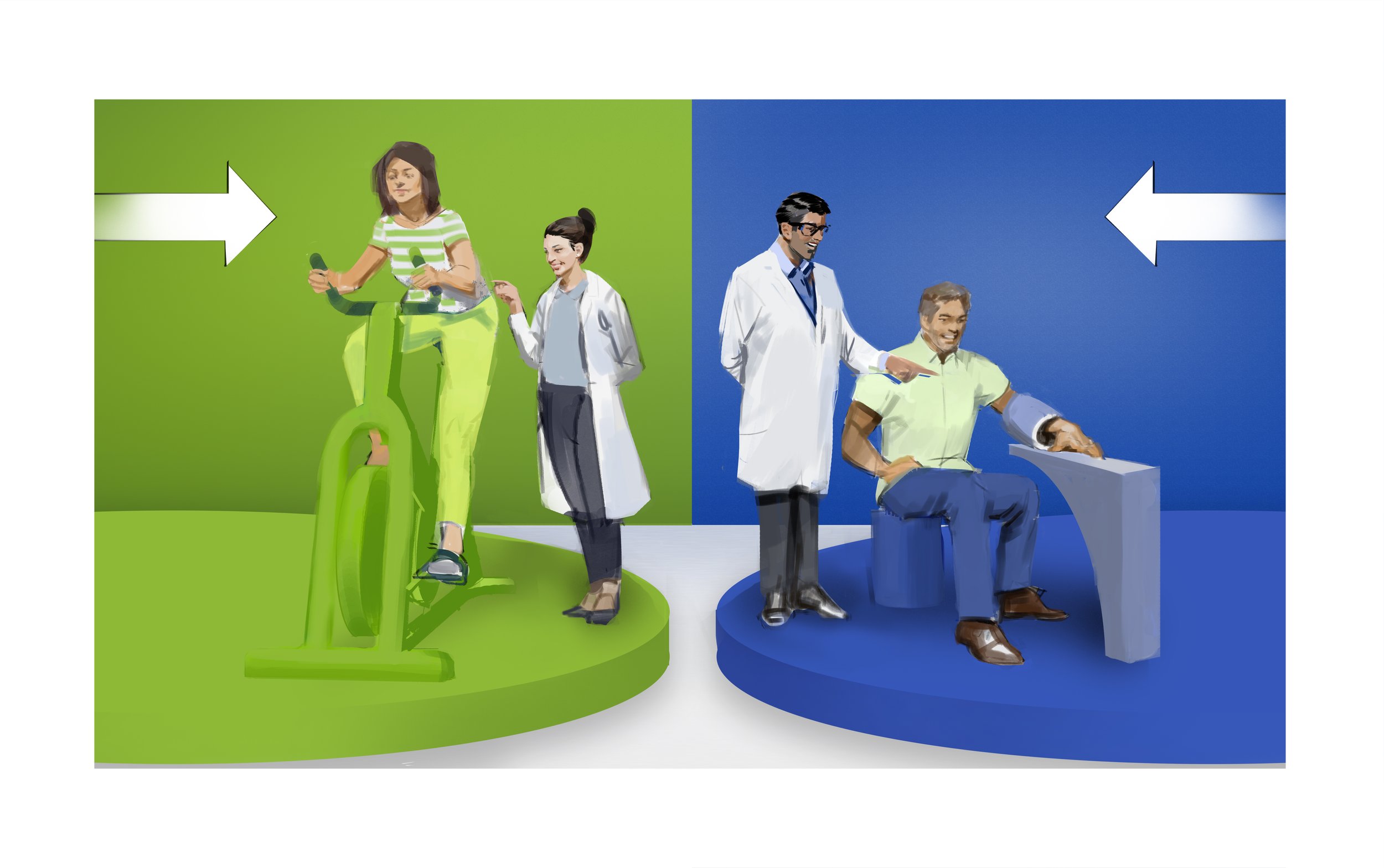
Example of a flat, diagrammable storyboard frame for a Rite Aid ad pitch. Art by Paul Temple.

Avoiding Flat Diagrammatic Staging in Film & Advertising

Paul Temple March 23, 2026

I keep seeing the same thing in recent projects: flat, diagrammatic staging where every face is visible, every gesture is spelled out, and the camera stays back like it's filming a 1950s sitcom. This approach is creeping back into film and advertising, and it is not because audiences suddenly prefer it. It is because too many people in management positions are weighing in, and the result is vanilla that offends no one but excites even fewer. Yes, I said it.

As a storyboard artist who has boarded sequences for indie features and TV, I see this pattern often. A strong idea gets diluted through layers of approval. The most interesting risks get booted because not every stakeholder can agree on them. What remains is functional, agreeable, and forgettable.

What Diagrammatic Staging Looks Like Today

Think of classic multi-camera sitcoms: wide shots, flat lighting, actors positioned frontally so everyone is readable, no deep shadows or bold angles that might hide an expression or create mystery. The camera rarely moves much because multiple operators need to cover the action simultaneously. It was efficient for live audiences and tight schedules.

Modern productions echo this for similar reasons. Sets get lit evenly to avoid noise or hotspots, killing dramatic contrast. Multi-camera or coverage-heavy setups favor static, wide frames that capture the whole scene at once. Studio limitations and fast turnarounds push for predetermined blocking on limited sets. The result is theatrical staging: actors in clear, pre-set positions, high-contrast but flat lighting for sensors, and compositions that prioritize clarity over mood.

Add motion smoothing on TVs, the "soap opera effect," and the look becomes hyper-smooth and artificial. Faces glow, shadows lift, everything centers. It feels like theater captured on video rather than cinema designed for the screen.

In advertising, this shows up as hieroglyphic commercials: every product benefit, every emotion, every character reaction crammed into one frame or quick cut. No subtlety, no trust in the audience to infer. Everything is diagrammed.

The Role of Design by Committee

This flattening often stems from design by committee. When too many decision-makers get involved… executives, clients, producers, focus group feedback…. etc. The vision compromises to satisfy everyone. Risky choices get vetoed because they might not test well or please the room. The process favors consensus over boldness, leading to banality and inconsistency.

In film, big-budget examples show how this plays out: reshoots to soften edges, added scenes to clarify what did not need clarifying, final cuts that feel patched together. The original director's intent gets watered down. In advertising, agency layers and client notes pile up until the spot is safe, polished, but lacks punch.

Pre-production suffers most. Instead of trusting artists to explore and propose, committees demand options that everyone can understand immediately. No room for the unexpected. The boards become diagrams rather than cinematic invitations.

AI and the Echo Chamber Effect

AI tools amplify this. Prompt "group scene in office" and it blends existing images: centered figures, even lighting, frontal poses. It pulls from what it has seen—millions of sitcom frames, stock photos, previous generations—and outputs flat Photoshop versions without originality. It never risks an off-center composition, dramatic shadow, or implied gesture because those are not average patterns in its training data.

AI gives what you ask for, but only within the bounds of the familiar. It cannot invent the bold leap that comes from a human artist observing life, questioning assumptions, or drawing from personal instinct. In visual development, that leap is what separates memorable frames from generic ones.

Trusting the Artist in Pre-Production

Audiences are not stupid. We do not need every face, every expression, every gesture visible at once. Subtlety works: a shoulder turn implies tension, a shadow suggests doubt, an off-screen glance builds mystery. Great cinema trusts viewers to connect the dots.

Strong pre-production planning lets artists build that trust into the boards. A single-camera mindset, even in coverage, allows for specific angles, intentional lighting, dynamic blocking. It creates depth, rhythm, and emotional truth that flat staging cannot.

When I board a scene, I start with the story's core feeling. What does the director want the audience to sense before dialogue starts? From there, I use composition, light, and movement to guide the eye without spelling everything out. Directors and producers who give space for that process get visuals that stand out. The ones bogged down by endless approvals end up with safe, diagrammatic frames that blend into the noise.

Wrapping It Up

The resurgence of diagrammatic, flat staging in film and advertising is a symptom of too many cooks and too little trust in creative vision. It produces work that is clear but lifeless, agreeable but unmemorable. Audiences deserve better: frames that invite them in, challenge them subtly, and reward close watching.

If you are directing or producing a project and want pre-production storyboards or visual development that avoid the committee trap and deliver cinematic truth, reach out. Let's plan visuals that take risks and honor the story from the start.

📩 Reach out: paul@paultemplestudios.com
🎨 Explore more: www.paultemplestudios.com

Want more blog posts on this topic?
1. When Iteration Becomes Overthinking and Hurts Your Story
2.
Breaking Creative Ruts: Metaphor and Non-Linear Thinking in Visual Development
3.
Camera Movement in Static Boards: Conveying Motion and Energy Without Animation
Tags advertising, film
Comment

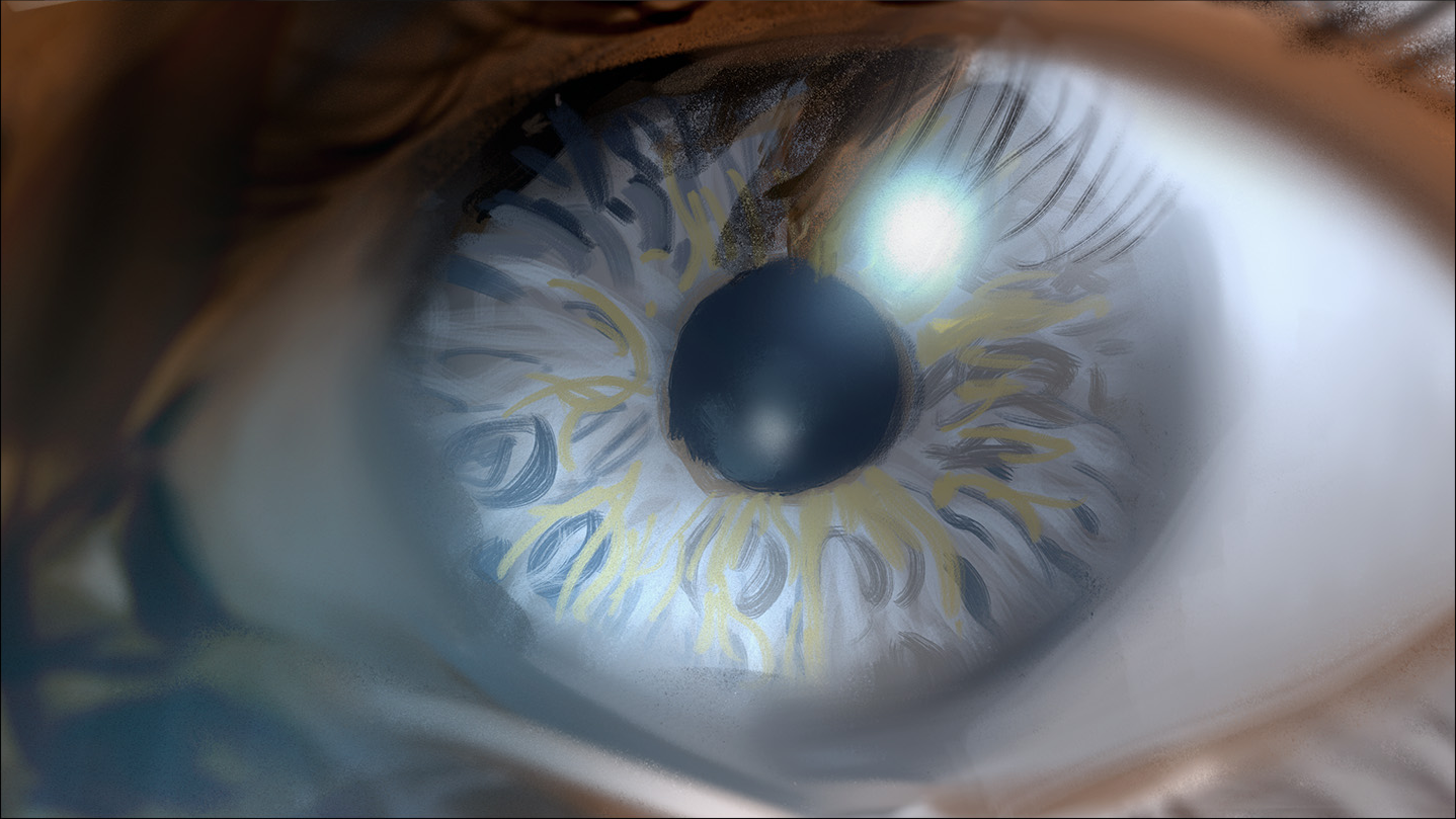
Storyboard frame showing an eye ball. Art by Paul Temple.

Patterns in Nature: Lessons for Cinematic Composition

Paul Temple March 16, 2026

Directors and cinematographers often talk about finding the right visual language for a scene. The script might describe a quiet forest or a chaotic storm, but translating that into frames that feel alive requires more than technical skill. It requires seeing the underlying order in the world around us. Patterns in nature provide that order. They show up everywhere, from the branching of a tree to the spiral of a seashell, and they have shaped how I approach storyboards and visual development for years.

As a storyboard artist working on films, TV, and commercials, I look to these patterns constantly. They guide composition, rhythm, and emotional flow in ways that feel instinctive once you start noticing them. Nature does not design randomly. It builds with efficiency, beauty, and purpose, and those same principles make storyboards more compelling when applied to cinematic frames.

Symmetry and Balance in the Frame

Symmetry appears constantly in nature: reflective in a butterfly's wings, rotational in a flower's petals, or radial in a snowflake. In film, we use symmetry to create calm, order, or emphasis. A centered character against a symmetrical background can convey stability or isolation. But nature rarely uses perfect static symmetry. It favors dynamic balance, where elements feel alive and in motion.

I think of this when blocking a scene. A perfectly centered shot can feel stiff, like a posed photograph. Shift the balance slightly, drawing from the way leaves arrange on a stem or the subtle asymmetry in a face, and the frame gains life. Directors notice this. It makes the audience lean in because the composition breathes.

Spirals and the Golden Proportion

Spirals are one of the most powerful patterns. The logarithmic spiral in a nautilus shell or sunflower seeds follows the golden ratio, roughly 1.618. This proportion appears in plant phyllotaxis, where leaves spiral to maximize light exposure, or in galaxies and hurricanes. Artists have used it for centuries to divide canvases and place key elements for natural harmony.

In storyboards, I apply this when composing key frames. Place a horizon or focal point along golden ratio lines, and the eye moves through the image effortlessly. It creates rhythm in a sequence, guiding the viewer from one panel to the next without force. For a dolly in on a revelation, the spiral can suggest inward focus, mirroring how a fern unfurls. On commercial projects, this proportion helps make product shots feel premium and balanced, even in tight deadlines.

Fractals: Repeating Complexity at Every Scale

Fractals repeat self-similar patterns at different scales: a tree's branches mirror its twigs, a coastline's jagged edges look the same zoomed in or out. Research shows these patterns reduce stress and feel pleasing because our visual system processes them efficiently.

In visual development, fractals inspire layered depth. A wide establishing shot of mountains can echo in the foreground rocks or distant clouds. This creates immersion without clutter. In action sequences, fractal branching can inform crowd movement or debris patterns, making chaos feel organized. Cinematographers respond well to this because it translates to practical lighting and set design: repeating motifs at scale build a cohesive world that feels real.

Branching, Tessellations, and Flow

Branching patterns, like rivers or blood vessels, distribute resources optimally. In film, they appear in blocking: characters diverging from a central path, or visual lines leading the eye through a space. Tessellations, like hexagons in beehives, offer efficiency and strength. They inspire grid-like compositions or repeating elements in backgrounds, from urban skylines to forest canopies.

Waves and flows, seen in sand dunes or ocean currents, guide energy through a scene. I use them for implied motion in static boards: curving lines that sweep across panels mimic camera tracks or emotional arcs.

Faith and the Creator's Handiwork

As someone who draws from observation every day, I cannot help but see these patterns as evidence of intentional design. The same golden ratio that organizes a sunflower seed head structures DNA turns and planetary orbits. The fractal branching in a tree echoes the way rivers carve landscapes or lungs exchange air. It all points to a Creator who delights in beauty and order, declaring His glory through the things He has made. Scripture reminds us that the heavens and earth proclaim this handiwork, even in a fallen world where perfection is marred. For me, studying these patterns is not just technical; it is a way to honor that creative intelligence and bring echoes of it into the stories we tell on screen.

Applying Nature's Patterns to Pre-Production

In practice, this means starting thumbnails with nature in mind. Stuck on a landscape? Sketch tree branches first to find natural flow. Designing a character's environment? Look at honeycomb structures for efficient layouts that feel grounded. These observations sharpen decisions early, so when the director reviews boards, the visuals already carry weight and truth.

Indie filmmakers benefit hugely here. Limited budgets mean every frame must work harder. Nature's patterns provide free inspiration: efficient, timeless, and emotionally resonant. They help turn simple locations into cinematic worlds without expensive builds.

Wrapping It Up

Patterns in nature offer filmmakers a master class in composition, rhythm, and emotional architecture. They show how to build frames that feel inevitable and alive, guiding the eye and the heart. When storyboards draw from these principles, they help directors visualize the film more clearly and make stronger choices before production begins.

If your next project needs visual development or storyboards that capture that natural harmony and cinematic truth, I would be glad to discuss how we can bring it to your script.

📩 Reach out: paul@paultemplestudios.com
🎨 Explore more: paultemplestudios.com

Want more blog posts on this topic?
1. Composition and Control: The Cinematic Science Behind a Great Frame
2.
Color Theory, Craft, and the Human Eye
3.
Studying Light: Lessons from the Masters of Painting

Comment

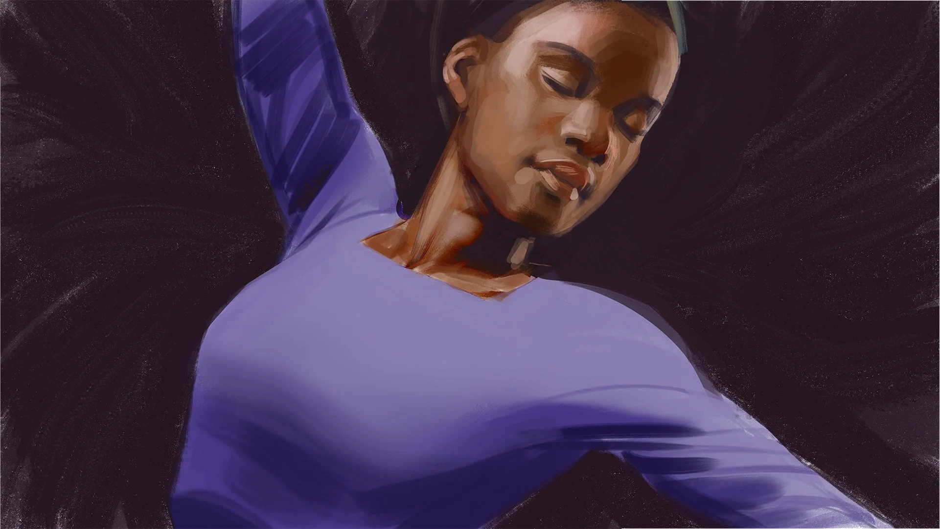
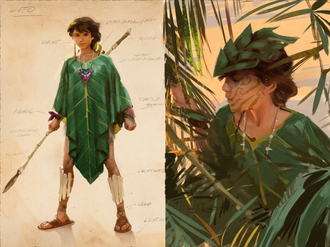
Character design, “Leo,” for unreleased film project. Art by Paul Temple.

Breaking Creative Ruts: Metaphor and Non-Linear Thinking in Visual Development

Paul Temple March 9, 2026

Directors and producers often come to me when their project feels stuck. The script is solid, but the visuals fall flat. They need storyboards that bring fresh energy, something that surprises even them. In my experience as a storyboard artist, the best way out of that rut is through metaphor and non-linear jumps. It is about shaking up what you think you know and letting the drawing lead to unexpected places.

I have seen it time and again on indie films and commercial pitches. You start with a clear idea, like a character in a helmet for a sci-fi sequence, but the designs keep coming out generic. So instead of forcing another helmet sketch, I ask: what if that helmet was a big floppy glove instead? That switch pulls you away from bias and opens doors to ideas you never saw coming. Suddenly, the glove's folds inspire new textures for the helmet, or its looseness suggests vulnerability in the character. The point is not the glove. It is the detour that refreshes your thinking.

Why Preconceptions Block the Best Ideas

We all carry biases into our work. As artists, we draw from what we have seen before: movies, ads, other designs. That familiarity can trap you. In visual development for film, those preconceptions make every frame predictable. A hero's entrance looks like every other hero's entrance. A chase scene follows the same beats.

Non-linear thinking breaks that cycle. It means stepping sideways instead of forward. If I am boarding a tense confrontation, I might imagine the characters as animals first. What if the antagonist is a coiled snake and the protagonist a cornered bird? That metaphor shifts the blocking: the snake circles low, the bird perches high but trapped. When I translate it back to humans, the scene gains new tension without changing the script.

The Power of Unexpected Switches in Drawing

Getting out of a rut often starts right on the page. You are stuck on a detail, say a character's outfit for a fantasy film. Instead of refining the same armor over and over, do something else within the drawing. Swap it out for the absurd. Put a teapot on the warrior's shoulders or turn the sword into a feather. It sounds silly, but that playfulness exposes what is not working.

The unexpected element forces you to question assumptions. Why does the armor need to be heavy and metallic? Maybe it could borrow the teapot's curves for better flow in action scenes. Or the feather's lightness inspires a redesign focused on speed over strength. This process pulls you from linear iteration, where you tweak the same idea endlessly, to leaps that reveal better paths.

In storyboard work, this matters because directors need options that feel authentic to the story. On one indie thriller, the villain's mask was coming out too cliché. I switched it to a crumpled paper bag in a quick sketch. The bag's fragility added irony and menace, like the villain was hiding behind something disposable. We did not keep the bag, but it led to a mask with torn, uneven edges that fit the character's instability perfectly.

How Metaphor Reveals What You Did Not Know You Needed

You might not know what your project needs until you try these detours. Linear thinking assumes you have the full picture from the start. But creativity does not work that way. Metaphors act as bridges to hidden ideas. They let you borrow from one world to enrich another.

Think about world-building in pre-production. For a post-apocalyptic film, the environment might start as ruined cities. Apply a metaphor: what if the ruins were overgrown gardens? That shift brings in themes of rebirth amid decay. Suddenly, your storyboards show vines twisting around concrete, light filtering through leaves. The visuals gain depth, and the director sees emotional layers they did not plan.

I use this in my own process constantly. If a scene feels off, I reframe it through a different lens. A dialogue exchange becomes a dance: characters circle each other, advance and retreat. That metaphor informs the blocking and camera angles, making the tension visual before words hit. Producers appreciate it because it turns abstract script notes into concrete, filmable moments.

The Limits of AI in Creative Exploration

Tools like AI can generate designs fast, but they stick to what you ask for. Tell it "give me a helmet design," and you get helmets. Variations on the same theme, pulled from existing data. It will never surprise you with a floppy glove on the head because it follows patterns, not intuition.

That is the problem with automating this process. AI lacks the human spark for non-linear jumps. It cannot question its own biases or play with absurdity to find truth. In visual development, those surprises are where breakthroughs happen. You end up with generic output if you rely on it alone, because it mirrors back your preconceptions without challenging them.

I have experimented with AI for initial ideas, but it always needs the human touch. On a recent pitch, AI spat out standard spaceship interiors. Boring corridors and consoles. I took those and applied metaphors: what if the ship was a beating heart? Chambers pulsing, wires like veins. That human twist made the boards unique and sold the concept to the agency.

Directors who hire storyboard artists are not just buying drawings. They are buying that ability to detour and discover. AI might speed up rendering, but it cannot automate the insight that comes from trying the unexpected.

Building Non-Linear Habits in Your Workflow

To make this part of your routine, start small. In thumbnail sketches, force one wild variation per idea. If you are designing a prop, replace it with an unrelated object and see what sticks. For storyboards, pick a metaphor from outside the genre: a horror scene as a comedy routine, or a romance as a battle.

Practice helps. I keep a sketchbook for these experiments. No pressure, just play. Over time, it trains your brain to spot biases and leap past them. In pre-production meetings, share these detours with the team. A producer might laugh at the floppy glove, but it sparks discussions that refine the final vision.

On film sets, this thinking saves time too. If a location does not match the boards, improvise with metaphors. What if the room was a cage instead of a home? Adjust angles to emphasize confinement. The crew adapts faster when the core idea is flexible.

Overcoming Resistance to the Unexpected

Some resist this approach because it feels inefficient. Why draw a glove when you need a helmet? But linear paths often lead to dead ends. The detour might take an hour, but it unlocks days of better work. In competitive fields like advertising, that edge matters. Agencies want campaigns that surprise audiences, not recycle tropes.

Indie filmmakers benefit most. With limited budgets, fresh visuals stretch resources. A metaphorical twist turns a simple set into something cinematic. Directors tell me these ideas make their films stand out at festivals.

Tying It Back to Cinematic Truth

At its core, this is about truth in storytelling. Metaphors and non-linear thinking strip away the obvious to reveal what feels real. A character's helmet is not just protection; it is a symbol of their world. By exploring absurd alternatives, you find the design that resonates.

In my boards, every frame aims for that honesty. Whether it is a commercial spot or a feature sequence, the visuals must serve the emotion. Non-linear detours ensure they do, by breaking free of what everyone expects.

Wrapping It Up

Creative ruts happen to everyone in film and visual development. But metaphor and non-linear thinking offer a reliable way out. They challenge biases, spark surprises, and lead to stronger ideas that AI alone cannot touch. When your project needs that fresh perspective, these tools keep the work alive and true.

If you are directing or producing something and want storyboards that go beyond the expected, reach out. We can explore metaphors that fit your story and bring it to life visually.

📩 Reach out: paul@paultemplestudios.com
🎨 Explore more: paultemplestudios.com

Want more blog posts on this topic?
1. Breathing Life Into Your Characters: The Importance of Good Character Design
2.
How Classical Painting Shaped Modern Filmmaking
3.
Color Theory, Craft, and the Human Eye

In AI, Concept Art, Film, Storyboards
Comment

Camera Movement in Static Boards: Conveying Motion and Energy Without Animation
Paul Temple March 2, 2026

In every project I board, the real challenge is the same: turning a stack of static panels into something that reads with real cinematic energy. Modern pre-production does not always have the budget or time for full animatics, especially on indie features or tight commercial schedules. So the boards have to carry the weight. They need to sell the dolly push, the tracking shot, the handheld tension, or the slow crane reveal using nothing but pencil, perspective, and composition.

The trick is not to fake animation. It is to give the reader, the director, the producer, the DP, the same sense of rhythm and energy they will feel when the camera actually moves. When I get that right, the sequence reads like it is already in motion, even pinned up on a wall or scrolled through on a tablet.

Perspective and Foreshortening: Making Space Feel Like It Is Changing

Camera movement changes how we experience space. A dolly in brings us closer, enlarges the subject, compresses the background. A pull-back opens everything up and makes the character feel smaller in the world. In static boards, we recreate that shift by controlling scale and depth across panels.

For a slow push in on a moment of realization, I will start with a wider frame where the character sits comfortably in the environment. Then, in the next panels, the figure grows larger, filling more of the frame. Foreground elements, a hand reaching out, the edge of a table, get exaggerated in size and foreshortening so they seem to come toward the viewer. Background details drop away or soften, mimicking shallow depth of field. The progression feels like forward motion because our eyes naturally follow the increasing scale and the converging perspective lines.

The reverse works for pull-outs. The character shrinks panel by panel, the environment expands, and perspective lines open outward. I used this approach in an indie drama where a man walks away from a confrontation. By the final panel he was tiny against a wide, empty street, and the director immediately felt the emotional distance without me having to explain it.

Line Flow and Directional Thrust: Guiding the Eye Through Movement

Our eyes follow strong lines and directional forces. That is why aligning key elements along a path can imply a pan or track so convincingly.

If the director wants a left-to-right reveal, maybe a new character stepping into frame during an argument, I draw architecture, shadows, or a road that sweeps across the panel from left to right. The action peaks on the right side so the eye lands there naturally. For faster movement, like someone running, I lean the figure into the direction of travel, push hair or clothing back slightly, and let trailing edges blur just enough to suggest speed. Nothing cartoonish, just confident lines that carry momentum.

Handheld energy is different. I introduce a little instability: tilt the horizon a couple of degrees, offset the subject so they are not perfectly centered, vary line weight to create subtle jitter in the background. In one thriller sequence I boarded, the chase felt urgent because each panel had the character leaning slightly out of frame, as if the operator was scrambling to keep them in shot. The composition felt alive and unsteady, even though every drawing was still.

Dynamic Angles: Using Height and Tilt to Sell Kinetic Force

Angle choices do a lot of heavy lifting. A low angle looking up makes a subject loom and advance, perfect for implying a forward track or a crane rising beneath them. High angles pull us back and make the world feel bigger, which works well for reveals or moments of vulnerability.

For dialogue scenes that need subtle life, I will shift angles gradually across panels, starting eye-level, then dropping a bit lower or arcing slightly higher. It gives the conversation a creeping sense of movement without forcing cuts. Directors pick up on this quickly because it shows the blocking supports the performance instead of fighting it.

Dutch tilts are another tool. A slight lean adds unease or disorientation, suggesting erratic handheld or a character losing balance. I do not overuse them, but when the story calls for tension, even a five-degree cant changes how the frame reads.

Annotations and Arrows: Helpful, But Not the Star

I do use arrows and notes, "slow dolly in," "track right to CU," "handheld follow," but they are there to confirm what the drawing is already saying. If the perspective, line flow, and angles are not selling the motion, no amount of arrows will fix it. The best boards let the director feel the camera move instinctively as they scan the sequence. Notes just make sure everyone is on the same page when it comes time to shoot.

Why This Matters on Indie and Commercial Projects

A lot of the projects I work on do not have room for expensive pre-vis. When that is the case, boards that imply motion become the difference between a clear plan and a shoot full of surprises. They help location scouts understand what space is actually needed, let the DP see lighting continuity across moves, and give producers confidence that the energy will translate to screen.

In commercials especially, clients want to feel the spot's pace before we ever roll camera. A well-drawn tracking reveal around a product or a dolly in on a key emotional beat can seal the deal faster than a mood board or script notes alone.

What to Avoid: The Things That Flatten Energy

Static posing is the biggest killer. If every character stands centered and squared to camera panel after panel, even a dynamic track will feel lifeless. Rotate torsos, shift weight, vary eye lines. Panel-to-panel progression matters too. If each frame feels like its own isolated illustration, the sequence loses rhythm.

Over-rendering is another trap. Tight, polished detail slows the eye down. Rough, confident lines with strong shapes and clear thrust convey speed and life much better. And always tie movement back to purpose: a dolly in is not just cool, it heightens intimacy or forces focus on a revelation. A track follows pursuit or power. Handheld adds realism or anxiety. When the why is clear, the how becomes obvious.

How I Build the Instinct

This comes from years of drawing from life, watching films frame by frame, and sketching thumbnails to test ideas. I will often start a sequence with stick figures and simple arrows just to map the energy, then layer in perspective and gesture. Studying directors like Hitchcock, Fincher, or Cuarón helps too. Their shots are so deliberate that freezing any frame shows exactly how composition implies the next move.

Wrapping It Up

Good storyboards show how it feels to watch the story unfold. When static frames carry dolly, pan, track, handheld, or crane energy through perspective, line, angle, and flow, the whole team begins from the same clear place. The director sees the film they want, the crew understands the plan, and decisions land early so the budget and the schedule stay on track.

If you are working on a project and want boards that bring real cinematic momentum from the first read-through, I would be glad to talk it over. Let us figure out how to make your visuals move before the camera does.

📩 Reach out: paul@paultemplestudios.com
🎨 Explore more: www.paultemplestudios.com

Want more blog posts on this topic?
1. How Shooting Boards Help Indie Filmmakers Compete with Studio Productions
2.
Commercials Are Short Films: Why Storyboards Matter Even More in 30 Seconds
3.
What Filmmakers Want from Shooting Boards: Save Time, Money and Communicate Clearly

Comment

Storyboard from a Pepsi Superbowl ad pitch featuring Steve Martin. Art by Paul Temple.

Gesture Drawing: The Action Behind the Emotion

Paul Temple February 23, 2026

When I first started focusing seriously on gesture drawing, it was because something felt off in my work. The proportions were fine and the anatomy studies were accurate, but the drawings felt posed instead of lived in. That problem shows up quickly in storyboards. You can design a beautiful frame, light it well, and compose it carefully, but if the character’s body does not communicate intention, the scene falls flat. Gesture drawing trains you to see what the body is actually doing, not just what it looks like. At its core, gesture drawing is about capturing the overall action of a pose. Not the muscle groups or costume details or eyelashes, but the action. Every pose has one central movement running through it. A forward drive, a recoil, a twist, a collapse. When you identify that movement first, the drawing holds together. When you ignore it, the figure feels assembled instead of alive. As a professional storyboard artist working in film pre-production, this is something I think about constantly. Before I worry about camera placement or lens choice, I am asking what the character’s body is saying.

The Overall Action Drives the Frame

In figure drawing there is often talk about the line of action. That is not just a technical term. It is the backbone of the pose, a single directional idea that runs through the body and organizes everything else. If a character is grieving, the spine curves forward, the shoulders round, and the head drops as the energy compresses inward. If a character is defiant, the chest opens, the weight settles into the feet, and the head lifts slightly as the energy expands outward. Those physical shifts communicate emotion long before a close-up ever does. When I am boarding a scene for a director, especially in the early stages of visual development, I look for that overall action first. Is the character advancing into the frame or retreating from it? Are they rooted in place or unstable? In cinematic storytelling those decisions shape how an audience feels before dialogue begins. Too often artists approach a pose by outlining parts, building head, torso, arms, and legs like a construction project. Gesture drawing flips that process. You start with movement, then build structure around it. The difference may seem subtle on paper, but on screen it changes everything.

Rhythm, Blocking, and Emotional Weight

Another principle that carries directly from gesture drawing into professional storyboard work is rhythm. If you only trace the outer contour of a body, you might get accuracy, but you lose connection. The human figure is full of opposing curves and counterbalances. One side stretches while the other compresses. The rib cage rotates against the hips. The shoulders tilt in response to weight shifts. When those relationships are understood, the drawing feels cohesive even in a rough state. When they are ignored, the pose feels rigid no matter how polished the rendering is. In storyboard development, especially when collaborating with directors and producers during film pre-production, rhythm keeps frames from feeling static. A well staged scene has visual flow. Characters relate to each other through angle, lean, and direction. If two characters are arguing and both stand upright and squared to camera, the scene reads neutral regardless of what the dialogue says. Shift one character’s weight forward and let the other pull back slightly. Rotate the torso just enough to show tension. Suddenly the emotional dynamic becomes visible. Gesture drawing teaches you to recognize and design those shifts quickly. This is why strong storyboard art does not depend on excessive detail. It depends on confident staging and clear action. Directors looking to hire a storyboard artist are not just looking for someone who can draw. They are looking for someone who understands blocking, performance, and visual storytelling at a structural level.

Emotion is physical before it is verbal. In filmmaking there is often heavy focus on facial performance, subtle eye movement, and micro expressions. Those things matter, but the body usually speaks first. Anxiety raises the shoulders and tightens the neck. Confidence stabilizes the stance and simplifies movement. Grief rounds the back and lowers the head. Even without seeing the face clearly, you can read the emotional truth of a moment if the gesture is honest. This is especially important in wide shots, silhouettes, and action beats where facial nuance disappears. In those situations the storyboard must communicate through posture and weight alone. If the gesture is weak, the emotional beat becomes muddy. If the gesture is committed, the audience understands the moment immediately.

From Gesture Practice to Professional Storyboard Services

Gesture drawing is often practiced in timed sessions, which forces prioritization. You cannot draw everything, so you must decide what matters most. That discipline translates directly into storyboard services during pre-production. Budgets are real and schedules are tight. Endless variation is not helpful. What helps is interpretation and judgment. A professional storyboard artist is not there to generate options without direction, but to interpret the script visually, stage the action, and help the director commit to choices that serve the film. Gesture drawing sharpens that ability because it trains the eye to see the dominant action in a moment and ignore noise. When I am developing storyboards for a feature film, commercial, or pitch, I am constantly reducing complexity to intention. Where is the weight? Who controls the space? Who yields? What is the physical truth of the moment? Those questions matter more than rendering style. Strong gesture leads to strong blocking, and strong blocking supports strong cinematic storytelling.

Blocking is emotional architecture. The physical relationship between characters communicates hierarchy, vulnerability, tension, or intimacy before a single line is delivered. A character who steps confidently into another’s space reads differently than one who hesitates at the edge of the frame. A slight shift in posture can redefine the power dynamic of a scene. In visual development and pre-visualization, these nuances are explored early so that when production begins, the emotional structure is already in place. Gesture drawing strengthens the instinct to see those nuances and to design them intentionally. In an era when images are easy to generate, human judgment still separates frames that feel authentic from those that feel hollow. Software can create polished visuals, but it does not understand weight, hesitation, or resolve in the human body. Gesture drawing builds that understanding over time and keeps the focus where it belongs, on action and meaning rather than surface detail.

If you are directing a project and want to strengthen the physical storytelling in your film, that work starts in development. It starts before cameras roll. It starts with clear, intentional staging built on real human movement. Strong gesture leads to strong boards, and strong boards support stronger films. If you are looking to hire a storyboard artist who approaches visual storytelling through movement, rhythm, and human behavior, I would be glad to talk through your project.

📩 Reach out: paul@paultemplestudios.com
🎨 Explore more: www.paultemplestudios.com

Want more blog posts on this topic?
1. Setting the Emotional Tempo: How Storyboards Shape the Audience’s Experience
2.
Shooting Boards for Action Scenes: Why Every Great Action Scene Starts on Paper
3.
See It Before You Shoot It: The Power of Shooting Boards

In Film, Shooting Boards, Storyboards, Advertising
Comment
← NewerOlder →
 

Search Posts

No results found
 

Featured Blog Posts

Featured
Story Structure and Song Structure: What They Share
October 26, 2026
Story Structure and Song Structure: What They Share
October 26, 2026
Read more →
October 26, 2026
Breaking Creative Ruts: Metaphor and Non-Linear Thinking in Visual Development
March 9, 2026
Breaking Creative Ruts: Metaphor and Non-Linear Thinking in Visual Development
March 9, 2026
Read more →
March 9, 2026
Hiring a Storyboard and VisDev Artist:  A Step by Step Guide for Filmmakers and Directors
January 7, 2026
Hiring a Storyboard and VisDev Artist: A Step by Step Guide for Filmmakers and Directors
January 7, 2026
Read more →
January 7, 2026
Composition and Control: The Cinematic Science Behind a Great Frame
November 3, 2025
Composition and Control: The Cinematic Science Behind a Great Frame
November 3, 2025
Read more →
November 3, 2025
 

Latest Blog Posts

Featured
Story Structure and Song Structure: What They Share
October 26, 2026
Story Structure and Song Structure: What They Share
October 26, 2026
Read more →
October 26, 2026
What Framed Ink Taught Me About Cinematic Composition
September 21, 2026
What Framed Ink Taught Me About Cinematic Composition
September 21, 2026
Read more →
September 21, 2026
Why Classic Literature Matters for Storyboard Artists
September 14, 2026
Why Classic Literature Matters for Storyboard Artists
September 14, 2026
Read more →
September 14, 2026
Don’t Let Your Film Ideas Stay Babies: Grow Them with Real Artists
August 3, 2026
Don’t Let Your Film Ideas Stay Babies: Grow Them with Real Artists
August 3, 2026
Read more →
August 3, 2026
J.C. Leyendecker: Mastery, Craft, and Timeless Visual Storytelling
July 27, 2026
J.C. Leyendecker: Mastery, Craft, and Timeless Visual Storytelling
July 27, 2026
Read more →
July 27, 2026
A Life Well Lived: Why AI Will Never Replace Art in Storytelling
July 21, 2026
A Life Well Lived: Why AI Will Never Replace Art in Storytelling
July 21, 2026
Read more →
July 21, 2026
HerosFarewell_02s.jpg
July 14, 2026
Edgar Payne on Composition: Lessons for Film Work
July 14, 2026
Read more →
July 14, 2026
Why Great Artists Need Interests Outside Their Main Medium
July 6, 2026
Why Great Artists Need Interests Outside Their Main Medium
July 6, 2026
Read more →
July 6, 2026
George Bridgman: The Anatomy Teacher Behind Generations of Artists
June 29, 2026
George Bridgman: The Anatomy Teacher Behind Generations of Artists
June 29, 2026
Read more →
June 29, 2026
Using Screenwriting Structure in Storyboards for Better Films
June 8, 2026
Using Screenwriting Structure in Storyboards for Better Films
June 8, 2026
Read more →
June 8, 2026
 
Behind the Boards: A Blog by Paul Temple

© Paul Temple Studios 2012-2026. All images on this site may not be reproduced in any form, stored, manipulated or used to train generative AI models of any kind without prior written consent from Paul Temple.