• Home
  • Film
  • Stage
  • Advertising
  • Contact
Menu

Paul Temple Studios

  • Home
  • Film
  • Stage
  • Advertising
  • Contact
×
 

Behind the Boards: A Blog by Artist, Paul Temple

Welcome to the blog! Here you'll find insights into the art of storyboarding, concept development, shooting boards, and visual storytelling for film, television, and advertising. From camera planning techniques to the emotional impact of character design, this is where I’ll share my expertise honed over a decade of working with directors and top brands. Whether you're a creative director, filmmaker, or agency looking to elevate your pitch, this blog reveals how powerful visuals drive unforgettable stories.

Questions? Email me at paul@paultemplestudios.com

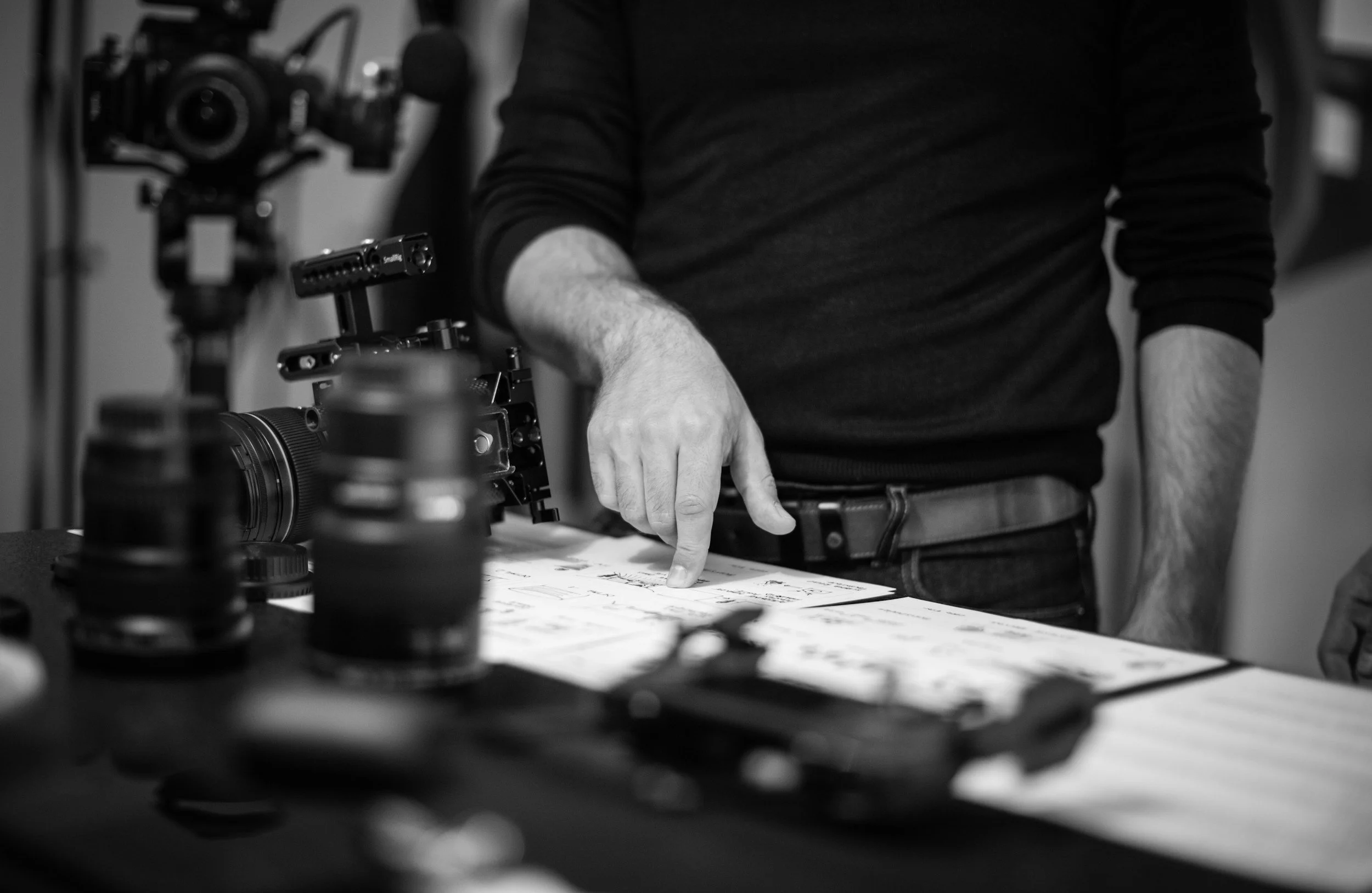
Hiring a Storyboard and VisDev Artist: A Step by Step Guide for Filmmakers and Directors

Paul Temple January 7, 2026

If you have never hired a storyboard artist or visual development artist before, you are not alone. Most directors, producers, and creatives I talk to feel a little unsure the first time. They know they need boards, but they are not always sure what to bring to the table, how detailed things need to be, or what the process actually looks like once the project starts.

This post is meant to take the mystery out of it.

Whether you are developing a feature, a short film, a series, or an independent project, the process of working with me follows a clear structure. My job is to help you translate ideas into visuals that your team and your crew can understand and execute.

Here is what the process typically looks like, from the first conversation to final delivery.

Step One: The Initial Call

Every project starts with a conversation.

This is usually a video call or phone call where we talk through the project at a high level. You do not need everything figured out yet. That is part of what I help with.

During this call, we usually cover:

  • What the project is and where it is in development.

  • The scope of the story or sequence.

  • The type of visual work you think you need.

  • Your timeline and any deadlines that matter.

This conversation sets the foundation. It helps me understand how much guidance you need and where I can add the most value.

Step Two: The Brief

After the initial call, I ask for a brief. This does not need to be overly formal, but it does need to be clear.

A solid brief usually includes:

  • The script or scene breakdown.

  • The number of frames or designs you think you need.

  • Reference images, mood boards, or visual inspiration.

  • Any constraints related to budget, scale, or production realities.

If you do not have all of this yet, that is completely fine. Part of my role is helping you shape the brief into something workable. Many projects begin with loose ideas that need structure before they can move forward visually.

Step Three: Quote and Schedule

Once I understand the scope, I provide a quote and a schedule. This may take a few days depending on the size of the script or material provided.

The quote is based on:

  • Number of frames or designs.

  • Level of finish.

  • Complexity of environments, characters, or action.

  • Timeline expectations.

The schedule outlines:

  • When rough sketches will be delivered.

  • When feedback is due.

  • How many revision rounds are included.

  • When final delivery happens.

This step removes uncertainty. Everyone knows what is being made and when.

Step Four: Rough Sketches

This is where drawing begins.

Rough sketches are not meant to be polished. They exist to solve problems. Composition, staging, camera placement, and story clarity all get worked out here.

At this stage, I am focused on:

  • Readability.

  • Clear visual storytelling.

  • Logical camera flow

  • Making sure the idea works on screen.

This phase moves quickly and is designed to invite discussion. It is far easier to adjust a rough drawing than a finished one.

Step Five: Feedback and Revisions

Feedback is a core part of the process.

Once roughs are delivered, you review them and send notes. These notes may come from a director, producer, or an entire creative team.

I revise based on that feedback, and the process repeats 2 or 3 times until the direction is locked.

This back and forth is where you and I align our visions. The goal isn’t perfection at this point.

Step Six: Refinement and Finish

Once structure and intent are approved, the work moves into refinement.

This phase takes significantly longer than the rough sketch phase. Whether the boards are black and white or color, refinement is where tone, clarity, and craft come together.

Refinement includes:

  • Cleaning up line work.

  • Clarifying lighting and spatial relationships.

  • Strengthening gesture and silhouette.

  • Ensuring consistency from frame to frame.

For color work, this also includes color harmony, light direction, and mood control.

This is the stage where the drawings become reliable tools for production.

Step Seven: Delivery and Payment

Once refinement is complete, you will receive the final files along with an invoice due within 30 days.

At this stage, ownership of the files is fully transferred to you. You are free to use, adapt, or repurpose the artwork as needed across your production, pitch materials, or internal workflows, with no restrictions on usage.

Ready to Move Forward?

You do not need to have everything solved before reaching out. I promise.

What helps most at the start is a clear sense of what you are trying to make, openness to collaboration, and a willingness to give honest feedback as the work evolves.

If something feels confusing during the process, that is often a good sign. Initial sketches have a way of revealing storytelling problems early, when they are still easy to fix. Visual development and storyboards exist to surface those questions long before production pressure sets in.

I help with:

  • Translating scripts into clear visual plans

  • Clarifying tone and visual intent

  • Identifying storytelling problems before production

  • Creating visuals that serve the final film, not just the development stage

You do not need to speak in artistic or technical terms to begin. That is my responsibility. The work starts with understanding your story and shaping visuals that support it.

Art Services Available at Paul Temple Studios

Visual development services may include:

  • Character and creature design

  • Costume and prop exploration

  • Environment studies

  • World building and tonal exploration

These designs help define the visual language of a project early. They give directors and producers something concrete to respond to, refine, and build from as the project takes shape.

Storyboards and shooting boards are used to:

  • Plan sequences

  • Break down action scenes

  • Define blocking and camera movement

  • Give production teams clear visual direction

Shooting boards focus less on polish and more on function. They are designed to communicate how a scene is meant to be captured, helping directors, cinematographers, and crew stay aligned during production.

In both cases, the goal is the same: clarity. When everyone understands the visual intent, production runs more smoothly and creative decisions hold together on screen.

Why This Process Matters

Hiring a storyboard or visual development artist is about removing guesswork. Clear visuals reduce confusion, prevent costly mistakes, and allow teams to communicate efficiently. They shift problem-solving to the page instead of the set, where time and resources are limited.

If you have never hired an artist before, the process should feel collaborative. My role is not to impose a style, but to help strengthen the story and make the path forward clearer for everyone involved. That is the value of thoughtful visual development and storyboards.

If you are developing a film, television project, or pitch and want to talk through how visuals can support your story, let’s set up an initial call! I am always happy to discuss your project and see if working together makes sense.

📩 Reach out: paul@paultemplestudios.com
🎨 Explore more: www.paultemplestudios.com

Other blog posts you might be interested in:
1. Concept Art and Storyboards for Indie Film Crowdfunding
2.
How Shooting Boards Help Indie Filmmakers Compete with Studio Productions
3.
Composition and Control: The Cinematic Science Behind a Great Frame
In Film, Storyboards, Advertising, Shooting Boards
Comment
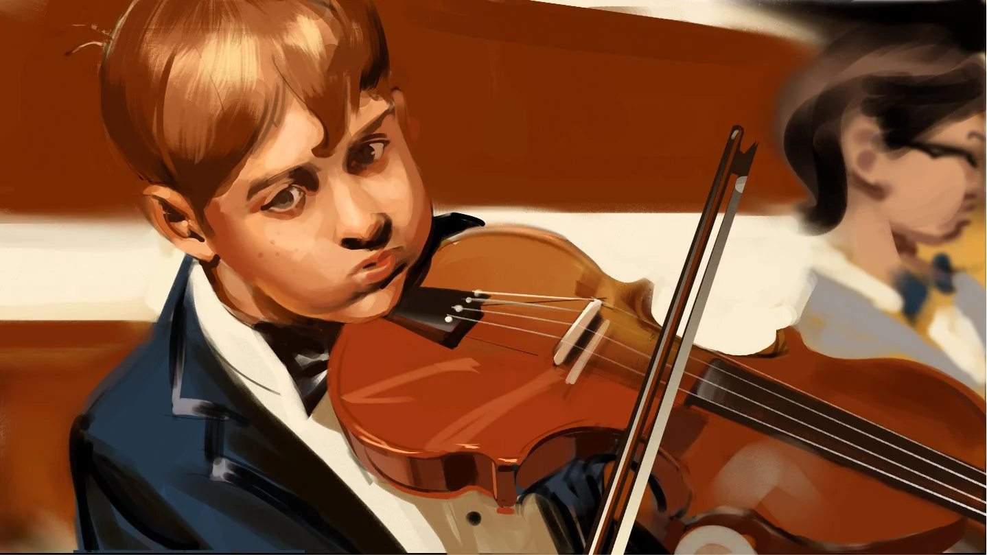
“Beautiful Mess” ad pitch for Infiniti. Art by Paul Temple.

Color Theory, Craft, and the Human Eye

Paul Temple January 6, 2026

Color theory gets quoted constantly. Know the rules before you break the rules. It is good advice, but it often gets misunderstood. Some people treat color theory like a rigid system you must obey at all times. Others dismiss it entirely and rely on instinct alone. Both approaches miss the point.

Color theory is a foundation. It is there to support decisions, not replace them. The moment it becomes a formula you blindly follow, it stops being useful. The moment you ignore it entirely, your work starts to fall apart. The balance lives in understanding why the rules exist, where they came from, and when they no longer serve the story you are trying to tell.

That balance only comes from experience.

Learning Color Through Paint, Not Presets

My understanding of color did not begin in software. It began with paint. Real pigment. Mixing on a palette. Watching colors change as they combine, dry, and sit next to one another over time. Traditional paint teaches you very quickly that color is not theoretical. It is physical.

When you mix pigments, you are dealing with chemistry. Some colors overpower others. Some combinations dull instantly. Some produce harmony you did not expect. You learn restraint because there is no undo button. Every decision carries weight.

That physical process creates an intuitive understanding of color relationships that is hard to fake digitally. Traditional mixing forces cohesion. Pigments contaminate one another in subtle ways. Shadows carry hints of surrounding colors. Highlights are rarely pure. That natural imperfection creates harmony.

Digital color does not behave that way by default.

Digital Color Is Clean, But Not Always Alive

Digital color is based on light, not pigment. RGB values stack neatly. Saturation stays intact. Everything can be isolated and controlled. This is incredibly powerful, but it also removes friction. When friction disappears, so does consequence.

It becomes very easy to create images that are technically correct but emotionally hollow. Clean palettes. Perfect contrast. No sense of atmosphere. No visual memory.

This is why so much digital work relies on film emulation. Grain. Color roll off. Subtle shifts in contrast. These are attempts to bring back the organic behavior that traditional processes naturally create.

For decades, filmmakers and painters have asked the same question. How do I distinguish myself visually. Early on, the answer was simple. Skill. Could you draw. Could you paint. Could you control light and anatomy. That was enough.

As skill became more widespread, distinction shifted to interpretation. Color became a voice. Not just what you painted, but how you saw.

Color Harmony Is Not a Formula

Color harmony is not something you apply at the end of a process. It is something you build from the beginning. It comes from relationships, not rules.

Warm and cool. Saturation and restraint. Value doing most of the work while color supports it quietly. Painters have known this for centuries. Many of the strongest paintings use limited palettes. Not because the artist lacked options, but because they understood control.

Harmony happens when colors feel like they belong to the same world. Traditional paint naturally pushes you in that direction. Digital tools require you to do it consciously.

This is where experience matters. Anyone can pull a palette from an image. Very few people can build one that supports story, mood, and production realities all at once.

Film, Color, and Visual Language

Film inherited its color language from painting. Early cinematography leaned heavily on painters for reference because film stock behaved more like pigment than modern sensors. Exposure mattered. Lighting mattered. Chemistry mattered.

Even today, digital productions chase the look of film. Not because it is nostalgic, but because it feels human. Film responds imperfectly. It compresses highlights. It softens shadows. It introduces variation.

Those imperfections communicate something audiences feel instinctively. Perfect color often feels artificial. Controlled imperfection feels believable.

Color in film is never just about beauty. It is about clarity, tone, and emotional direction. Color tells the viewer how to feel before dialogue ever does.

Knowing When to Break the Rules

This is where the phrase know the rules before you break the rules actually applies. Breaking color theory is not rebellion. It is decision making.

When I push a palette too far warm or too far cold, it is not accidental. I know what realism I am giving up. I know what emotional weight I am adding. That tradeoff is intentional.

A less experienced artist might copy a look. A seasoned artist understands why that look works and when it will fail. That understanding comes from years of observation, painting, correction, and study.

Color theory gives you a language. Experience gives you judgment.

Automation Changes the Landscape, Not the Value

We are in a new shift now. Automation can generate color instantly. Algorithms can analyze palettes, apply grades, and replicate styles. Speed has never been higher.

What automation cannot do is care.

It cannot understand why one scene should feel slightly uncomfortable. It cannot know when clarity matters more than beauty. It cannot weigh emotional context against technical correctness.

A real person brings perspective shaped by taste, memory, and lived experience. When I make color decisions, I am thinking about story flow, production constraints, and audience response at the same time.

That kind of thinking does not come from data. It comes from doing the work.

Color in Visual Development and Storyboarding

In visual development and storyboarding, color is not decoration. It is communication. It helps directors, cinematographers, and crews understand tone quickly. It signals emphasis. It establishes mood and rhythm across sequences.

Good color choices prevent confusion later. They reduce misinterpretation. They save time on set and in post. A well designed palette supports lighting decisions, costume choices, and production design.

This is where hiring the right artist matters.

You are not paying for someone who knows color theory. You are paying for someone who knows when to use it and when to step outside it. Someone who understands how color behaves across mediums, pipelines, and real world conditions.

Why the Human Perspective Is the Value

For a long time, artists distinguished themselves through skill alone. Today, skill is assumed. The real value is perspective.

A human artist brings intention. They bring restraint. They bring judgment shaped by years of studying painting, film, and visual storytelling. That perspective cannot be automated.

Color theory is a tool. Traditional pigments teach harmony. Digital tools offer speed. Film emulation reminds us what imperfection feels like. None of it matters without a person making decisions with purpose.

That is why hiring a good artist still matters.

Not because they follow rules, but because they know when the rules stop serving the story.

That is how I approach color. Not as a system to obey, but as a language to speak clearly, honestly, and with intent.

📩 Contact: paul@paultemplestudios.com
🎨 Explore more: www.paultemplestudios.com

Want more blog posts on this topic?
1. Studying Light: Lessons from the Masters of Painting
2.
From Traditional Painting to Preproduction: How Fine Art Roots Shape Visual Storytelling
3.
How Classical Painting Shaped Modern Filmmaking

Comment
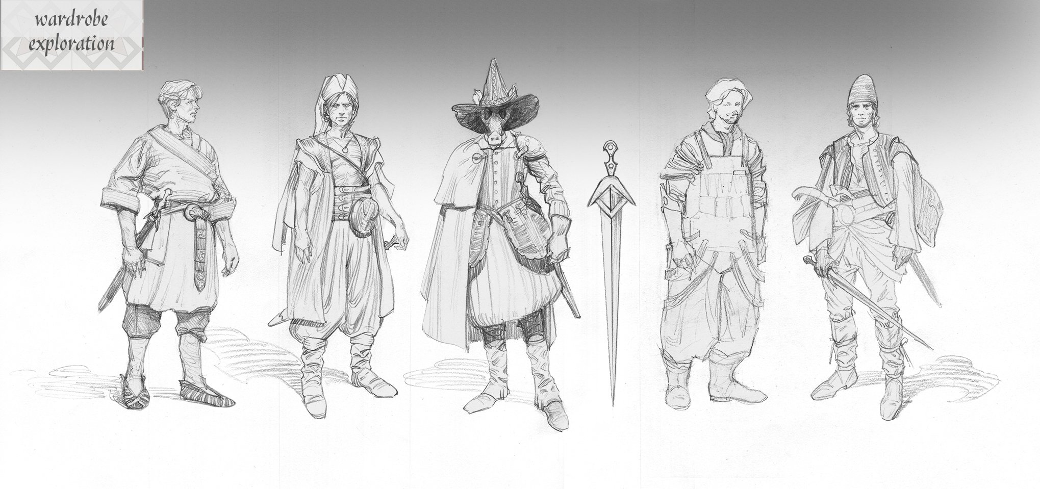
Character design for unannounced fantasy film project. Art by Paul Temple.

Character and clothing design for unannounced fantasy film project. Art by Paul Temple.

The Silhouette Test: Why Character Design Starts with Simple Shapes

Paul Temple December 8, 2025

In my work as a storyboard visdev artist, the first thing I judge in a character design is the silhouette. Before color, before texture, before expression, before costume choices, there is the outline. If a character or an object cannot communicate its identity in a single flat shape, the design is not ready. A strong silhouette is the foundation of visual communication. Everything else is built on top of it.

Filmmakers and artists are often tempted to start decorating too early. Detail feels like craftsmanship. It feels like personality. It feels like labor. But detail does not save a weak design. You can engrave an armor plate with every symbol ever invented and it still will not read as clearly as a shape with a strong, unmistakable outline. A character with a simple but powerful silhouette will stand out every time.

I revisit this principle constantly, not because I enjoy repeating myself, but because it protects productions from confusion later. I was working recently on a fantasy project that required the design of ceremonial masks for an ancient warrior order. The team wanted them to feel powerful, sacred, and visually distinct. I explored various historical influences and sketched detailed versions. When I stepped back and filled them in as solid shapes, many of them looked nearly identical. The attractive details had distracted me from the fact that the core shapes were not pulling their weight.

It did not ruin my week. It was not a dramatic life lesson. It was simply a practical reminder that silhouette always catches the truth. Once I simplified each mask and adjusted the major shapes, everything snapped into place. The masks immediately gained personality and presence. It was a clean example of why I always test silhouette first.

Silhouette works because it is the fastest and clearest way humans read visual information. Our brains identify contrast before texture. We read shapes before faces. We respond to posture before micro expressions. If the silhouette communicates, the viewer understands the scene even before looking at the details.

Here is how I judge a silhouette and why it matters for filmmakers and artists.

Clear Read at a Glance

A silhouette must read instantly. If I blur my eyes, or if I stand back from the frame, the character or action should remain clear. The pose should be readable. The intention should be visible. If the shape is confusing, the pose needs adjustment or the design is overcrowded.

Negative space is one of the best ways to achieve clarity. If a character is holding something, the gap between the arm and the torso must be readable. If a character is walking, you need separation between the limbs so that the stride is obvious. If a character is crouched in fear, their outline should shrink. If a character is confident, their shape should expand.

Even slight adjustments improve the read. Raising an elbow. Angling a shoulder. Leaning the torso forward. Opening the stance. These changes strengthen the silhouette and make the intention obvious.

Unique Identity Through Shape

A strong silhouette helps characters stand apart from one another. If your protagonist, sidekick, mentor, and villain all share roughly the same outline, the visuals lose impact. Good design assigns each character a shape language that belongs to them.

When I develop silhouettes for a lineup, I often render them as pure black cutouts first. If I cannot identify who is who instantly, I refine until I can. The solution may be proportion changes, costume adjustments that change the outline, distinct hair shapes, or stronger posture choices.

The audience should be able to recognize a character even if everything else is removed. That is the standard.

Shape as Storytelling

Silhouette is not just a clarity exercise. It communicates personality on a deeper level.

Round shapes feel friendly. Angular shapes feel dangerous. Tall shapes feel proud. Wide shapes feel grounded. Slanted shapes feel unstable. Small clustered shapes feel anxious. Large open shapes feel confident.

These signals are so intuitive that viewers absorb them without noticing. They feel them instinctively. A good designer takes advantage of that.

The silhouette of the masks from that recent project communicated more about the characters than any embellishment ever could. A tall vertical crest made the warriors feel elevated. A forward tilt made them feel predatory. Carved details helped with worldbuilding but the silhouette carried the meaning.

Silhouette in Motion

A silhouette should hold up not only in still poses but also in action. Motion reveals flaws that static sketches hide. When boarding an action sequence, I test silhouettes throughout the movement. If the outline becomes muddy at any point, the action needs to be rebuilt.

Fight scenes especially rely on clear silhouettes. Good choreography uses readable shapes to guide the viewer through the rhythm of hits, dodges, swings, and impacts. Even in chaotic environments, a clean silhouette lets the audience follow who is doing what and why.

The same applies to quieter motion. A character lifting a cup, slumping into a chair, or turning their head must remain legible. Animation supervisors often say if the silhouette works, the acting works. They are right.

Simplicity First

The fastest way to improve a design is to simplify it. Most artists fall into the trap of decoration. They start adding tiny details long before the big shapes are resolved. That is the equivalent of trying to decide what earrings to wear before choosing a shirt. Details should support design, not compensate for it.

I often start with the simplest version possible. When the silhouette works at a basic level, I add complexity slowly. If a detail breaks the clarity of the outline or distracts from the intention, it does not belong.

This principle is liberating. It frees the designer from clutter. It frees the filmmaker from confusion. It frees the audience from visual noise.

Why Filmmakers Should Care

You do not need to draw professionally to benefit from understanding silhouette. Directors, cinematographers, actors, and production designers all make stronger choices when they think in terms of shape.

Lighting works better with clean silhouettes. Blocking becomes more dynamic. Lens choices become more intentional. A strong silhouette gives the camera something meaningful to work with.

Creature designers, hero designers, and costumers rely on silhouette to define the visual identity of a character long before color swatches or texture samples become relevant. Silhouette is the universal language across the entire pipeline.

Silhouette in Storyboarding

In storyboards, silhouette is often the clearest way to communicate action. I begin many frames with simple shapes. Circles, triangles, rectangles. These give me the gesture before I think about detail. When a frame feels unclear, I reduce it to black and check what is happening.

In quiet scenes, silhouette guides emotional clarity. A lonely character leans into emptiness. A confident character stands tall with broad shape language. A frightened character collapses inward. These choices let the audience understand emotion without dialogue.

In high energy scenes, silhouette is my anchor. Even if the environment explodes, the reader must follow the characters. A strong outline is the fastest solution.

Using Silhouette to Fix Problems

One of the easiest diagnostic tools in visual development is to black out your work. If the silhouette fails, the design needs revision. If the silhouette reads but the details feel off, the design is probably strong but needs refinement. If both read well, the design is complete.

When I used silhouette to refine the fantasy masks, it was a practical correction, not a dramatic revelation. The team liked the final versions because they carried personality even without textures or complexity. That is the power of silhouette. It strips away everything but the truth.

Final Thoughts

Silhouette is the first and most honest test of a design. It reveals clarity, personality, purpose, and identity faster than any other method. It helps directors communicate intent. It helps storyboard artists clarify action. It helps production designers refine characters. It helps the entire pipeline function smoothly.

A character with a strong silhouette will survive any change in lighting, framing, costume, coloring, or detail. They will always read clearly and immediately. They will hold the viewer’s attention.

I always say that detail is the seasoning and silhouette is the meal. You can create a gorgeous design, but if the outline does not say anything, the viewer will forget it the moment the shot changes. If the silhouette is strong, the design will live in the audience’s memory.

Silhouette first. Everything else second. That rule has never failed me, and it keeps my work focused, honest, and clear.

📩 Contact: paul@paultemplestudios.com
🎨 Explore more: www.paultemplestudios.com

Want more blog posts on this topic?
1. Breathing Life Into Your Characters: The Importance of Good Character Design
2.
Carrying the Legacy of Film Illustrators Forward
3.
Concept Art and Storyboards for Indie Film Crowdfunding

In Film, Concept Art
Comment
United Airlines uniform lookbook. Art by Paul Temple.

The Fake Perfect Trap and Why Lived In Art Wins Every Time

Paul Temple December 4, 2025

There is a strange pressure in the creative world today to make everything perfect. Too perfect. I see it in pitches, decks, treatments, previs, even mood boards. I see it in the flood of AI generated images that look polished and impressive at first glance but fall apart the moment you look for any sense of truth. It is a visual language that has been sanded down until it has no fingerprints left. Everything is smooth, clean, perfect, and hollow.

I call it the Fake Perfect Trap. It is the easiest pit to fall into right now because the tools we have are incredibly good at surface level beauty. With one click you can generate a composition that looks expensive. You can create lighting that looks technically correct. You can build sets that are spotless and props that are untouched by time. You can even generate a character with perfect symmetry and skin so flawless it looks like it has never interacted with a real atmosphere.

But none of that feels alive. None of that feels lived in. None of that carries the weight of a person, a room, or a world that existed before the frame.

The trap is that perfect visuals feel impressive for a second but never stay with you. They slide right off the mind. They are empty calories. You remember the shine but not the story. You remember the polish but not the point. Perfection is forgettable because perfection has no tension. It has no struggle. It has no history. Humans are drawn to flaws, age, mistakes, grit, and quiet signs of life. That is where emotional truth lives.

I learned this slowly as an artist, not through a single moment of enlightenment but through years of sitting with paintings, sketching in museums, studying masters, and drawing from life. Every time I go to the Nelson Atkins Museum here in Kansas City, I find myself pulled toward work that has imperfections baked into it. I love paintings where you can still see the underdrawing. I love brushstrokes that were not fully blended. I love little flaws that reveal the hand of the artist. These details feel like evidence that a real person was there, thinking, adjusting, trying to solve the puzzle in front of them.

That lived in quality is what makes great art stick with you. It is also what makes great films stick with you. And it is something the Fake Perfect Trap can never provide.

Filmmaking is full of invisible history. A great scene carries the weight of everything the character has been through before the moment we meet them. A great room looks like someone walked out of it ten seconds ago. A great prop shows the marks of use. A great location feels like generations have moved through it. When everything on screen has a past, the story feels present.

That belief guides everything I do when I storyboard. I am not drawing scenes that exist in a sterile vacuum. I am trying to capture tension, energy, and the messy humanity of a moment. This is where the lived in idea becomes the antidote to the Fake Perfect Trap. You cannot fake life. You have to observe it. You have to pay attention to how light moves across a wall that has been scuffed over time. You have to notice the slump in someone’s shoulders when they are tired. You have to watch how people hold their coffee cups or how objects slowly collect in a corner of a workspace. These details are the vocabulary of real life.

When you study the world closely, you start to understand what actually makes a frame feel honest. Once you understand that, you can decide how to use it in your work. That is the skill AI does not have. AI knows what an image should look like. It does not know why. It does not know how a person feels in a moment. It does not know the taste of struggle. It does not know the weight of loss. It does not know the quiet fear that rises before a big decision. Humans create from lived experience, and that difference is visible no matter how many pixels you polish.

I see a lot of industry conversations that echo this sentiment. Artists are tired of feeling like everything is being flattened by the pursuit of perfection. There is a growing hunger for authenticity, texture, and soul. People are reacting strongly to work that tastes fake because the lack of humanity shows immediately. It is the same reaction you would have if you walked into a beautiful bakery, ordered a perfect pastry, and took a bite only to realize it was flavored with artificial sweetener. The presentation was stunning, but the taste reveals the truth.

That reaction matters. It is the same instinct that tells you when a film frame is honest or when it was built for show. My job as a storyboard artist depends on that instinct. Directors hire me to translate ideas into visuals that feel cinematic, grounded, and emotionally charged. They are not hiring a machine to generate a flawless image. They are hiring a person who observes life and understands how to communicate it. My job is to create frames that help the crew plan, but also to hint at the emotional spine of the scene. A perfect drawing does not do that. A lived in drawing does.

The lived in approach strengthens filmmaking in every stage. It helps actors lock onto the emotional tone. It helps production designers think through the history of a room. It helps cinematographers consider how to use natural imperfections in lighting. It helps directors communicate nuance rather than relying on spectacle. And it helps the entire team avoid the Fake Perfect Trap by grounding decisions in reality rather than aesthetic trends.

This is especially important in a time when AI generated art is everywhere. The speed and convenience of it sets a dangerous expectation that visuals should appear instantly and look flawless from the start. But filmmaking does not work that way. Creativity does not work that way. Real stories are shaped by trial and error, confusion, revisions, and the search for meaning. The process is messy because humans are messy. When you erase that mess, you erase the humanity.

And that is exactly why lived in art resonated long before AI existed. Look at the great directors who build worlds that feel inhabited. Look at the painters who leave evidence of their process. Look at the illustrators who let their lines wander. Look at the films you loved as a kid and ask yourself what you remember. It is rarely the perfect shot. It is usually something imperfect and strangely honest.

I build that same honesty into my boards. Sometimes it is in the looseness of a gesture. Sometimes it is in the rough edges of an environment. Sometimes it is in the posture of a character who looks like they have been on their feet all day. These choices help filmmakers get closer to the emotional truth of their story. They also help avoid the trap of producing scenes that look correct but feel empty.

This is where the lived in mindset becomes practical. If you want your project to feel real, you need to gather real reference. You need to sketch in places that feel alive. You need to watch people in everyday settings. You need to study light in the morning, at noon, and at dusk. You need to look at walls, shoes, streets, and faces. You need to understand the small imperfections that tell you who someone is or what a place has been through. Once you train your eye to see these things, you will be able to put them into your work with intention instead of guessing.

Filmmakers who embrace this approach gain a powerful advantage. A lived in story feels expensive even when the budget is not. A lived in world feels believable even when the set is simple. A lived in performance feels grounded even when the character is fantastical. Audiences can sense authenticity faster than you think, and they reward it every time.

That is why I fight the Fake Perfect Trap with lived in visual storytelling. Perfection is an illusion. Life is not. My work will always sit with the side of life.

If you are a filmmaker trying to build a world that feels honest, or if you want storyboards that bridge concept and emotion, I am always happy to help bring your vision to the screen. My job is to help you communicate clearly and to make your story feel like it has a pulse.

Real stories deserve real art that feels lived in. That is something perfection will never deliver.

📩 Reach out: paul@paultemplestudios.com
🎨 Explore more: www.paultemplestudios.com

Want more blog posts on this topic?
1. The Human Element: Why Observation Still Beats AI in Visual Development
2.
Understanding Context and Subtext: Why Choosing the Right Storyboard Artist Matters
3.
Breathing Life Into Your Characters: The Importance of Good Character Design

In AI, Cinematography
Comment

Shooting boards for unreleased action film project. Art by Paul Temple.

How Shooting Boards Help Indie Filmmakers Compete with Studio Productions

Paul Temple December 2, 2025

If you are an indie filmmaker, you already know the truth. You are fighting an uphill battle before you even step on set. Studio productions have bigger crews, bigger resources, and bigger safety nets. They have entire departments dedicated to making sure every shot lands. They have specialists for previsualization, continuity, lighting, creature effects, background design, and logistics. They even have the budget to fix some mistakes in post.

You do not.

But here is the good news. You do not need to match their resources to compete with them. You need clarity. You need planning. You need a film that feels intentional from the first frame to the last. That is where shooting boards change the game.

I work as a Visual Development and Storyboard Artist, and the filmmakers who get the most out of my work are not the ones with endless money. They are the ones who understand that story begins long before the camera is rolling, and that the fastest way to elevate the final product is to visualize the entire film in a way that guides every department with purpose.

Shooting boards are the tool that let indie filmmakers operate with the confidence and precision of a studio, even when the budget could not be more different.

Let me walk you through how.

You Cannot Afford Confusion on Set

Studios can burn a day fixing a scene that fell apart. Indies cannot. When you only have six hours in a borrowed location, or a narrow window before losing daylight, confusion becomes your most expensive enemy.

A shooting board is the antidote.

When you walk onto set with a clear, panel by panel plan, you know exactly what the scene requires. Actors know where they move. Camera knows what the lens is doing. The DP understands the emotional tone. The art department knows what needs to be in frame and what does not. And everyone knows why the scene is being shot a certain way.

This is not about restricting creativity. It is about directing it. The more prepared you are, the more freedom you have on set to explore alternate ideas. The director who is guessing at the shot list has no freedom at all. They are just scrambling.

When you only have one chance to get something right, clarity becomes a kind of superpower.

Indie Filmmakers Need Visual Planning Even More Than Studios Do

You might assume that shooting boards are a luxury, something that belongs in the world of big franchise films and commercials for the largest brands in the world. The truth is that indies need them even more, because boards fill the gaps where money would usually solve problems.

You cannot afford to build extra sets.
You cannot afford to shoot ten takes of every angle.
You cannot afford to let the crew wander around trying to figure out coverage.

What you can afford is preparation.

I have worked with directors who are operating with half the resources of a typical commercial, and their films still look polished, intentional, and cinematic. It is not because they have secret access to better gear. It is because they know how to think like a large scale production even when they are working out of a garage.

Shooting boards give them the same decision making power that a studio director has. The difference is that they use it with even more discipline.

Your Crew Will Thank You

When a crew knows exactly what the day looks like, morale goes up and mistakes go down. People work faster. Everyone understands the visual goal instead of guessing. Every department can prioritize what actually matters.

The indie sets that fall apart are not the ones with small budgets. They are the ones where the director keeps changing their mind because the shot in their head does not match the space they walked into. When you have a set of shooting boards, you avoid that problem entirely. You have already solved the sequence in advance. Even if you need to adjust for the location, the visual intent stays the same.

A reliable plan is not just good leadership. It saves your film.

Camera Flow Matters More in Indie Cinema

Studios can hide a cluttered sequence with spectacle. Indie filmmakers cannot. You need clean, readable storytelling. You need sequences where the camera guides the viewer with purpose. You need blocking that makes sense. You need compositions that maximize emotion.

I design shooting boards around flow. How one shot moves into the next. How the camera shifts perspective. How the viewer understands geography. How to keep momentum alive. Those decisions are made before anyone shows up on set, because if you wait until the pressure hits, the scene will suffer.

Good boards act like a rehearsal for the entire movie. You walk through the pacing, tension, rhythm, and transitions. You see where the energy spikes or drops. You work out the kinks before they cost you time and money.

The payoff is a film that feels bigger than its budget.

Better Boards Lead to Better Performances

Actors are not mind readers. When a director has a clear visual plan, actors know how to shape the moment. They know the frame they are living in. They know whether the camera will be close enough to read every micro expression or far enough to focus on movement. They know why they are crossing the room or why they deliver a line from a specific angle.

It is incredibly difficult to give a truthful performance when the visual plan is unclear. Boards give actors the context they need to play a scene with confidence.

You might not think of shooting boards as a tool for actors, but I promise you they feel the difference.

Action Scenes Will Always Need Boards

If you are shooting action of any kind, from a simple shove to full on fight choreography, you cannot afford to wing it. Nothing destroys an action scene faster than confusion. Shooting boards let you map out spatial relationships, camera movement, impact beats, eyelines, timing, safety considerations, and emotional pacing.

You make the complicated readable. You make the fast moments clean. You make the geography clear. Even very simple action sequences become dramatically stronger once the plan is on paper.

The truth is that studios are not good at action because of money. They are good at action because they prepare. Indie filmmakers can too.

Boards Prevent Continuity Problems That Can Derail Your Edit

Studio productions have script supervisors, reshoot budgets, and large post teams. Indies often have one editor and a prayer. If you miss a critical angle, or a prop moves without explanation, or an actor’s eyeline jumps between shots, your edit will suffer.

A shooting board functions as a continuity map. When you have the sequence laid out visually, you are far less likely to miss essential information. You know the coverage you need. You know the order of shots. You know what is safe to cut and what is required for rhythm.

The more you solve in pre production, the smoother the edit becomes.

Boards Help You Communicate with Backers and Crew

When an indie filmmaker walks into a room with shooting boards or concept art, they immediately elevate the perception of the project. Suddenly the film feels real. Investors understand the tone. Producers understand the scale. Crew members understand the director’s voice.

People support what they can see. It is that simple.

I have created boards for directors who were securing funding, pitching festival partners, or recruiting department heads. The boards did half the talking for them because everyone could see the story taking shape.

If you want people to trust your vision, show them the vision.

A Skilled Story Artist Is a Creative Partner, Not a Luxury

A lot of indie filmmakers tell me they think story artists are only for big projects. I always tell them the same thing. A story artist is never about scale. It is about clarity. You do not hire someone like me to make your project more expensive. You hire me to make your project stronger.

I am trained in composition, camera language, performance, anatomy, light, color, pacing, and visual storytelling. I think in frames. I help directors translate what they want into something the crew can execute with confidence.

That collaborative relationship is the same whether you are shooting a hundred million dollar film or a personal project with five people and borrowed lights.

The size of the project does not matter. The intent does.

Studios Are Not the Only Ones Allowed to Look Professional

At the end of the day, shooting boards help you compete with studio productions because they give you a clear, controlled film before you even arrive on set. You do not win by matching their resources. You win by matching their discipline.

A well planned shot is free.
A well designed sequence costs nothing.
A well thought out emotional moment requires no additional crew.

What you achieve through planning will always look more expensive than what you achieve through improvisation.

Your film deserves that level of care.

Final Thoughts

I have spent years studying classical art, filmmaking techniques, animation pipelines, and the visual language that makes movies work. All of that knowledge shows up in shooting boards because they sit at the intersection of every discipline.

When you are low budget, that intersection becomes invaluable. Thoughtful boards give you structure, clarity, confidence, and momentum. They help you communicate your vision, guide your crew, protect your schedule, and bring the audience into a world that feels larger than the resources behind it.

If you want your film to compete with studio productions, start with the one thing that costs a fraction of their budget but delivers the same level of intention. Start with shooting boards.

📩 Contact: paul@paultemplestudios.com
🎬 Explore more: www.paultemplestudios.com

Want more blog posts on this topic?
1. See It Before You Shoot It: The Power of Shooting Boards
2.
What Filmmakers Want from Shooting Boards: Save Time, Money and Communicate Clearly
3.
Shooting Boards for Action Scenes: Why Every Great Action Scene Starts on Paper

Comment
← NewerOlder →
 

Search Posts

No results found
 

Featured Blog Posts

Featured
Breaking Creative Ruts: Metaphor and Non-Linear Thinking in Visual Development
March 9, 2026
Breaking Creative Ruts: Metaphor and Non-Linear Thinking in Visual Development
March 9, 2026
Read more →
March 9, 2026
Hiring a Storyboard and VisDev Artist:  A Step by Step Guide for Filmmakers and Directors
January 7, 2026
Hiring a Storyboard and VisDev Artist: A Step by Step Guide for Filmmakers and Directors
January 7, 2026
Read more →
January 7, 2026
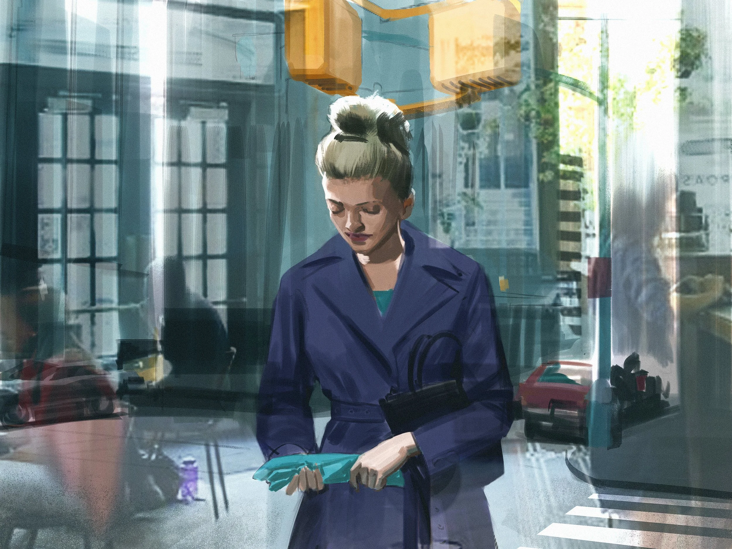
Composition and Control: The Cinematic Science Behind a Great Frame
November 3, 2025
Composition and Control: The Cinematic Science Behind a Great Frame
November 3, 2025
Read more →
November 3, 2025
Concept Art and Storyboards for Indie Film Crowdfunding
September 18, 2025
Concept Art and Storyboards for Indie Film Crowdfunding
September 18, 2025
Read more →
September 18, 2025
 

Latest Blog Posts

Featured
Don’t Let Your Film Ideas Stay Babies: Grow Them with Real Artists
August 3, 2026
Don’t Let Your Film Ideas Stay Babies: Grow Them with Real Artists
August 3, 2026
Read more →
August 3, 2026
J.C. Leyendecker: Mastery, Craft, and Timeless Visual Storytelling
July 27, 2026
J.C. Leyendecker: Mastery, Craft, and Timeless Visual Storytelling
July 27, 2026
Read more →
July 27, 2026
A Life Well Lived: Why AI Will Never Replace Art in Storytelling
July 21, 2026
A Life Well Lived: Why AI Will Never Replace Art in Storytelling
July 21, 2026
Read more →
July 21, 2026
HerosFarewell_02s.jpg
July 14, 2026
Edgar Payne on Composition: Lessons for Film Work
July 14, 2026
Read more →
July 14, 2026
Why Great Artists Need Interests Outside Their Main Medium
July 6, 2026
Why Great Artists Need Interests Outside Their Main Medium
July 6, 2026
Read more →
July 6, 2026
George Bridgman: The Anatomy Teacher Behind Generations of Artists
June 29, 2026
George Bridgman: The Anatomy Teacher Behind Generations of Artists
June 29, 2026
Read more →
June 29, 2026
Using Screenwriting Structure in Storyboards for Better Films
June 8, 2026
Using Screenwriting Structure in Storyboards for Better Films
June 8, 2026
Read more →
June 8, 2026
Learning to Pivot in Pre-Production: Lessons for Directors
May 18, 2026
Learning to Pivot in Pre-Production: Lessons for Directors
May 18, 2026
Read more →
May 18, 2026
Diving Into the Color Charts of Richard Schmid
May 12, 2026
Diving Into the Color Charts of Richard Schmid
May 12, 2026
Read more →
May 12, 2026
Negative Space: The Power of What You Leave Out
April 14, 2026
Negative Space: The Power of What You Leave Out
April 14, 2026
Read more →
April 14, 2026
 
Behind the Boards: A Blog by Paul Temple

© Paul Temple Studios 2012-2026. All images on this site may not be reproduced in any form, stored, manipulated or used to train generative AI models of any kind without prior written consent from Paul Temple.