• Home
  • Film
  • Stage
  • Advertising
  • Contact
Menu

Paul Temple Studios

  • Home
  • Film
  • Stage
  • Advertising
  • Contact
×
 

Behind the Boards: A Blog by Artist, Paul Temple

Welcome to the blog! Here you'll find insights into the art of storyboarding, concept development, shooting boards, and visual storytelling for film, television, and advertising. From camera planning techniques to the emotional impact of character design, this is where I’ll share my expertise honed over a decade of working with directors and top brands. Whether you're a creative director, filmmaker, or agency looking to elevate your pitch, this blog reveals how powerful visuals drive unforgettable stories.

Questions? Email me at paul@paultemplestudios.com

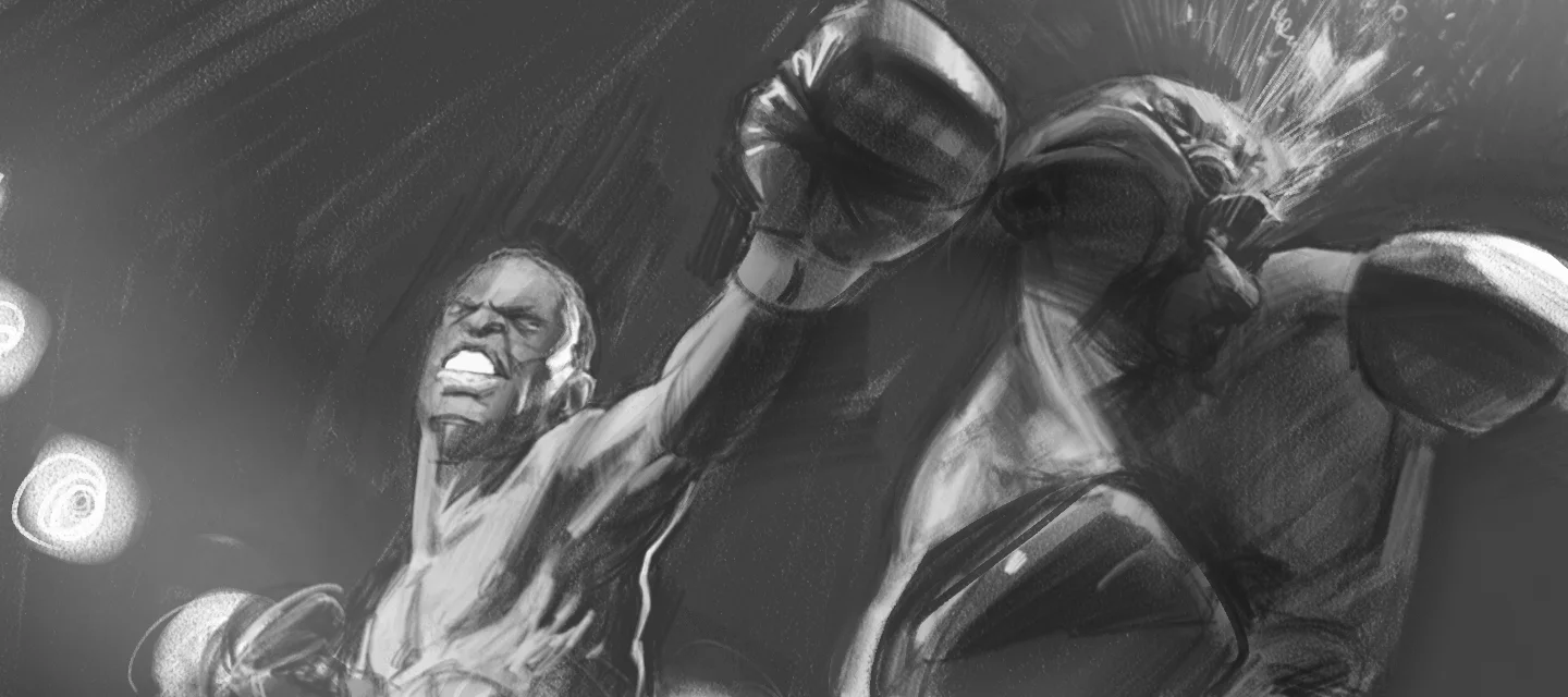
Concept art by Paul Temple.

George Bridgman: The Anatomy Teacher Behind Generations of Artists

Paul Temple June 29, 2026

I keep a few well-worn books on the shelf in my studio that I return to regularly. One of them is George Bridgman’s Constructive Anatomy. The pages are full of notes and dog-ears because Bridgman had a way of explaining the human figure that actually made sense when you were trying to draw it in motion. He was not flashy. He was practical. And that practicality influenced a surprising number of major artists, including Norman Rockwell.

George Bridgman taught at the Art Students League in New York for nearly fifty years. He trained tens of thousands of students, many of whom went on to become working professionals in illustration and fine art. His classes were legendary for their intensity and clarity. He focused on constructive anatomy, teaching students to understand the body as a machine of interlocking forms rather than a collection of surface details. That approach stuck with his students, and it still influences how I think about figure work today.
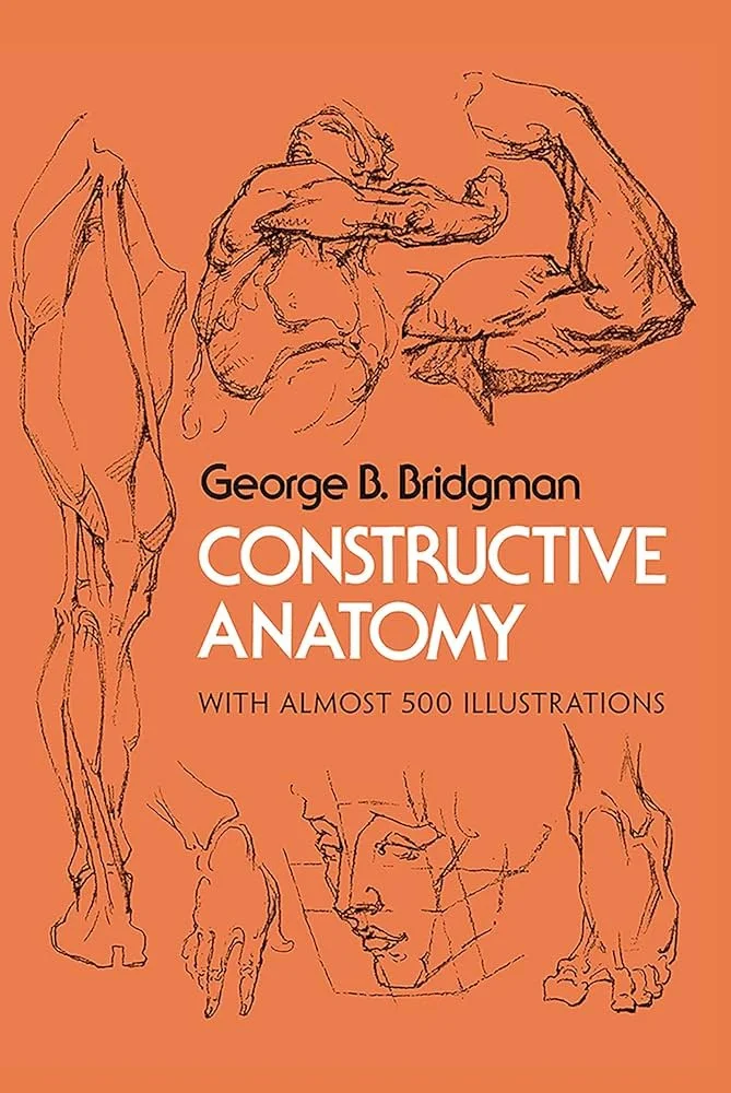
Constructive Anatomy by George Bridgeman.

Bridgman’s Method and Lasting Influence

Bridgman’s books, especially Constructive Anatomy and Bridgman’s Life Drawing, broke the human body down into simple geometric shapes and mechanical principles. He showed how the rib cage wedges into the pelvis, how the shoulder girdle moves independently, and how muscles create visible surface forms when the body twists or bends. He emphasized “wedging” and “passing” forms, ideas that help artists draw convincing figures even from memory or imagination.

Norman Rockwell studied under Bridgman and spoke highly of his teaching. Rockwell credited Bridgman with giving him a rock-solid foundation in anatomy and draftsmanship. You can see that influence in Rockwell’s ability to paint complex, expressive figures that feel completely natural, even in highly narrative scenes. Bridgman gave Rockwell and many others the tools to draw people who looked like they could actually move and breathe.

There is a bit of wit in the fact that Bridgman himself was known as a tough, no-nonsense instructor who sometimes showed up in rumpled suits and kept a skeleton in his locker for dramatic demonstrations. He was not trying to be artistic in the romantic sense. He was trying to teach artists how the body actually works. That straightforward approach produced results that lasted.

Why Bridgman’s Lessons Still Matter in Film Pre-Production

As a storyboard artist and visual development artist working on films, I draw from Bridgman’s ideas almost every day. When you are boarding a scene, you need to understand how a character’s body communicates emotion and intention through posture, weight shift, and gesture. Bridgman’s constructive approach helps me draw figures that feel grounded and alive, even in rough thumbnail form.

Directors often need to see how a performance will read on screen before shooting begins. A character slumping in defeat, leaning forward in anger, or twisting in surprise needs to feel believable. Bridgman’s emphasis on underlying structure lets me show those physical truths quickly and clearly. The boards become more useful to the director because they convey performance, not just poses.

In visual development, the same principles apply when designing characters or environments. Understanding how forms interlock and how the body moves under clothing or armor helps create designs that feel convincing from every angle.
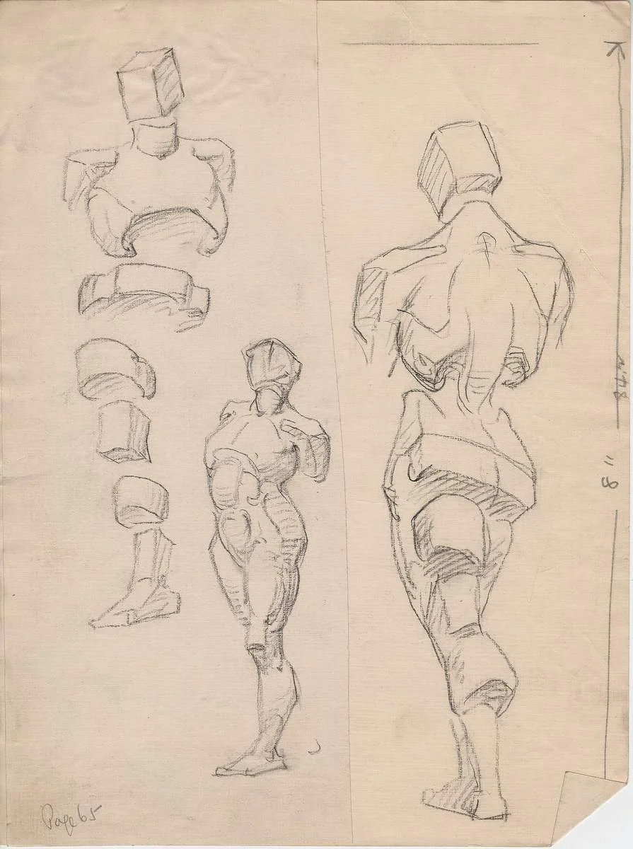
George Bridgeman anatomy sketches.

Practical Application in Storyboarding

When I start boarding a sequence, I often begin with simple Bridgman-style construction. I block in the major forms first (the rib cage, pelvis, and spine) before adding gesture and detail. This keeps the figures consistent across panels and helps maintain clear staging even when the camera angle changes.

It also speeds up revisions. When a director wants to adjust a character’s attitude or blocking, I can make those changes quickly because I understand the underlying mechanics. The structure is already there.

Independent filmmakers especially benefit from this. With limited shooting days, strong boards that show believable performance save time and reduce confusion on set. The crew can see exactly what the director is going for because the anatomy and gesture read clearly.

The Enduring Value of Solid Fundamentals

Bridgman was not interested in artistic trends. He taught fundamentals that have held up for decades. That is why his influence shows up in the work of so many successful artists, including Rockwell, J.C. Leyendecker, and even Jackson Pollock . Solid anatomy and constructive drawing give you freedom. Once you understand the rules, then you can start to break them with purpose.

In film work, that freedom is essential. You need to be able to draw fast, revise fast, and still deliver visuals that feel true. Bridgman’s methods help me do that without sacrificing quality or clarity.

Wrapping It Up

George Bridgman’s teaching and books represent something valuable in an era that sometimes favors speed over substance. His focus on constructive anatomy and clear figure drawing created a foundation that helped artists like Norman Rockwell tell powerful visual stories. That same foundation still serves storyboard artists and visual development professionals working in film today.

If you are directing a film and want storyboards and visual development grounded in strong fundamentals and real understanding of the human figure, I would be glad to talk through your project. We can build boards that support performance, emotion, and story with clarity and efficiency.

📩 Reach out: paul@paultemplestudios.com
🎨 Explore more: www.paultemplestudios.com

Want more blog posts on this topic?
1. From Traditional Painting to Preproduction: How Fine Art Roots Shape Visual Storytelling
2.
How Classical Painting Shaped Modern Filmmaking
3.
Breathing Life Into Your Characters: The Importance of Good Character Design

Comment

Storyboards for Samsung ad pitch. Art by Paul Temple.

Using Screenwriting Structure in Storyboards for Better Films

Paul Temple June 8, 2026

Directors and producers often want to know how deeply their storyboard artist understands story. It is one of the most important factors in whether the visuals will actually serve the script or simply decorate it.

Over the years I have learned that a strong grasp of classic screenwriting structure makes a real difference in the boards I deliver. Two frameworks I return to again and again are the traditional three-act structure and Joseph Campbell’s Hero’s Journey. Understanding these patterns helps me create storyboards and visual development that support the emotional arc instead of fighting against it.

The Classic Three-Act Structure

The three-act structure remains the foundation of most narrative films. It is straightforward but incredibly effective.

Act One is the setup. We meet the protagonist, understand their world, and witness the inciting incident that disrupts their normal life. In storyboards this is where strong establishing shots and character introduction visuals matter most. The goal is to get the audience invested quickly.

Act Two is the confrontation. This is the longest and most challenging section. The hero faces increasing obstacles, makes mistakes, and undergoes real growth. For a storyboard artist, this act requires careful pacing. Some sequences need room to breathe with wider shots and slower visual rhythm. Others demand tighter, more intense framing as the stakes rise and tension builds.

Act Three is the resolution. The hero confronts the central conflict in the climax and reaches some form of transformation. Visually, this section is about payoff. The framing, lighting, and composition should reflect the character’s change and the story’s emotional conclusion.

This structure is not a rigid formula, but it gives a reliable map. When I board a film, I look for these major turning points and make sure the visuals reinforce them. A weak Act Two often appears in boards as repetitive staging or unclear progression. Strong boards help the director see the story’s shape clearly before cameras roll.

The Hero’s Journey

Joseph Campbell’s Hero’s Journey offers another powerful lens. It outlines a universal pattern of transformation: the ordinary world, the call to adventure, crossing the threshold, tests and allies, the ordeal, the reward, and the return with new wisdom.

Many great films follow this pattern to varying degrees. The visual opportunities are significant. The shift from the ordinary world to the special world is a perfect moment for striking visual contrast. The ordeal and resurrection stages often call for powerful silhouettes, dramatic lighting shifts, or careful use of negative space to convey the hero’s internal struggle.

I do not force every script into the full Hero’s Journey template. Some stories benefit from it more than others. But having that framework in mind helps me spot opportunities where visual storytelling can deepen character development and emotional impact.

Why Story Structure Matters for Storyboard Artists

A storyboard artist who does not understand story structure tends to create attractive but disconnected frames. They might make every shot look cool in isolation, but the sequence as a whole feels flat or unclear.

An artist who understands structure makes much more intentional choices. They know when to hold on a character’s reaction, when to pull back to show isolation or scale, and when to use repeating visual motifs to track growth across the film. This knowledge helps identify potential pacing problems early, long before they become expensive issues on set.

For example, on a quiet character-driven film, using three-act thinking helps build a clear visual progression. The opening establishes the protagonist’s constrained ordinary world. The middle section becomes disruptive and full of conflict and growth. The final act shows real transformation through changes in framing, lighting, and composition. Boards built this way help the director and crew see the emotional journey more clearly, leading to stronger decisions during production.

The Advantage for Directors

Hiring a storyboard artist who genuinely understands story structure gives directors several real advantages:

  • Visuals that support the script’s emotional arc

  • Earlier identification of pacing or story problems

  • Clearer communication with the cinematographer, production designer, and crew

  • More efficient use of shooting days because the vision is already tested visually

For independent filmmakers working with limited resources, this is especially valuable. Strong storyboards become an efficient way to test and refine the film’s structure without burning through expensive production time.

Wrapping It Up

Classic screenwriting structures like the three-act format and the Hero’s Journey are practical tools. When a storyboard artist really understands them, the boards become a true partner to the director’s vision.

If you are directing a film and want storyboards and visual development built on solid story understanding, I would be glad to talk through your script. We can break down the structure together and create visuals that support the emotional journey your story needs to take.

📩 Reach out: paul@paultemplestudios.com
🎨 Explore more: www.paultemplestudios.com

Want more blog posts on this topic?
1. Hiring a Storyboard and VisDev Artist: A Step by Step Guide
2.
The Value of a Story Partner in Visual Storytelling
3.
The Grammar of Storyboards: Thinking Like a Story Consultant

In Film, Storyboards
Comment

A single shooting board frame from a Pepsi Zero Sugar Super Bowl ad - featuring Ben Stiller. Art by Paul Temple.

Learning to Pivot in Pre-Production: Lessons for Directors

Paul Temple May 18, 2026

One of the questions I get fairly often from directors and art directors is: “Once the storyboards are approved, how locked in are we? If things change during production, can the storyboard artist actually help us adapt quickly, or are we going to waste a lot of time and money with major revisions?”

It is a smart and practical question. The truth is, storyboards are not final blueprints. They are flexible visual guides. A good storyboard artist plays a key role in helping productions adapt when changes inevitably come. Mistakes, limitations, and unexpected problems are normal parts of the creative process. Whether you are directing a feature film, shooting a commercial, or developing visuals for a campaign, things rarely go exactly according to plan. The difference between good work and great work often comes down to how well you, and your storyboard artist, adapt when reality does not match the original vision.

A Lesson From the Pantheon

A classic example of this happened during the construction of the Pantheon in Rome. The massive granite columns were quarried in Egypt and shipped across the Mediterranean. When they finally arrived, they were shorter than ordered. Emperor Hadrian had a choice: send them back and wait years for replacements, or figure out a way to make them work. He chose to build. The team adjusted the portico design on the spot. The pediment sits a bit lower than originally intended and the proportions are not exactly what was planned. Yet two thousand years later people still travel from around the world to stand in awe of it. The Pantheon is considered one of the most perfect buildings ever constructed, even with the adjustment.

Photo of the Pantheon in Rome.

That story gives me a lot of comfort as a storyboard artist and visual development artist. It reminds me that even the greatest projects deal with unexpected problems. Smart adaptation often leads to something better than the original plan.

In film and advertising pre-production, surprises are basically guaranteed. References do not match the location. Budgets shift. Client notes come in late. Actors change. These things happen on nearly every project.

Adjusting on the Fly in Pre-Production

Early in a project I try to plan as thoroughly as possible, but I always leave room for changes. Client feedback and budget adjustments are a normal part of pre-production, and they often require quick thinking and redraws.

For example, I once boarded a Super Bowl Pepsi Zero Sugar commercial featuring Ben Stiller. The boards were already well along when we got notes that Ben wanted to make sure his “good side” was showing in the shots. That small preference completely changed the blocking and staging of several key scenes. I had to go back and redraw large portions of the shooting boards to accommodate the new angles while still keeping the energy and timing intact. It was honestly pretty cool knowing that Ben Stiller had actually looked at the boards. Making those adjustments felt like an honor, and the final version worked better because of them.

In feature work and other commercial projects, I regularly rework sequences based on client feedback, revised scripts, or new budget realities. What looked strong in the first round of boards sometimes needs a full rethink once practical constraints come in. Those are exactly the moments when experienced visual development and storyboard skills become most valuable. You can explore new options quickly, present clear alternatives, and keep the project moving forward without losing the heart of the story.

Practical Steps When Problems Hit

When something goes sideways in pre-production, here are some practical things I recommend directors and producers do:

  1. Identify what actually matters. Ask yourself: What is the emotional core or main story point of this scene? Protect that first. Everything else is negotiable.

  2. Get the right people in the room quickly. A short call with key decision makers and the storyboard artist can solve problems faster than long email chains.

  3. Ask for options instead of opinions. Request two or three specific versions focused on different solutions. This helps the artist focus effort where it counts.

  4. Try the one change rule. When time or budget is tight, change only one major element at a time, whether it is camera angle, staging, or lighting. Test how the scene holds up before making bigger shifts.

  5. Re-check the full sequence after changes. A fix in one scene can accidentally hurt the flow of the scenes around it.

  6. Document the reason for each adjustment on the boards. This helps the crew understand the thinking when they reach the set.

Turning Problems into Strengths

Some of my favorite finished projects started with big headaches. A limited budget forced simpler compositions that ended up feeling more confident. A last-minute script change opened up a stronger visual metaphor we had not considered before.

The directors and producers who handle these situations best stay calm, keep the emotional goal in sight, and remain willing to let go of their first idea when a better solution appears.

What Directors and Producers Should Look For

When hiring a storyboard artist or visual development partner, look for someone who has been through real production battles. Experience helps them suggest practical solutions fast and communicate changes clearly to the rest of the team. The best pre-production work is flexible enough to bend when needed while still holding the vision together.

Wrapping It Up

Things will go wrong. Columns will arrive the wrong height. Budgets will change. Client notes will shift the plan. That is normal creative life. What matters is how you respond when it happens.

Strong pre-production planning, flexible storyboards, and experienced visual development give you the foundation to adapt confidently. The Pantheon still stands almost two thousand years later because someone knew how to adjust wisely. Your film or commercial can benefit from the same mindset.

If you are directing a project and want a storyboard artist or visual development partner who knows how to roll with the punches and still deliver strong cinematic work, I would be glad to talk through your story. We can build a solid but flexible plan that protects what matters most even when things inevitably change.

📩 Reach out: paul@paultemplestudios.com
🎨 Explore more: www.paultemplestudios.com

Want more blog posts on this topic?
1.
Common Mistakes Directors Avoid with Shooting Boards
2.
Storyboard Revisions: Knowing When to Refine and When to Simplify
3. What Filmmakers Want from Shooting Boards: Save Time, Money and Communicate Clearly

In Film, Shooting Boards, Storyboards, Advertising
Comment

A single storyboard frame from a “Let Go” brand ad pitch - Art by Paul Temple.

Diving Into the Color Charts of Richard Schmid

Paul Temple May 12, 2026

I have a bit of an obsession these days with getting color right. Lately I have been testing new computer monitors because accuracy matters a lot to me when I am working digitally. It has been a surprising headache. Different brands claim excellent color reproduction, but put them side by side and you quickly see they are not on the same page at all. One monitor makes skin tones look too pink, another washes everything out. It reminds me why I still value deep, hands-on color knowledge in my work. That is one reason I keep coming back to the color charts Richard Schmid laid out in his book Alla Prima.

Schmid’s approach to color is one of the most practical and honest systems I have come across. In Alla Prima, he describes a rigorous color chart exercise that forces you to truly understand every pigment on your palette and how it behaves when mixed with every other color. It is not a quick warmup. It is serious work. But the confidence it builds is worth every hour spent mixing.

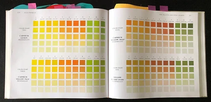
Color charts of Richard Schmid

What the Color Charts Actually Are

In Alla Prima, Schmid recommends creating systematic charts for your chosen palette. You start with full-strength colors and then create value scales by mixing in increasing amounts of white. More importantly, you make “color dominant” charts. For each main color on your palette, you mix it as the dominant hue with every other color in small increments. Then you create value steps for each of those mixtures.

This means painting hundreds of small color swatches in an organized grid. It sounds tedious, and it is. But by the end you have an intimate map of what every combination looks like at different values. You see exactly how a particular red behaves when it meets a blue, or how a yellow changes when mixed with an earth tone. You discover which colors are strong stainers, which ones shift temperature dramatically when lightened, and which mixtures stay clean versus turning muddy.

Why This Exercise Matters to Me

I first dug into Schmid’s Alla Prima years ago in art school. Even though most of my client work is now digital, that foundation carries over every single day. When I am developing concepts or boarding scenes, I need to know how colors will feel under different lighting conditions. The charts trained my eye in a way that no casual mixing ever could.

The beauty of the system is that it removes guesswork. Instead of hoping a color combination will work, you already know what it will do because you have mixed it dozens of times at different values. That kind of knowledge becomes instinctive over time.

Applying Schmid’s Color Thinking to Storyboards and Visual Development

In pre-production for film and TV, color decisions need to be made early. Directors and producers want to see how a sequence will feel emotionally before they commit resources. That is where deep color understanding pays off.

When I create storyboards or concept art, I am not just drawing shapes and values. I am thinking about temperature, saturation, and how colors interact under the key lighting I have planned. Thanks to time spent with Schmid’s methods, I can predict how a warm interior light will affect skin tones against cool window light, or how a desaturated palette will shift the mood of a tense scene.

For advertising work, this knowledge is even more critical. You have very little time to communicate feeling. A well-chosen color harmony can make a thirty-second spot feel premium, comforting, or exciting without extra copy. I often build small color studies during visual development so the agency can see exactly how the palette will support the brand message.

The Practical Payoff on Real Projects

I remember boarding a dramatic scene for an indie feature where the director wanted a sense of unease in a supposedly normal suburban home. Using lessons from color charting, I suggested a palette that stayed mostly cool but included subtle warm accents that felt slightly off. The slight temperature conflict created quiet tension that supported the story. The director responded strongly to the boards because the color choices felt intentional rather than decorative.

In commercial work I use the same thinking. A food client might want their product to look appetizing. Understanding how certain warms behave against neutrals helps me design frames where the food feels inviting instead of flat or artificial. These are not dramatic flashy choices. They are quiet, solid decisions that make the final footage work better.

Color Accuracy in the Digital Age

That brings me back to my monitor situation. I have spent more time than I care to admit calibrating and comparing screens. One monitor might render shadows beautifully but shift reds. Another handles brights well but loses subtlety in mid-tones. It is frustrating because when I am delivering concepts or animated boards, I need the client to see the colors the way I intend them.

This is exactly why foundational color knowledge from something like Schmid’s charts remains so valuable. Technology changes, monitors vary, lighting on set can be unpredictable, but if you understand how pigments and colors fundamentally behave, you can adapt. You make better choices from the beginning instead of hoping post-production will fix problems.

Building Real Color Instinct

The charts teach patience and observation. You cannot rush them if you want accurate results. That same patience helps when I am developing a look for a project. I take time in the early stages to explore color relationships instead of jumping to whatever looks good on the screen at that moment.

For younger artists or directors I work with, I often recommend spending time with systematic color study. It builds confidence that shows up in the work. You stop second-guessing yourself during tight deadlines because you already know what will happen when you mix that particular green with that particular gray.

Wrapping It Up

Richard Schmid’s color charts in Alla Prima are one of the most thorough ways I have found to truly learn your materials. The exercise might feel old-school, but the understanding it delivers is timeless. In visual development and storyboarding, that knowledge helps me deliver work that feels emotionally right and technically solid, whether we are working traditionally, digitally, or somewhere in between.

If you are directing a film, TV project, or commercial and want visual development or storyboards built on thoughtful, confident color choices, I would be glad to talk through your project. We can explore palettes and lighting approaches that serve your story from the very beginning.

📩 Reach out: paul@paultemplestudios.com
🎨 Explore more: www.paultemplestudios.com

Want more blog posts on this topic?
1. Color Theory, Craft, and the Human Eye
2.
Color Temperature in Film & Advertising
3.
How Classical Painting Shaped Modern Filmmaking

In Film, Advertising, Storyboards, Traditional Painting
Comment

Concept art for the “Eden’s Twilight” production by Firelight Creative. Art by Paul Temple.

Negative Space: The Power of What You Leave Out

Paul Temple April 14, 2026

I have a confession. One of the hardest sells I make in this job is convincing people that sometimes the best thing to draw is… nothing.

Creative Directors and Filmmakers often look at my boards and point to the empty areas. “Should we add something there?” they ask. I get it. It feels risky. But after years of boarding scenes for films and commercials, I have learned that some of the strongest moments come from what I deliberately leave out. Negative space is one of my favorite tools in visual development, even if it makes clients nervous at first.

Negative space is simply the empty area around and between your main subjects. It is the big stretch of sky above a lonely character, the long empty hallway behind someone walking away, or the open seat across the table from a person eating dinner alone. That emptiness is not wasted space. It actually does a lot of emotional heavy lifting.

Why Negative Space Feels Scary (But Shouldn’t)

Early in my career I would present clean boards with generous empty space and someone would almost always say the visuals looked “unfinished.” Now I expect it. People are used to seeing busy frames packed with detail. But busy is not always better. Sometimes it just makes everything feel loud and less important.

I have had plenty of moments where I showed two versions of the same scene. One packed with extra props and background details, the other stripped back with more breathing room. Nine times out of ten, the simpler version with real negative space feels more cinematic and emotional. The empty space lets the important stuff stand out and gives the audience room to feel something.

How Negative Space Actually Works in Storytelling

When you give a character a lot of space around them, the audience immediately senses isolation or vulnerability. A small figure in a huge empty frame can make you feel their loneliness without any dialogue. On the flip side, tight negative space between two characters can create intimacy or tension depending on how you use it.

In suspenseful scenes, negative space becomes a great setup tool. If I show a character looking toward a big empty part of the frame, the viewer starts waiting for something bad to happen in that space. The emptiness creates anticipation. It is sneaky and effective.

I also love using it for contrast in sequences. Tight emotional close-ups followed by wide frames full of negative space give the audience a chance to breathe. It creates natural rhythm without fancy camera moves.

Commercials are where negative space really earns its keep. You only have fifteen or thirty seconds. If you try to show everything, the viewer remembers nothing. But if you let the product sit quietly in a well-composed frame with beautiful empty space around it, the whole thing feels more premium and confident.

How I Use It in My Own Boards

When I start a new project, I try to figure out the emotional core of each scene first. Then I decide how much space the subject actually needs. For a quiet, introspective moment I will pull the camera way back and let the character sit in a big empty frame. For an intense confrontation I might crowd the negative space to make it feel claustrophobic.

I am not afraid to be extreme with it either. Some of my favorite boards have a tiny figure in one corner and acres of empty space. It looks almost wrong on the page until you see it in context. Then it feels exactly right.

Common Traps I See

The biggest trap is fear. People worry that empty space will look boring or cheap, especially on lower-budget projects. Ironically, the opposite is usually true. Clutter often makes things feel cheaper because it tries too hard.

Another mistake is using negative space randomly. It has to serve the story. Random emptiness just looks like a mistake. Purposeful emptiness looks intentional and confident.

Why This Matters in Pre-Production

Good negative space decisions made during storyboarding save everyone time and money later. They give the cinematographer clear framing ideas. They help the production designer understand what is actually important in the shot. And for indie filmmakers, it is one of the cheapest ways to make limited locations feel more cinematic.

You do not need massive set builds when smart framing and negative space sell scale and atmosphere.

Wrapping It Up

Negative space took me a while to get confident with, but it has become one of the most useful tools in my kit. It rewards restraint. And it often communicates emotion more honestly than adding more stuff ever could.

If you are directing a project and want storyboards or visual development that use space with purpose instead of filling every inch of the frame, I would be glad to talk it over. Sometimes the most powerful thing you can do is leave room for the audience to feel something.

📩 Reach out: paul@paultemplestudios.com
🎨 Explore more: www.paultemplestudios.com

Want more blog posts on this topic?
1. Composition and Control: The Cinematic Science Behind a Great Frame
2.
Building the Perfect Reveal in Storyboards
3.
Setting the Emotional Tempo: How Storyboards Shape the Audience’s Experience

In Cinematography, Film, Advertising, Storyboards
Comment
← NewerOlder →
 

Search Posts

No results found
 

Featured Blog Posts

Featured
Breaking Creative Ruts: Metaphor and Non-Linear Thinking in Visual Development
March 9, 2026
Breaking Creative Ruts: Metaphor and Non-Linear Thinking in Visual Development
March 9, 2026
Read more →
March 9, 2026
Hiring a Storyboard and VisDev Artist:  A Step by Step Guide for Filmmakers and Directors
January 7, 2026
Hiring a Storyboard and VisDev Artist: A Step by Step Guide for Filmmakers and Directors
January 7, 2026
Read more →
January 7, 2026
Composition and Control: The Cinematic Science Behind a Great Frame
November 3, 2025
Composition and Control: The Cinematic Science Behind a Great Frame
November 3, 2025
Read more →
November 3, 2025
Concept Art and Storyboards for Indie Film Crowdfunding
September 18, 2025
Concept Art and Storyboards for Indie Film Crowdfunding
September 18, 2025
Read more →
September 18, 2025
 

Latest Blog Posts

Featured
Don’t Let Your Film Ideas Stay Babies: Grow Them with Real Artists
August 3, 2026
Don’t Let Your Film Ideas Stay Babies: Grow Them with Real Artists
August 3, 2026
Read more →
August 3, 2026
J.C. Leyendecker: Mastery, Craft, and Timeless Visual Storytelling
July 27, 2026
J.C. Leyendecker: Mastery, Craft, and Timeless Visual Storytelling
July 27, 2026
Read more →
July 27, 2026
A Life Well Lived: Why AI Will Never Replace Art in Storytelling
July 21, 2026
A Life Well Lived: Why AI Will Never Replace Art in Storytelling
July 21, 2026
Read more →
July 21, 2026
HerosFarewell_02s.jpg
July 14, 2026
Edgar Payne on Composition: Lessons for Film Work
July 14, 2026
Read more →
July 14, 2026
Why Great Artists Need Interests Outside Their Main Medium
July 6, 2026
Why Great Artists Need Interests Outside Their Main Medium
July 6, 2026
Read more →
July 6, 2026
George Bridgman: The Anatomy Teacher Behind Generations of Artists
June 29, 2026
George Bridgman: The Anatomy Teacher Behind Generations of Artists
June 29, 2026
Read more →
June 29, 2026
Using Screenwriting Structure in Storyboards for Better Films
June 8, 2026
Using Screenwriting Structure in Storyboards for Better Films
June 8, 2026
Read more →
June 8, 2026
Learning to Pivot in Pre-Production: Lessons for Directors
May 18, 2026
Learning to Pivot in Pre-Production: Lessons for Directors
May 18, 2026
Read more →
May 18, 2026
Diving Into the Color Charts of Richard Schmid
May 12, 2026
Diving Into the Color Charts of Richard Schmid
May 12, 2026
Read more →
May 12, 2026
Negative Space: The Power of What You Leave Out
April 14, 2026
Negative Space: The Power of What You Leave Out
April 14, 2026
Read more →
April 14, 2026
 
Behind the Boards: A Blog by Paul Temple

© Paul Temple Studios 2012-2026. All images on this site may not be reproduced in any form, stored, manipulated or used to train generative AI models of any kind without prior written consent from Paul Temple.