• Home
  • Film
  • Stage
  • Advertising
  • Contact
Menu

Paul Temple Studios

  • Home
  • Film
  • Stage
  • Advertising
  • Contact
×
 

Behind the Boards: A Blog by Artist, Paul Temple

Welcome to the blog! Here you'll find insights into the art of storyboarding, concept development, shooting boards, and visual storytelling for film, television, and advertising. From camera planning techniques to the emotional impact of character design, this is where I’ll share my expertise honed over a decade of working with directors and top brands. Whether you're a creative director, filmmaker, or agency looking to elevate your pitch, this blog reveals how powerful visuals drive unforgettable stories.

Questions? Email me at paul@paultemplestudios.com

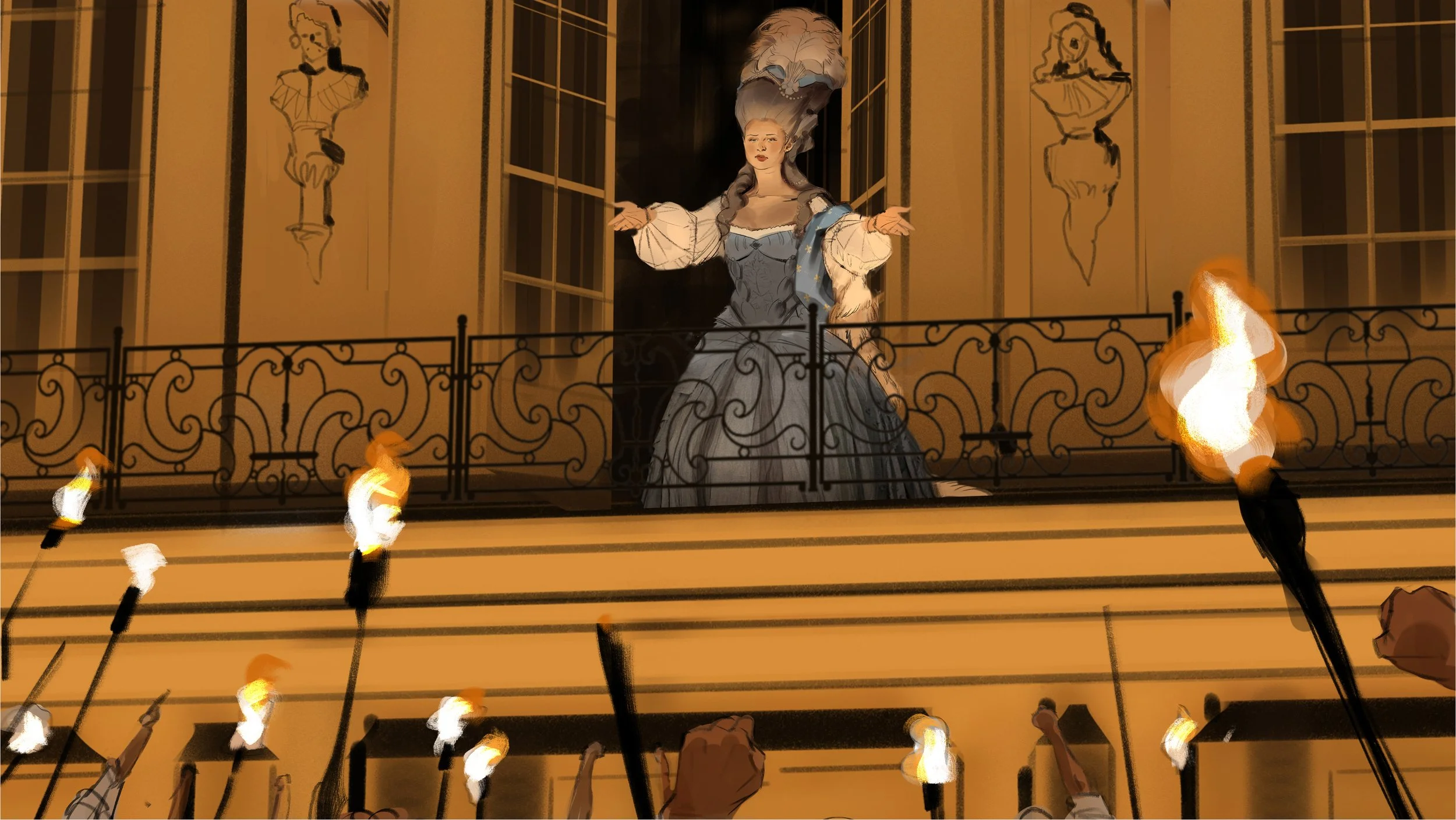
Storyboard from a Progressive Insurance" ad pitch. Art by Paul Temple.

Color Temperature in Film & Advertising

Paul Temple April 6, 2026

I spend a surprising amount of time thinking about light. When I am not boarding scenes for directors or working on visual development, I am often in my art studio testing light bulbs. I have become a bit obsessive about it. I hunt for bulbs that give the most accurate natural illumination possible so my traditional drawings feel true to life. That habit has taught me how deeply color temperature influences mood, and it carries straight into the work I do for film and advertising.

Color temperature is measured in Kelvin. Lower numbers feel warm, like candlelight or sunset, around 2000K to 3500K. Higher numbers feel cool, like overcast sky or daylight, around 5000K to 6500K and up. Warm light leans golden and orange. Cool light leans blue and crisp. These are not just technical choices. They affect how audiences feel before they consciously register why.

Science shows that warm light tends to promote relaxation and positive emotions. It triggers associations with safety, comfort, and connection. Cool light increases alertness and can create feelings of clarity, distance, or tension. Our brains respond to these wavelengths on a biological level. Warm tones stimulate the parasympathetic nervous system, helping people feel calmer. Cool tones engage the sympathetic system more, sharpening focus but sometimes increasing unease when overused.

In filmmaking and advertising, this becomes a powerful storytelling tool right from pre-production.

How Warm Light Influences Emotion

Warm light generally makes scenes feel inviting and human. It softens shadows, compresses space slightly, and makes skin tones look healthier. Audiences tend to relax into it. In a family scene or a heartfelt commercial, warm light helps viewers feel the emotional connection. A golden hour glow around a couple talking quietly can make the moment feel intimate and nostalgic without a single line of extra dialogue.

I see this often when boarding commercials. A warm practical lamp or soft sunset light can turn an ordinary product shot into something that feels desirable and comforting. People do not just see the product. They feel the emotion the brand wants to associate with it.

How Cool Light Shapes Mood and Tension

Cool light does the opposite in a useful way. It expands the sense of space and sharpens detail. It can feel clean, modern, clinical, or isolating. In thrillers or sci-fi, cool moonlight or harsh office fluorescents create that uneasy edge before anything dramatic happens. In advertising, cool tones work well for technology, finance, or healthcare spots where the goal is to project precision and trust.

The contrast between warm and cool is especially effective. Moving a character from warm interior light into cool exterior night air visually signals emotional change. Warm can represent safety or memory. Cool can represent reality, uncertainty, or growth. I try to show these shifts in the boards so the director can feel the progression early.

Personal Research and Why It Matters

Because I spend so much time studying real light in my studio, I have learned how small changes in temperature make big differences on paper and on screen. I test different bulbs constantly, trying to match natural conditions as closely as I can. That hands-on work helps me understand why a scene feels right or wrong even before I finish the drawing.

In pre-production, this translates into clearer boards. Instead of vague notes, I indicate key light sources and their intended temperature. Warm practicals like table lamps or golden windows versus cool overheads or blue-hour exteriors. This gives the cinematographer and producer something concrete to plan around.

For indie filmmakers working with limited resources, planning color temperature early is especially helpful. You may not have a big lighting package, but choosing the right time of day or adding one practical source can reinforce the emotion without expensive fixes later.

Common Mistakes I See

One frequent issue is using temperature without clear purpose. Blanket warm light makes everything feel the same. Blanket cool light can feel flat or depressing. The strongest work shifts temperature intentionally to support the story arc.

Another mistake is ignoring practical light sources. Boards that assume perfect studio lighting often do not translate well to real locations. I always try to ground the temperature in something believable within the scene, whether it is a window, a lamp, or streetlights.

Directors sometimes default to what looks good in reference images instead of what serves the emotional beat. Showing two quick versions of the same panel, one warm and one cool, usually makes the difference obvious.

Putting It to Work in Storyboards

When I create boards or concept art, I block the main light source and note the temperature. This helps everyone on the team visualize the mood before cameras roll. In commercials, where you have only seconds to connect with viewers, getting the temperature right can make or break the spot. In features, it helps maintain emotional consistency across long sequences.

The science is clear. Our bodies respond to these light wavelengths. Warm light tends to calm and connect. Cool light sharpens and separates. When we plan it deliberately in pre-production, the final film or ad feels more intentional and emotionally honest.

Wrapping It Up

Color temperature is one of the most effective tools we have for shaping how an audience feels. Warm versus cool light changes the emotional tone of a scene in ways that go far beyond simple aesthetics. Doing the research and planning it early through thoughtful storyboards and visual development makes a real difference in the final result.

If you are working on a film or advertising project and want boards or visual development that use light with intention and care, I would be glad to talk it over. We can explore how warm and cool temperatures can best support the story you are trying to tell.

📩 Reach out: paul@paultemplestudios.com
🎨 Explore more: www.paultemplestudios.com

Want more blog posts on this topic?
1. Studying Light: Lessons from the Masters of Painting
2.
From Traditional Painting to Preproduction: How Fine Art Roots Shape Visual Storytelling
3.
Color Theory, Craft, and the Human Eye
In Advertising, Film, Storyboards, Concept Art
Comment

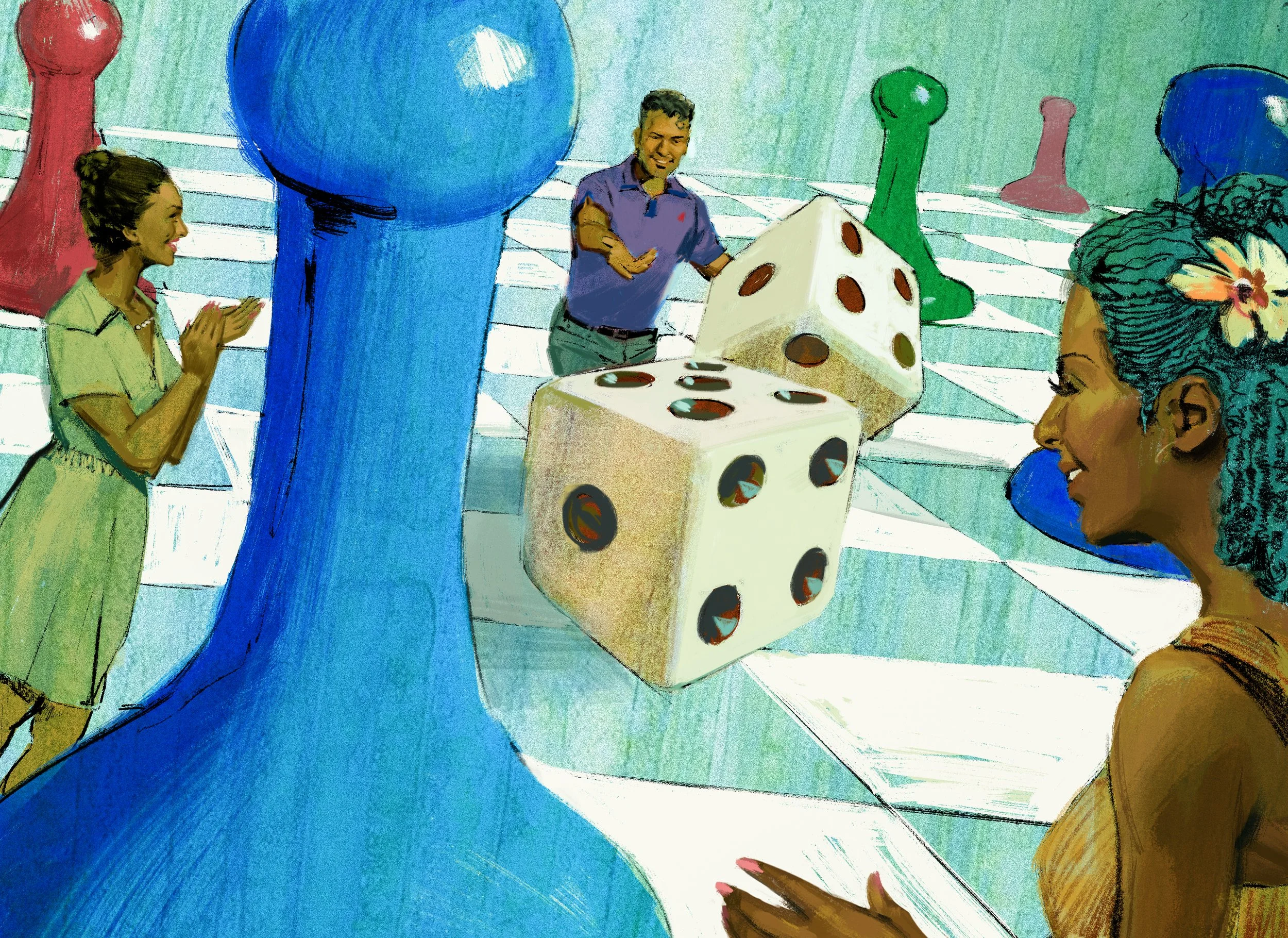
Advertising comp in the style of a Bernie Fuchs 1960’s Magazine illustration. Art by Paul Temple.

Imitation and Originality: Why Your Personal Twist Matters

Paul Temple March 30, 2026

Directors and producers sometimes worry that their visual development will look too much like everything else. They want something fresh that feels specific to their story, but they also want it grounded in what works on screen. The truth is, every strong artistic voice starts with imitation. You study the masters, copy their techniques, and try to match what you see. But perfect imitation never happens, and that is exactly where the value comes from. If every student could copy a master perfectly, art would stay the same for all human history. What you cannot help but change about your work ends up being the most valuable part of it.

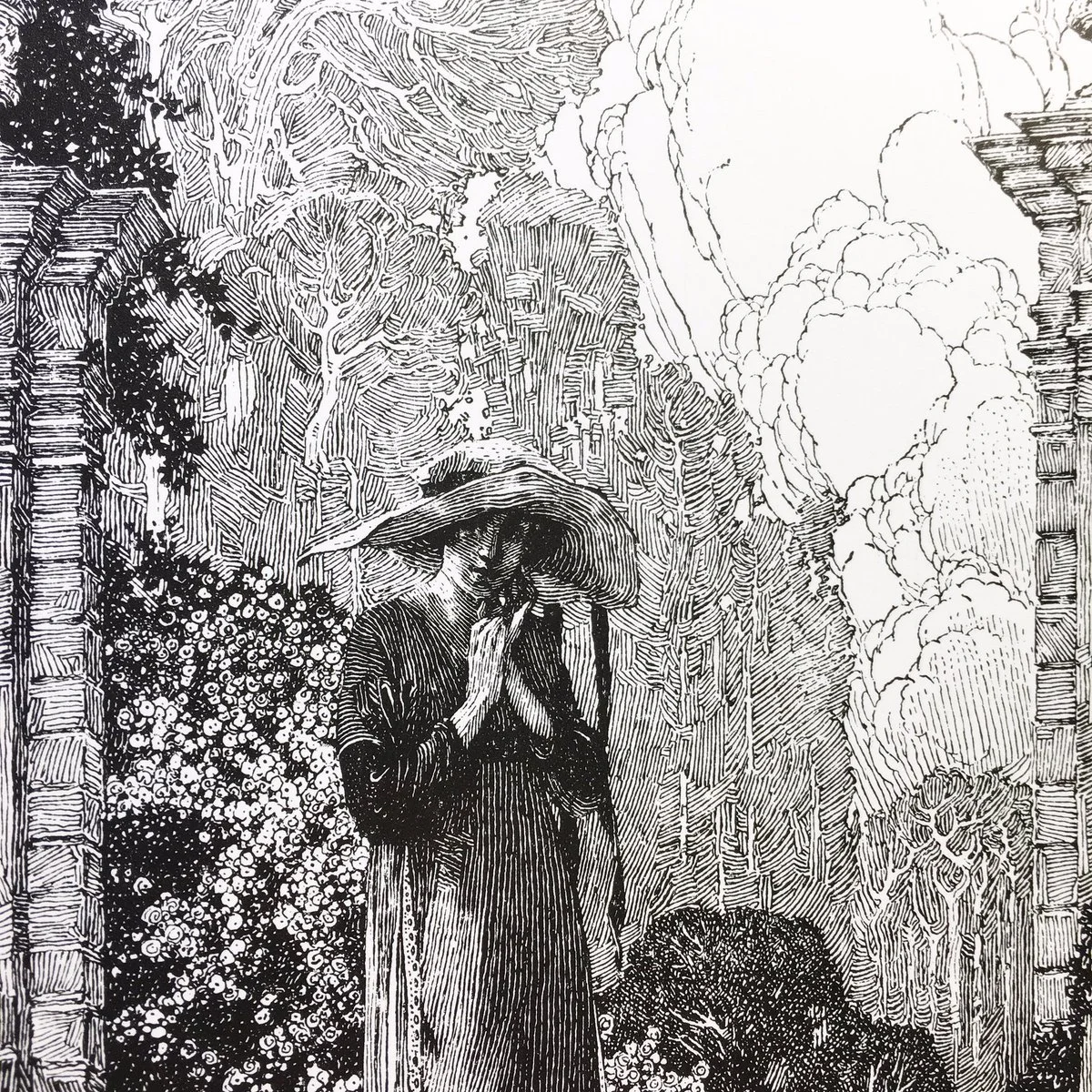
I learned this lesson early in my own career as a storyboard artist, and it shows up every time I sit down to develop visuals for a film or commercial. The example I come back to most often is Franklin Booth, an illustrator from Iowa who became one of the great American pen-and-ink artists in the early twentieth century. Booth taught himself to draw by copying illustrations he found in magazines. He thought those images were straightforward pen-and-ink drawings, so he tried to replicate every line exactly. What he did not realize was that he was actually copying wood engravings. Those prints had been carved into wood blocks, inked, and pressed, creating subtle variations in tone through tiny carved lines. Booth reproduced what he saw with thousands of careful pen strokes, building density and shade by placing lines next to one another. The result was a style that looked like fine etching, full of intricate cross-hatching and dramatic scale contrasts. Large buildings or forests loomed over tiny figures, and classic hand lettering framed the scenes. His work appeared in major magazines like Cosmopolitan, Harper's, and Good Housekeeping from around 1905 to 1935. Contemporaries envied it. No one could match it exactly because it was not a pure copy. It was Booth's misunderstanding turned into something original and beautiful.

Ink drawing by Franklin Booth.

That story stays with me because it shows how imitation becomes creativity when you add your own hand. Booth did not set out to invent a new technique. He was just trying to get it right. His Iowa background, his limited access to original drawings, and his own way of holding the pen changed the result. Those small, unavoidable differences created beauty that no one else could replicate. The same principle applies directly to visual development and storyboarding for film and TV. When directors hire me, they are not paying for someone who can copy a shot list perfectly. They are paying for the personal twist that makes the boards feel alive and specific to their project.

Why Perfect Imitation Would Kill Creativity

If imitation were flawless, every artist who studied the same master would produce identical work. History would repeat itself in every generation. A student copying Caravaggio would end up with the exact same chiaroscuro lighting. Someone studying Spielberg's storyboards would deliver frames that looked exactly like his. There would be no evolution, no surprises, and no reason for audiences to feel anything new. But that never happens. The human hand, the personal eye, and individual life experience always sneak in. You try to copy the master's line weight or camera angle, but your own sense of rhythm or emotional response shifts it slightly. Those shifts are where originality lives.

Learning from the Masters Without Becoming Them

Every serious artist begins by copying. Copying teaches you to see. You slow down and study how a master handles form, light, or rhythm. But perfect copying is impossible and should not be the goal. The gap between the original and your version is where your own voice emerges.

Franklin Booth's story proves this clearly. Self-taught in rural Iowa with no formal training, he had access only to printed magazines. He copied what he saw, line for line, believing he was learning standard drawing technique. Because he was actually copying wood engravings, his pen could not duplicate the mechanical precision exactly. His thousands of fine lines created tonal variations that felt almost three-dimensional, like etching on metal. His dramatic scale extremes and decorative borders reflected his own sense of wonder at nature and space. The result was a distinctive style that illustrators still study today.

In my own process, I do the same with cinematic references. I might study a sequence from Hitchcock or Fincher, copying the blocking or lighting at first. But when I translate it into storyboards for a new project, my understanding of the script takes over. A low angle that worked for suspense in one film might feel wrong here, so I adjust the height slightly. That adjustment is my input. It turns a generic reference into something that serves this particular story.

Applying Imperfect Imitation to Pre-Production

For directors and cinematographers, this idea has practical value in pre-production. When you hire a storyboard artist, share your references as starting points, then trust the artist to interpret. I start by imitating the composition or lighting the director shows me. But as I draw, the specifics of the script and characters force changes. The frame that looked perfect in the reference now needs a different weight shift or light source to match the emotional beat. Those unavoidable changes are what give the boards their real value.

This matters especially for indie filmmakers working with tight budgets. You cannot afford to shoot endless coverage and fix problems in post. Strong pre-production boards that carry a unique voice help everyone see the film clearly from the start. The director gets visuals that feel specific instead of generic. The cinematographer sees lighting and movement ideas that fit the actual locations. The producer knows the plan is efficient because the artist has already solved problems through personal interpretation rather than blind copying.

AI tools try to shortcut this process by blending millions of existing images. But perfect imitation from AI produces work that has no personal twist. It looks like everything else because it copies without the human element that changes things. A storyboard artist brings lived experience and instinct. Those things guarantee the work will differ from the references in valuable ways.

The Value for Filmmakers

Directors who understand this principle get better results. They do not demand exact copies. They share references and trust the artist to bring their own perspective. The boards that come back carry the DNA of great cinema but feel tailored to this project. That is what makes pre-production efficient and helps the final film stand out.

Wrapping It Up

Imitation is the foundation of every artist's training. It teaches you to see and understand light, form, and rhythm. But perfect imitation would mean the end of creativity. What you cannot help but change… the small shifts that come from your own hand and your own life … those are the parts that matter most. Franklin Booth's story proves it. His mistaken copying of wood engravings gave the world a pen-and-ink style that no one else could match. The same truth holds for visual development and storyboards. The most valuable work comes when an artist imitates the masters but cannot help adding their own perspective.

If you are directing or producing a project and want storyboards or visual development that start with proven techniques but end with something original and specific to your story, reach out. We can explore the references together and let the personal interpretation bring the film to life.

📩 Reach out: paul@paultemplestudios.com
🎨 Explore more: www.paultemplestudios.com

Want more blog posts on this topic?
1. The Fake Perfect Trap and Why Lived In Art Wins Every Time
2.
Color Theory, Craft, and the Human Eye
3.
Wisdom In The Work: Bezalel And The Tabernacle

In Film, Storyboards, Traditional Painting, AI, Advertising
Comment

Example of a flat, diagrammable storyboard frame for a Rite Aid ad pitch. Art by Paul Temple.

Avoiding Flat Diagrammatic Staging in Film & Advertising

Paul Temple March 23, 2026

I keep seeing the same thing in recent projects: flat, diagrammatic staging where every face is visible, every gesture is spelled out, and the camera stays back like it's filming a 1950s sitcom. This approach is creeping back into film and advertising, and it is not because audiences suddenly prefer it. It is because too many people in management positions are weighing in, and the result is vanilla that offends no one but excites even fewer. Yes, I said it.

As a storyboard artist who has boarded sequences for indie features and TV, I see this pattern often. A strong idea gets diluted through layers of approval. The most interesting risks get booted because not every stakeholder can agree on them. What remains is functional, agreeable, and forgettable.

What Diagrammatic Staging Looks Like Today

Think of classic multi-camera sitcoms: wide shots, flat lighting, actors positioned frontally so everyone is readable, no deep shadows or bold angles that might hide an expression or create mystery. The camera rarely moves much because multiple operators need to cover the action simultaneously. It was efficient for live audiences and tight schedules.

Modern productions echo this for similar reasons. Sets get lit evenly to avoid noise or hotspots, killing dramatic contrast. Multi-camera or coverage-heavy setups favor static, wide frames that capture the whole scene at once. Studio limitations and fast turnarounds push for predetermined blocking on limited sets. The result is theatrical staging: actors in clear, pre-set positions, high-contrast but flat lighting for sensors, and compositions that prioritize clarity over mood.

Add motion smoothing on TVs, the "soap opera effect," and the look becomes hyper-smooth and artificial. Faces glow, shadows lift, everything centers. It feels like theater captured on video rather than cinema designed for the screen.

In advertising, this shows up as hieroglyphic commercials: every product benefit, every emotion, every character reaction crammed into one frame or quick cut. No subtlety, no trust in the audience to infer. Everything is diagrammed.

The Role of Design by Committee

This flattening often stems from design by committee. When too many decision-makers get involved… executives, clients, producers, focus group feedback…. etc. The vision compromises to satisfy everyone. Risky choices get vetoed because they might not test well or please the room. The process favors consensus over boldness, leading to banality and inconsistency.

In film, big-budget examples show how this plays out: reshoots to soften edges, added scenes to clarify what did not need clarifying, final cuts that feel patched together. The original director's intent gets watered down. In advertising, agency layers and client notes pile up until the spot is safe, polished, but lacks punch.

Pre-production suffers most. Instead of trusting artists to explore and propose, committees demand options that everyone can understand immediately. No room for the unexpected. The boards become diagrams rather than cinematic invitations.

AI and the Echo Chamber Effect

AI tools amplify this. Prompt "group scene in office" and it blends existing images: centered figures, even lighting, frontal poses. It pulls from what it has seen—millions of sitcom frames, stock photos, previous generations—and outputs flat Photoshop versions without originality. It never risks an off-center composition, dramatic shadow, or implied gesture because those are not average patterns in its training data.

AI gives what you ask for, but only within the bounds of the familiar. It cannot invent the bold leap that comes from a human artist observing life, questioning assumptions, or drawing from personal instinct. In visual development, that leap is what separates memorable frames from generic ones.

Trusting the Artist in Pre-Production

Audiences are not stupid. We do not need every face, every expression, every gesture visible at once. Subtlety works: a shoulder turn implies tension, a shadow suggests doubt, an off-screen glance builds mystery. Great cinema trusts viewers to connect the dots.

Strong pre-production planning lets artists build that trust into the boards. A single-camera mindset, even in coverage, allows for specific angles, intentional lighting, dynamic blocking. It creates depth, rhythm, and emotional truth that flat staging cannot.

When I board a scene, I start with the story's core feeling. What does the director want the audience to sense before dialogue starts? From there, I use composition, light, and movement to guide the eye without spelling everything out. Directors and producers who give space for that process get visuals that stand out. The ones bogged down by endless approvals end up with safe, diagrammatic frames that blend into the noise.

Wrapping It Up

The resurgence of diagrammatic, flat staging in film and advertising is a symptom of too many cooks and too little trust in creative vision. It produces work that is clear but lifeless, agreeable but unmemorable. Audiences deserve better: frames that invite them in, challenge them subtly, and reward close watching.

If you are directing or producing a project and want pre-production storyboards or visual development that avoid the committee trap and deliver cinematic truth, reach out. Let's plan visuals that take risks and honor the story from the start.

📩 Reach out: paul@paultemplestudios.com
🎨 Explore more: www.paultemplestudios.com

Want more blog posts on this topic?
1. When Iteration Becomes Overthinking and Hurts Your Story
2.
Breaking Creative Ruts: Metaphor and Non-Linear Thinking in Visual Development
3.
Camera Movement in Static Boards: Conveying Motion and Energy Without Animation

Tags advertising, film
Comment

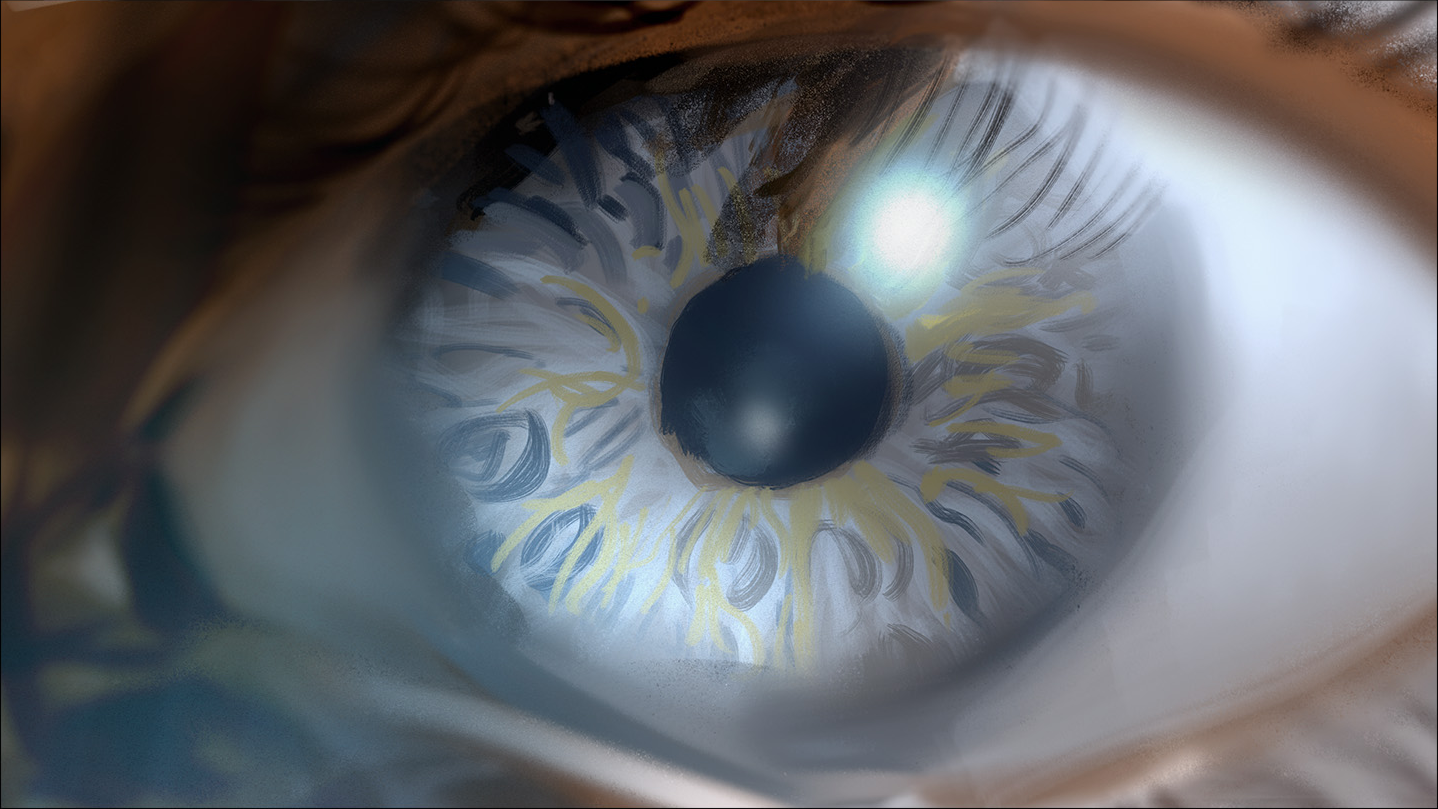
Storyboard frame showing an eye ball. Art by Paul Temple.

Patterns in Nature: Lessons for Cinematic Composition

Paul Temple March 16, 2026

Directors and cinematographers often talk about finding the right visual language for a scene. The script might describe a quiet forest or a chaotic storm, but translating that into frames that feel alive requires more than technical skill. It requires seeing the underlying order in the world around us. Patterns in nature provide that order. They show up everywhere, from the branching of a tree to the spiral of a seashell, and they have shaped how I approach storyboards and visual development for years.

As a storyboard artist working on films, TV, and commercials, I look to these patterns constantly. They guide composition, rhythm, and emotional flow in ways that feel instinctive once you start noticing them. Nature does not design randomly. It builds with efficiency, beauty, and purpose, and those same principles make storyboards more compelling when applied to cinematic frames.

Symmetry and Balance in the Frame

Symmetry appears constantly in nature: reflective in a butterfly's wings, rotational in a flower's petals, or radial in a snowflake. In film, we use symmetry to create calm, order, or emphasis. A centered character against a symmetrical background can convey stability or isolation. But nature rarely uses perfect static symmetry. It favors dynamic balance, where elements feel alive and in motion.

I think of this when blocking a scene. A perfectly centered shot can feel stiff, like a posed photograph. Shift the balance slightly, drawing from the way leaves arrange on a stem or the subtle asymmetry in a face, and the frame gains life. Directors notice this. It makes the audience lean in because the composition breathes.

Spirals and the Golden Proportion

Spirals are one of the most powerful patterns. The logarithmic spiral in a nautilus shell or sunflower seeds follows the golden ratio, roughly 1.618. This proportion appears in plant phyllotaxis, where leaves spiral to maximize light exposure, or in galaxies and hurricanes. Artists have used it for centuries to divide canvases and place key elements for natural harmony.

In storyboards, I apply this when composing key frames. Place a horizon or focal point along golden ratio lines, and the eye moves through the image effortlessly. It creates rhythm in a sequence, guiding the viewer from one panel to the next without force. For a dolly in on a revelation, the spiral can suggest inward focus, mirroring how a fern unfurls. On commercial projects, this proportion helps make product shots feel premium and balanced, even in tight deadlines.

Fractals: Repeating Complexity at Every Scale

Fractals repeat self-similar patterns at different scales: a tree's branches mirror its twigs, a coastline's jagged edges look the same zoomed in or out. Research shows these patterns reduce stress and feel pleasing because our visual system processes them efficiently.

In visual development, fractals inspire layered depth. A wide establishing shot of mountains can echo in the foreground rocks or distant clouds. This creates immersion without clutter. In action sequences, fractal branching can inform crowd movement or debris patterns, making chaos feel organized. Cinematographers respond well to this because it translates to practical lighting and set design: repeating motifs at scale build a cohesive world that feels real.

Branching, Tessellations, and Flow

Branching patterns, like rivers or blood vessels, distribute resources optimally. In film, they appear in blocking: characters diverging from a central path, or visual lines leading the eye through a space. Tessellations, like hexagons in beehives, offer efficiency and strength. They inspire grid-like compositions or repeating elements in backgrounds, from urban skylines to forest canopies.

Waves and flows, seen in sand dunes or ocean currents, guide energy through a scene. I use them for implied motion in static boards: curving lines that sweep across panels mimic camera tracks or emotional arcs.

Faith and the Creator's Handiwork

As someone who draws from observation every day, I cannot help but see these patterns as evidence of intentional design. The same golden ratio that organizes a sunflower seed head structures DNA turns and planetary orbits. The fractal branching in a tree echoes the way rivers carve landscapes or lungs exchange air. It all points to a Creator who delights in beauty and order, declaring His glory through the things He has made. Scripture reminds us that the heavens and earth proclaim this handiwork, even in a fallen world where perfection is marred. For me, studying these patterns is not just technical; it is a way to honor that creative intelligence and bring echoes of it into the stories we tell on screen.

Applying Nature's Patterns to Pre-Production

In practice, this means starting thumbnails with nature in mind. Stuck on a landscape? Sketch tree branches first to find natural flow. Designing a character's environment? Look at honeycomb structures for efficient layouts that feel grounded. These observations sharpen decisions early, so when the director reviews boards, the visuals already carry weight and truth.

Indie filmmakers benefit hugely here. Limited budgets mean every frame must work harder. Nature's patterns provide free inspiration: efficient, timeless, and emotionally resonant. They help turn simple locations into cinematic worlds without expensive builds.

Wrapping It Up

Patterns in nature offer filmmakers a master class in composition, rhythm, and emotional architecture. They show how to build frames that feel inevitable and alive, guiding the eye and the heart. When storyboards draw from these principles, they help directors visualize the film more clearly and make stronger choices before production begins.

If your next project needs visual development or storyboards that capture that natural harmony and cinematic truth, I would be glad to discuss how we can bring it to your script.

📩 Reach out: paul@paultemplestudios.com
🎨 Explore more: paultemplestudios.com

Want more blog posts on this topic?
1. Composition and Control: The Cinematic Science Behind a Great Frame
2.
Color Theory, Craft, and the Human Eye

3.
Studying Light: Lessons from the Masters of Painting

Comment

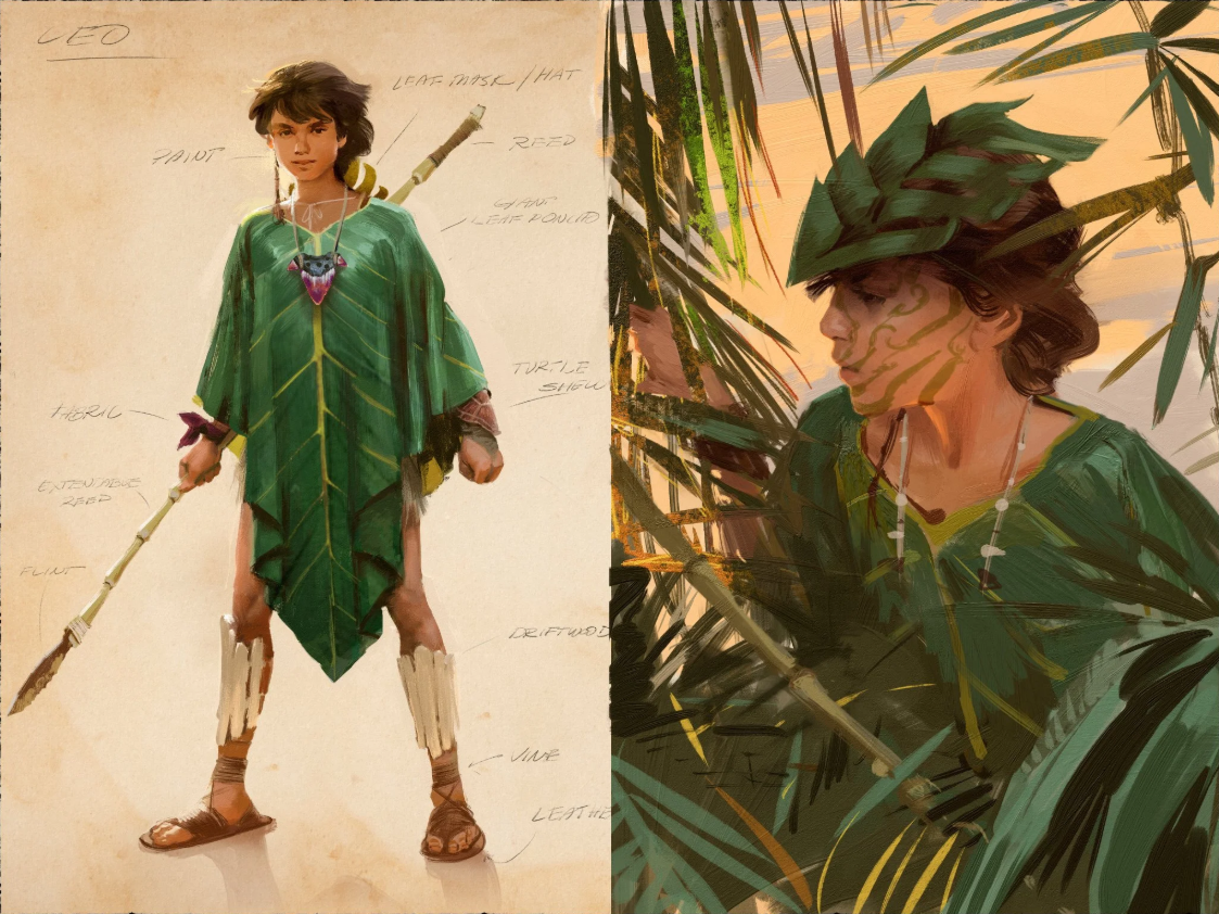
Character design, “Leo,” for unreleased film project. Art by Paul Temple.

Breaking Creative Ruts: Metaphor and Non-Linear Thinking in Visual Development

Paul Temple March 9, 2026

Directors and producers often come to me when their project feels stuck. The script is solid, but the visuals fall flat. They need storyboards that bring fresh energy, something that surprises even them. In my experience as a storyboard artist, the best way out of that rut is through metaphor and non-linear jumps. It is about shaking up what you think you know and letting the drawing lead to unexpected places.

I have seen it time and again on indie films and commercial pitches. You start with a clear idea, like a character in a helmet for a sci-fi sequence, but the designs keep coming out generic. So instead of forcing another helmet sketch, I ask: what if that helmet was a big floppy glove instead? That switch pulls you away from bias and opens doors to ideas you never saw coming. Suddenly, the glove's folds inspire new textures for the helmet, or its looseness suggests vulnerability in the character. The point is not the glove. It is the detour that refreshes your thinking.

Why Preconceptions Block the Best Ideas

We all carry biases into our work. As artists, we draw from what we have seen before: movies, ads, other designs. That familiarity can trap you. In visual development for film, those preconceptions make every frame predictable. A hero's entrance looks like every other hero's entrance. A chase scene follows the same beats.

Non-linear thinking breaks that cycle. It means stepping sideways instead of forward. If I am boarding a tense confrontation, I might imagine the characters as animals first. What if the antagonist is a coiled snake and the protagonist a cornered bird? That metaphor shifts the blocking: the snake circles low, the bird perches high but trapped. When I translate it back to humans, the scene gains new tension without changing the script.

The Power of Unexpected Switches in Drawing

Getting out of a rut often starts right on the page. You are stuck on a detail, say a character's outfit for a fantasy film. Instead of refining the same armor over and over, do something else within the drawing. Swap it out for the absurd. Put a teapot on the warrior's shoulders or turn the sword into a feather. It sounds silly, but that playfulness exposes what is not working.

The unexpected element forces you to question assumptions. Why does the armor need to be heavy and metallic? Maybe it could borrow the teapot's curves for better flow in action scenes. Or the feather's lightness inspires a redesign focused on speed over strength. This process pulls you from linear iteration, where you tweak the same idea endlessly, to leaps that reveal better paths.

In storyboard work, this matters because directors need options that feel authentic to the story. On one indie thriller, the villain's mask was coming out too cliché. I switched it to a crumpled paper bag in a quick sketch. The bag's fragility added irony and menace, like the villain was hiding behind something disposable. We did not keep the bag, but it led to a mask with torn, uneven edges that fit the character's instability perfectly.

How Metaphor Reveals What You Did Not Know You Needed

You might not know what your project needs until you try these detours. Linear thinking assumes you have the full picture from the start. But creativity does not work that way. Metaphors act as bridges to hidden ideas. They let you borrow from one world to enrich another.

Think about world-building in pre-production. For a post-apocalyptic film, the environment might start as ruined cities. Apply a metaphor: what if the ruins were overgrown gardens? That shift brings in themes of rebirth amid decay. Suddenly, your storyboards show vines twisting around concrete, light filtering through leaves. The visuals gain depth, and the director sees emotional layers they did not plan.

I use this in my own process constantly. If a scene feels off, I reframe it through a different lens. A dialogue exchange becomes a dance: characters circle each other, advance and retreat. That metaphor informs the blocking and camera angles, making the tension visual before words hit. Producers appreciate it because it turns abstract script notes into concrete, filmable moments.

The Limits of AI in Creative Exploration

Tools like AI can generate designs fast, but they stick to what you ask for. Tell it "give me a helmet design," and you get helmets. Variations on the same theme, pulled from existing data. It will never surprise you with a floppy glove on the head because it follows patterns, not intuition.

That is the problem with automating this process. AI lacks the human spark for non-linear jumps. It cannot question its own biases or play with absurdity to find truth. In visual development, those surprises are where breakthroughs happen. You end up with generic output if you rely on it alone, because it mirrors back your preconceptions without challenging them.

I have experimented with AI for initial ideas, but it always needs the human touch. On a recent pitch, AI spat out standard spaceship interiors. Boring corridors and consoles. I took those and applied metaphors: what if the ship was a beating heart? Chambers pulsing, wires like veins. That human twist made the boards unique and sold the concept to the agency.

Directors who hire storyboard artists are not just buying drawings. They are buying that ability to detour and discover. AI might speed up rendering, but it cannot automate the insight that comes from trying the unexpected.

Building Non-Linear Habits in Your Workflow

To make this part of your routine, start small. In thumbnail sketches, force one wild variation per idea. If you are designing a prop, replace it with an unrelated object and see what sticks. For storyboards, pick a metaphor from outside the genre: a horror scene as a comedy routine, or a romance as a battle.

Practice helps. I keep a sketchbook for these experiments. No pressure, just play. Over time, it trains your brain to spot biases and leap past them. In pre-production meetings, share these detours with the team. A producer might laugh at the floppy glove, but it sparks discussions that refine the final vision.

On film sets, this thinking saves time too. If a location does not match the boards, improvise with metaphors. What if the room was a cage instead of a home? Adjust angles to emphasize confinement. The crew adapts faster when the core idea is flexible.

Overcoming Resistance to the Unexpected

Some resist this approach because it feels inefficient. Why draw a glove when you need a helmet? But linear paths often lead to dead ends. The detour might take an hour, but it unlocks days of better work. In competitive fields like advertising, that edge matters. Agencies want campaigns that surprise audiences, not recycle tropes.

Indie filmmakers benefit most. With limited budgets, fresh visuals stretch resources. A metaphorical twist turns a simple set into something cinematic. Directors tell me these ideas make their films stand out at festivals.

Tying It Back to Cinematic Truth

At its core, this is about truth in storytelling. Metaphors and non-linear thinking strip away the obvious to reveal what feels real. A character's helmet is not just protection; it is a symbol of their world. By exploring absurd alternatives, you find the design that resonates.

In my boards, every frame aims for that honesty. Whether it is a commercial spot or a feature sequence, the visuals must serve the emotion. Non-linear detours ensure they do, by breaking free of what everyone expects.

Wrapping It Up

Creative ruts happen to everyone in film and visual development. But metaphor and non-linear thinking offer a reliable way out. They challenge biases, spark surprises, and lead to stronger ideas that AI alone cannot touch. When your project needs that fresh perspective, these tools keep the work alive and true.

If you are directing or producing something and want storyboards that go beyond the expected, reach out. We can explore metaphors that fit your story and bring it to life visually.

📩 Reach out: paul@paultemplestudios.com
🎨 Explore more: paultemplestudios.com

Want more blog posts on this topic?
1. Breathing Life Into Your Characters: The Importance of Good Character Design
2.
How Classical Painting Shaped Modern Filmmaking
3.
Color Theory, Craft, and the Human Eye
In AI, Concept Art, Film, Storyboards
Comment
← NewerOlder →
 

Search Posts

No results found
 

Featured Blog Posts

Featured
Breaking Creative Ruts: Metaphor and Non-Linear Thinking in Visual Development
March 9, 2026
Breaking Creative Ruts: Metaphor and Non-Linear Thinking in Visual Development
March 9, 2026
Read more →
March 9, 2026
Hiring a Storyboard and VisDev Artist:  A Step by Step Guide for Filmmakers and Directors
January 7, 2026
Hiring a Storyboard and VisDev Artist: A Step by Step Guide for Filmmakers and Directors
January 7, 2026
Read more →
January 7, 2026
Composition and Control: The Cinematic Science Behind a Great Frame
November 3, 2025
Composition and Control: The Cinematic Science Behind a Great Frame
November 3, 2025
Read more →
November 3, 2025
Concept Art and Storyboards for Indie Film Crowdfunding
September 18, 2025
Concept Art and Storyboards for Indie Film Crowdfunding
September 18, 2025
Read more →
September 18, 2025
 

Latest Blog Posts

Featured
Don’t Let Your Film Ideas Stay Babies: Grow Them with Real Artists
August 3, 2026
Don’t Let Your Film Ideas Stay Babies: Grow Them with Real Artists
August 3, 2026
Read more →
August 3, 2026
J.C. Leyendecker: Mastery, Craft, and Timeless Visual Storytelling
July 27, 2026
J.C. Leyendecker: Mastery, Craft, and Timeless Visual Storytelling
July 27, 2026
Read more →
July 27, 2026
A Life Well Lived: Why AI Will Never Replace Art in Storytelling
July 21, 2026
A Life Well Lived: Why AI Will Never Replace Art in Storytelling
July 21, 2026
Read more →
July 21, 2026
HerosFarewell_02s.jpg
July 14, 2026
Edgar Payne on Composition: Lessons for Film Work
July 14, 2026
Read more →
July 14, 2026
Why Great Artists Need Interests Outside Their Main Medium
July 6, 2026
Why Great Artists Need Interests Outside Their Main Medium
July 6, 2026
Read more →
July 6, 2026
George Bridgman: The Anatomy Teacher Behind Generations of Artists
June 29, 2026
George Bridgman: The Anatomy Teacher Behind Generations of Artists
June 29, 2026
Read more →
June 29, 2026
Using Screenwriting Structure in Storyboards for Better Films
June 8, 2026
Using Screenwriting Structure in Storyboards for Better Films
June 8, 2026
Read more →
June 8, 2026
Learning to Pivot in Pre-Production: Lessons for Directors
May 18, 2026
Learning to Pivot in Pre-Production: Lessons for Directors
May 18, 2026
Read more →
May 18, 2026
Diving Into the Color Charts of Richard Schmid
May 12, 2026
Diving Into the Color Charts of Richard Schmid
May 12, 2026
Read more →
May 12, 2026
Negative Space: The Power of What You Leave Out
April 14, 2026
Negative Space: The Power of What You Leave Out
April 14, 2026
Read more →
April 14, 2026
 
Behind the Boards: A Blog by Paul Temple

© Paul Temple Studios 2012-2026. All images on this site may not be reproduced in any form, stored, manipulated or used to train generative AI models of any kind without prior written consent from Paul Temple.